Statistics
Overview
Display key metrics and numbers with description to ensure the crucial data is presented in a visually engaging and informative way.
Anatomy
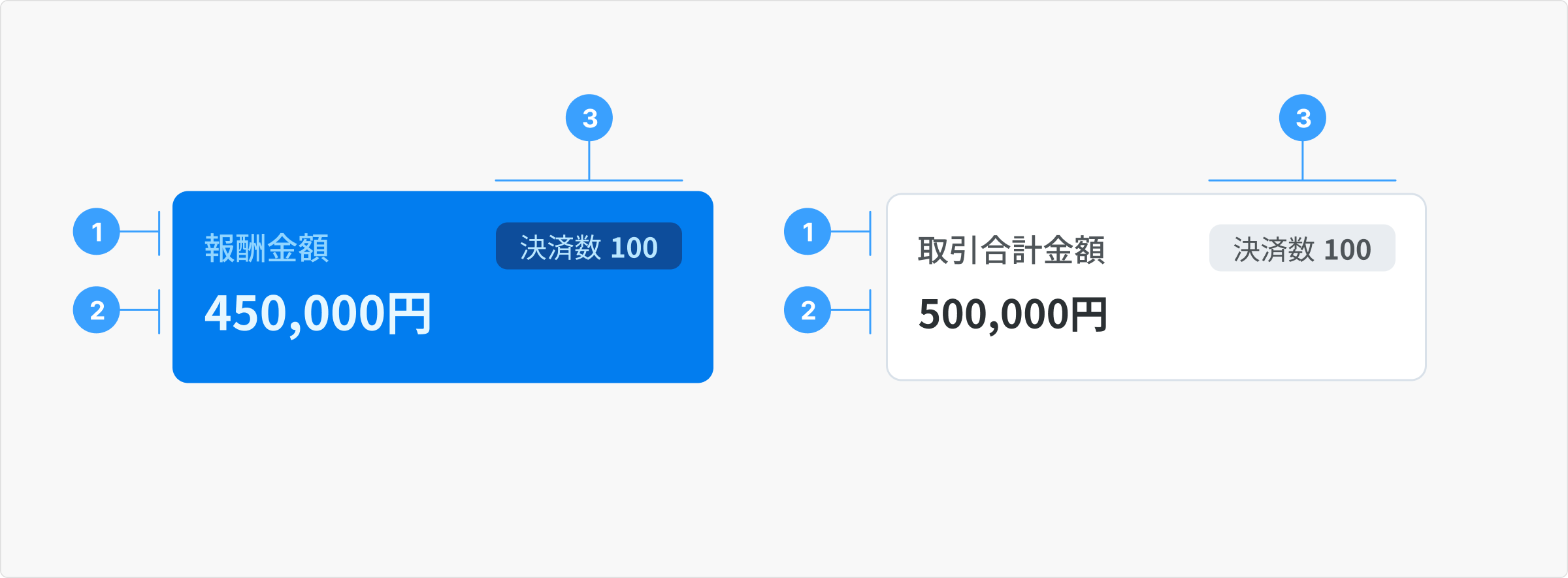
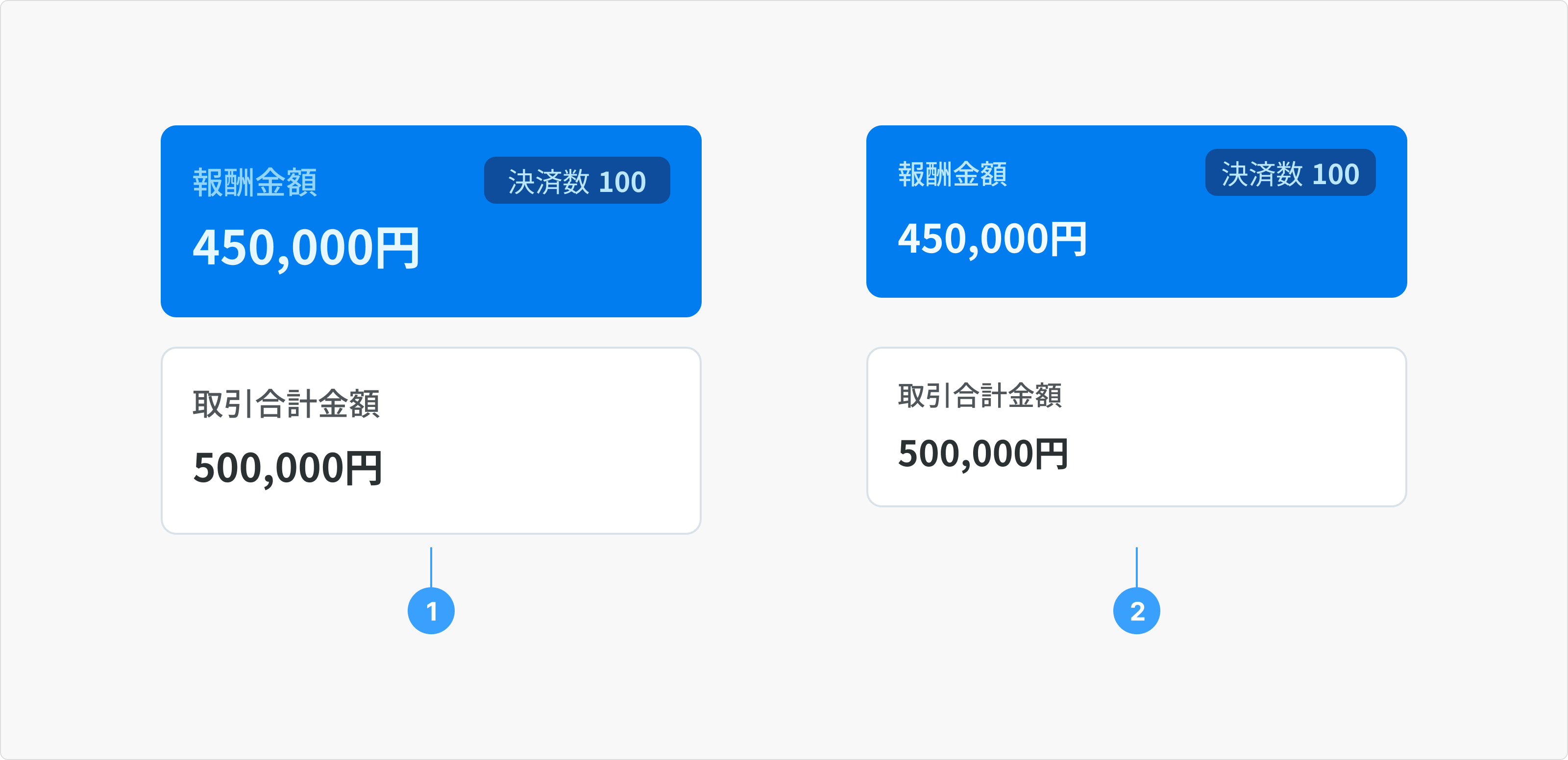
- Title: Concise name of primary information.
- Value: Number value of primary data point or metric being highlighted.
- Secondary Information (optional): Additional context or details related to the value.
- Secondary title: Name of secondary information.
- Secondary value: Number value of secondary information.
Example: the primary information indicates that the Provider earned 450,000円 (subject to applicable business taxes) from 100 successful paid bookings.
Type

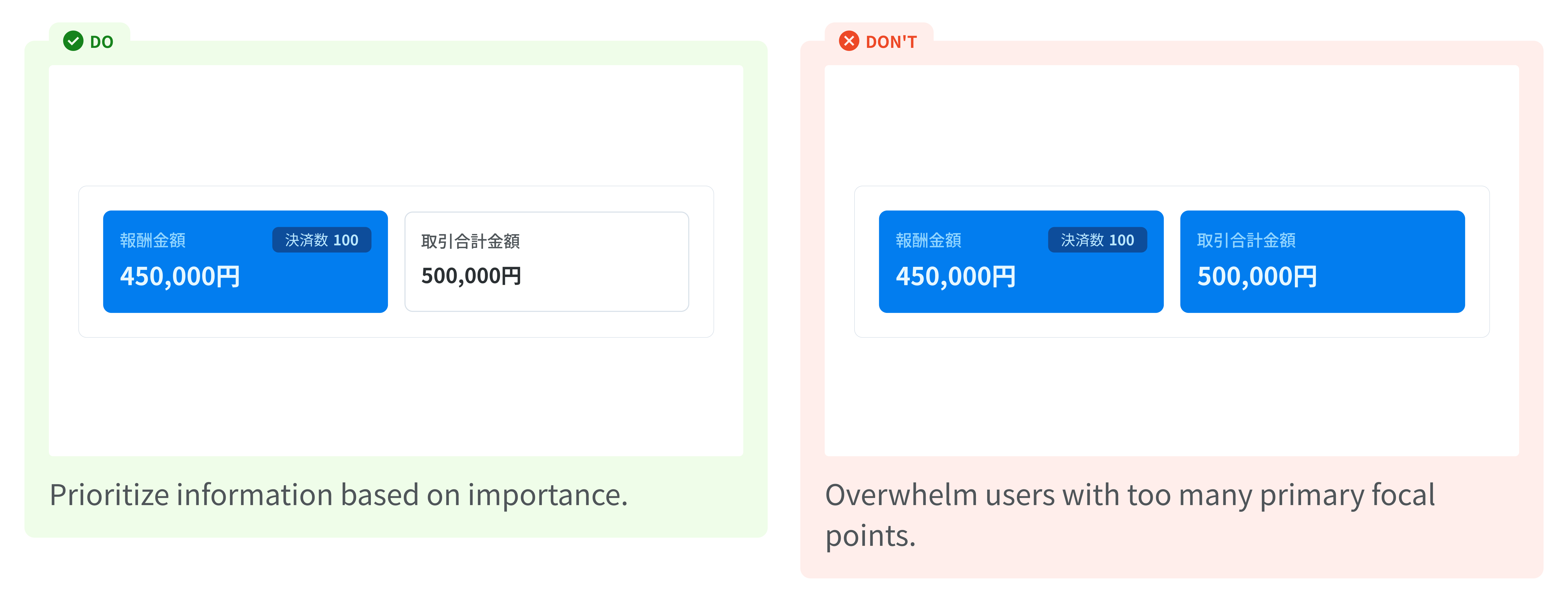
- Primary: Displays the most critical information that users need to see immediately.
- Secondary: Provides supplementary or less crucial details.
For example, we can display key metrics of Earning and Payout like this:
-
Earning:
- Primary: Earning Subtotal
- Secondary: Gross Earning, Commission Fees
-
Payout:
- Primary: Net Payout Amount
- Secondary: Gross Payout, Transfer Fees, Commission Fees
Note: the categorization of information as primary or secondary can vary depending on the project requirements.
Content
Title
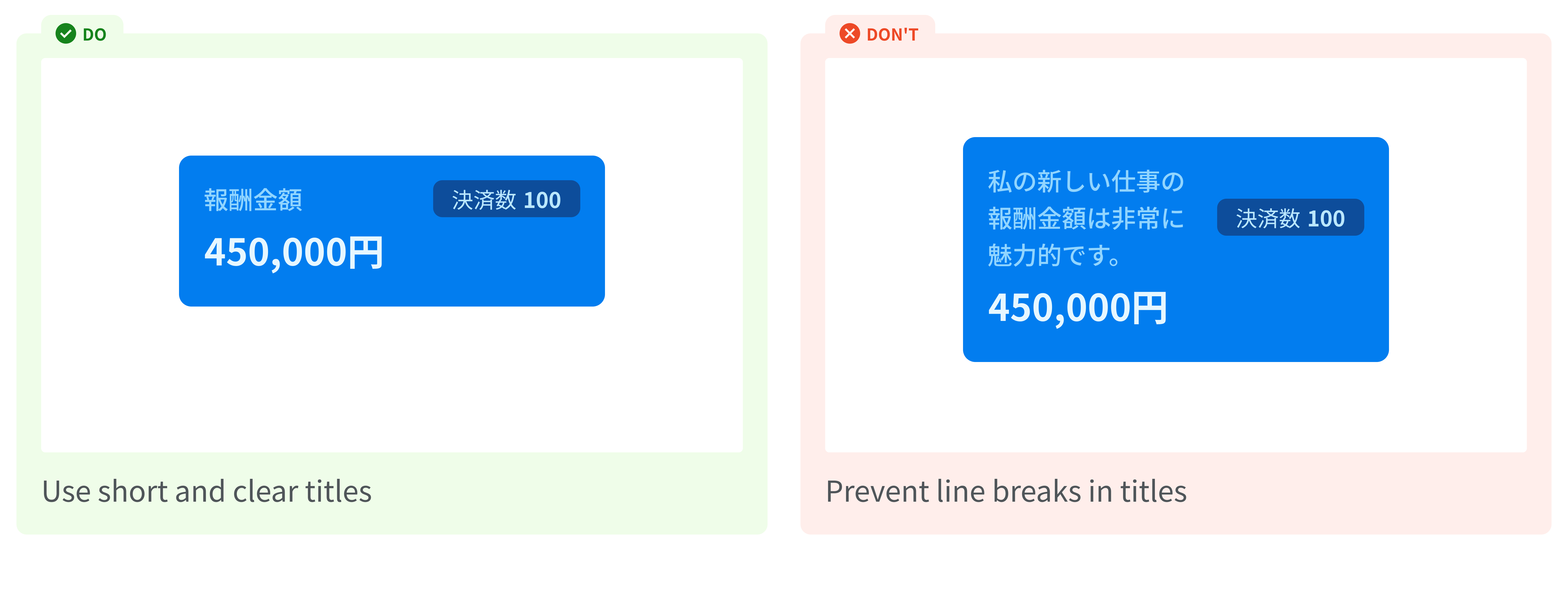
Work best with less than 8 characters
Value
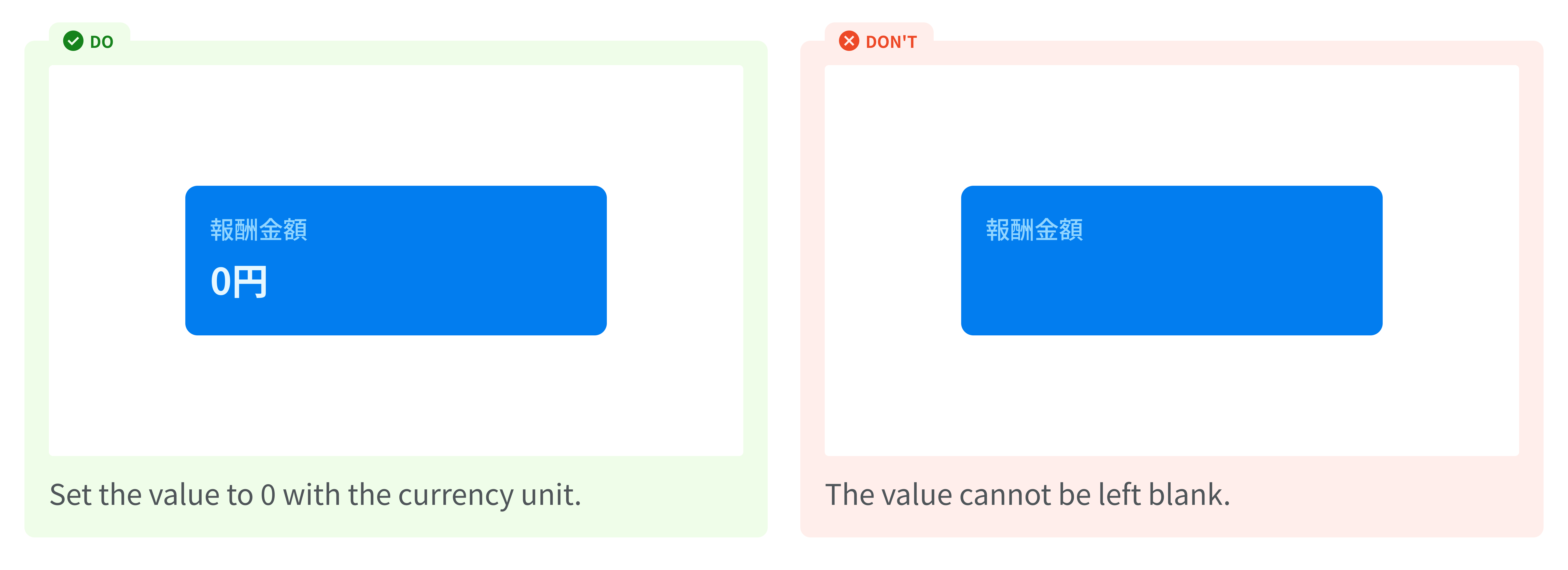
- Value equal to 0 yen: Set the value to "0円".
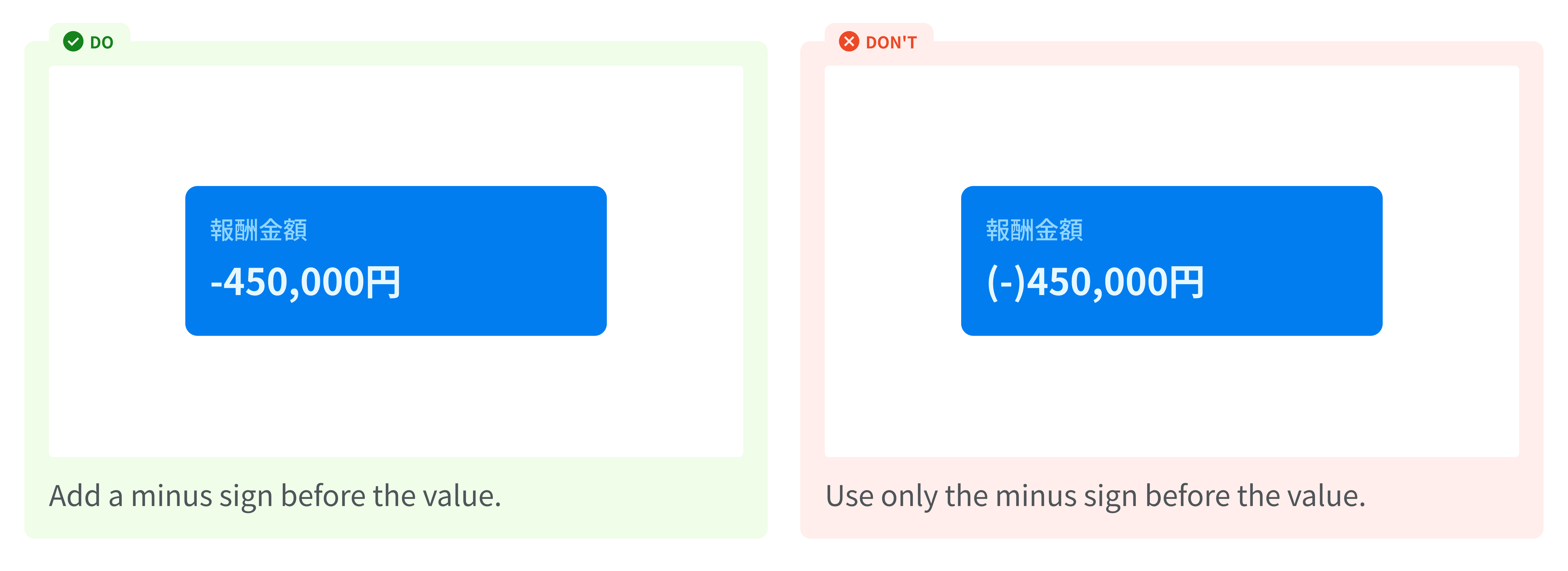
- Value less than 0 yen: Add a minus sign before the value.
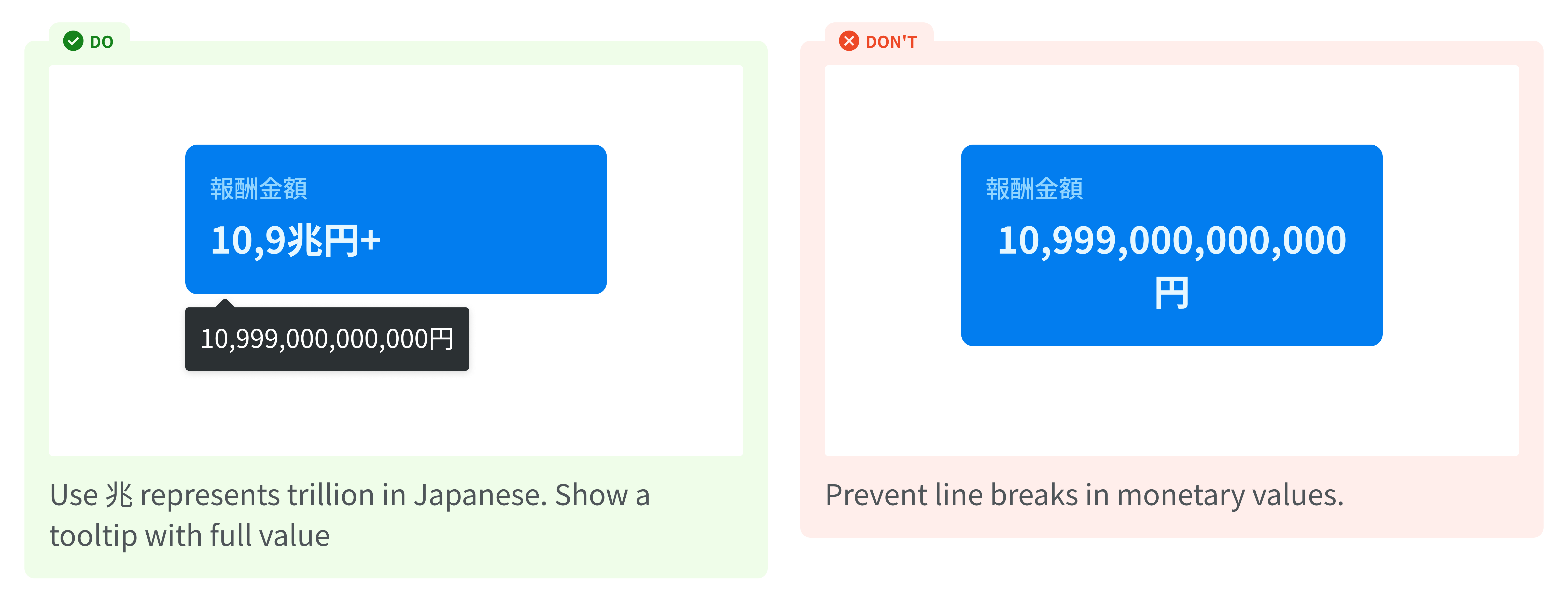
- Value greater than or equal to 9,999,999,999,999 yen: If the value exceeds 9.99 trillion yen, represent it as "10.9兆円+". This indicates a value slightly larger than 10.9 trillion yen. When the user hovers over this card, a tooltip will appear, showing the full value of 9,999,999,999,999 yen.
Hierarchy
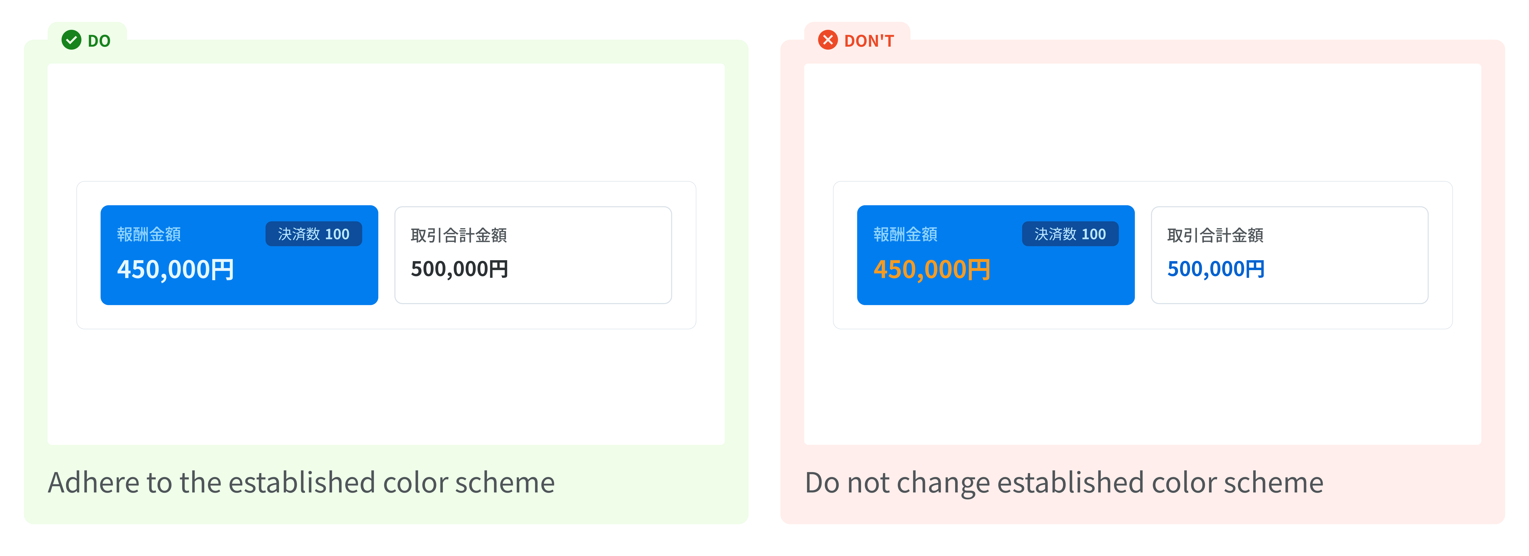
Color Scheme
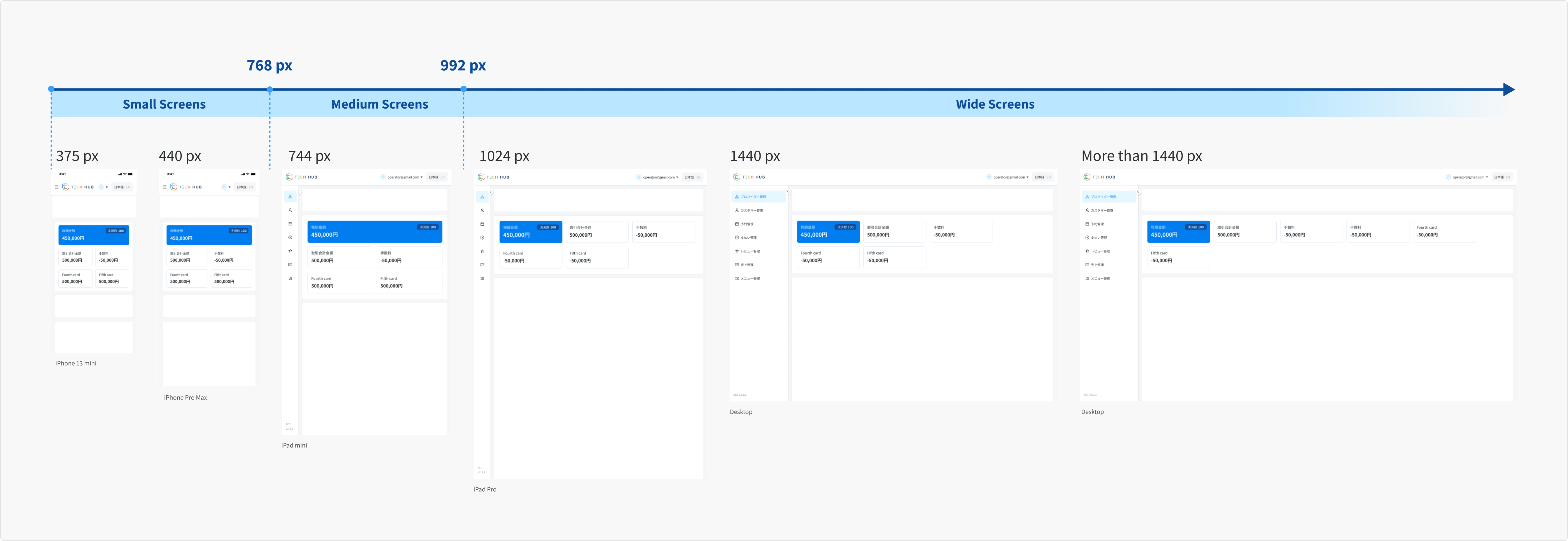
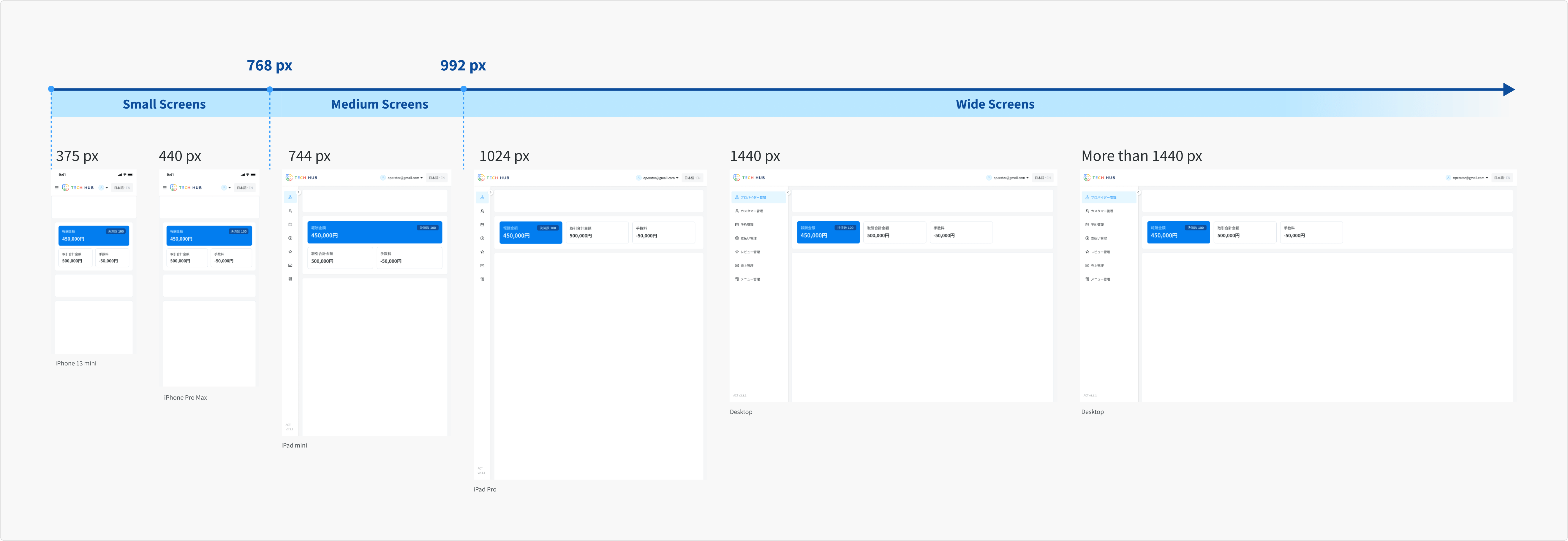
Responsiveness common guidelines
Adjust the font size to optimize the user interface for various screen sizes.
Wide Screens (≥ 992px) and Medium Screens (768px - 991px)
- Primary Cards: 16px for title, 24px for value.
- Secondary Cards: 16px for title, 20px for value.
Small Screens (< 768px)
- Primary Cards: 14px for title, 20px for value.
- Secondary Cards: 14px for title, 18px for value.
Usage Guidelines
The Statistics component can be used in various layout configurations, such as 3-card, 4-card, or 5-card arrangements, to accommodate different data presentation needs.
Case 1: 3-Card Layout
- Wide Screens (≥ 992px): Both primary and secondary card have a fixed width of 256px and always fill the container.
- Medium Screens (768px - 991px): Primary card fills the first row, while secondary card occupies the second row.
- Small Screens (< 768px): Similar to the medium screen, Primary cards fills the first row, while secondary card occupies the second row.
Case 2: 4-Card Layout
- The primary, secondary, and the 3rd card behaves similarly to 3-Card Layout.
- The 4th card will fill the entire container in the third row in Medium and Small screens.

Case 3: 5-Card Layout
- The primary, secondary, and the 3rd card behaves similarly to 3-Card Layout.
- The 4th and 5th card will fill the entire container in the third row in Medium and Small screens.