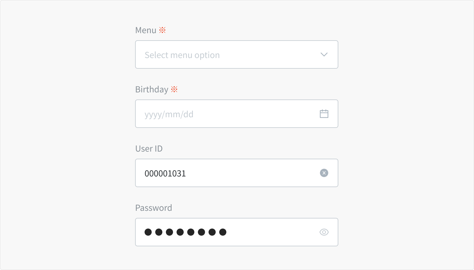
Textfield
Overview
Textfields are the basis and most common input fields used on forms.
Besides their simple uses, they can allow typing data from any character types to text only, number only or predefined formats.
Anatomy
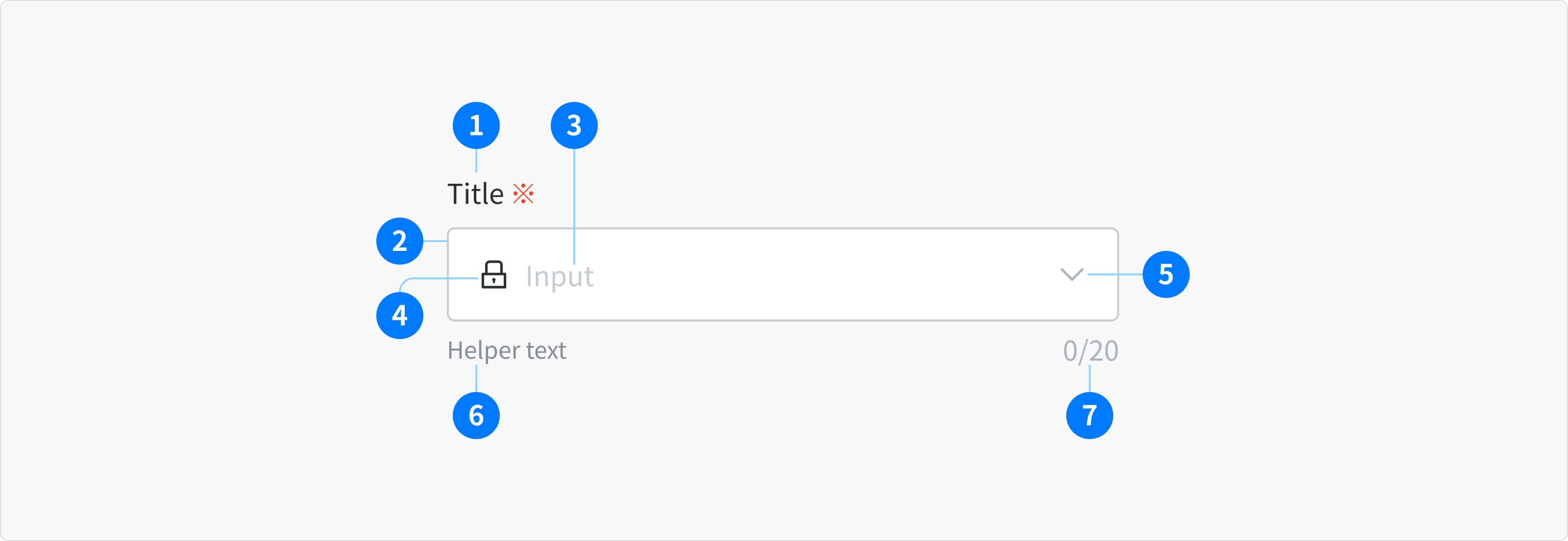
- Title (Optional)
- Input Container
- Input Area
- Prefix (Optional)
- Suffix (Optional)
- Helper text Area (Optional)
- Character Counter (Optional)
Types
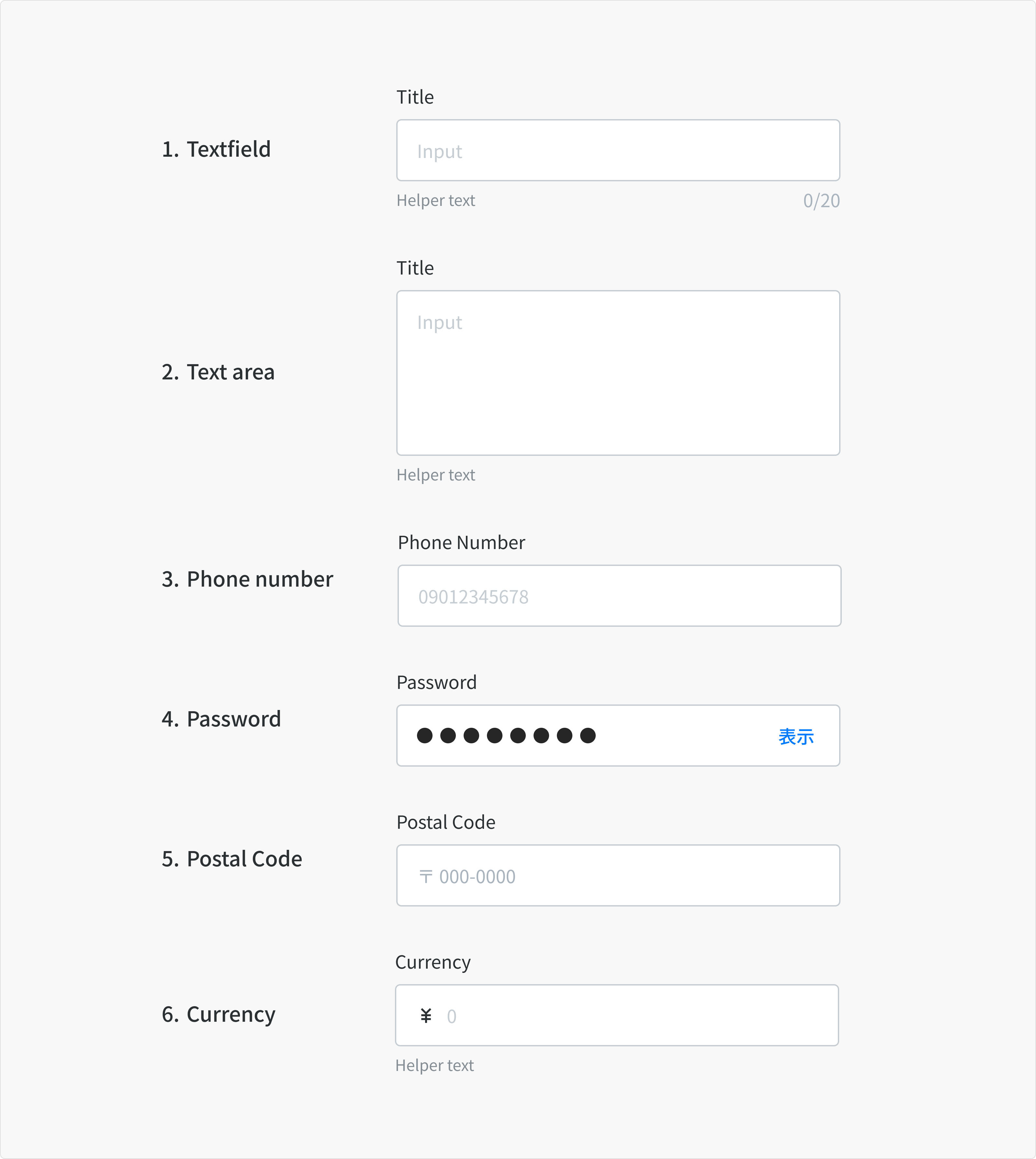
1. Textfield
When the expected user input is a single line of text.
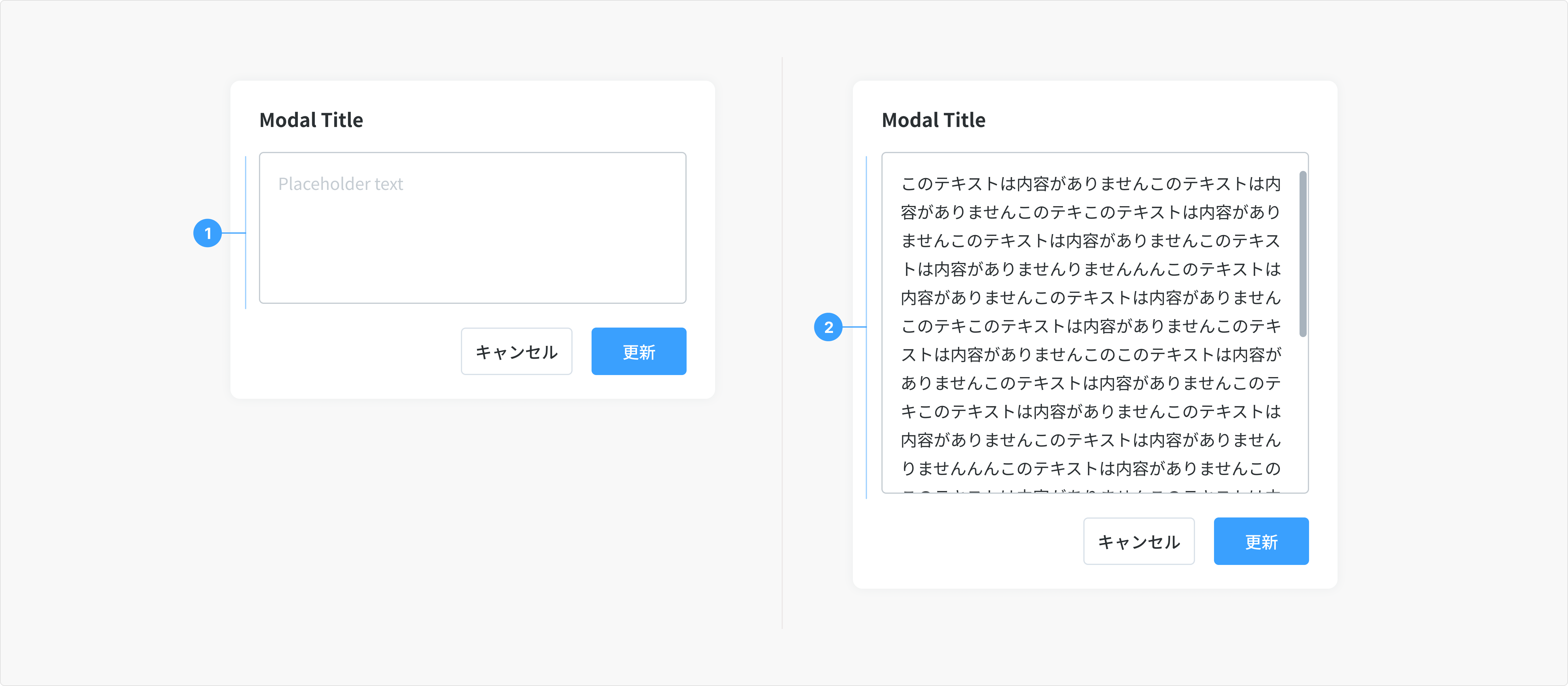
2. Text area
When the expected user input is more than a few words that could span multiple lines
- Using “Controlled Autosize” of Ant component
- Min height: 128px (default size)
- Max height: 288px. Note: The height of the text area will depend on the number of lines. After reaching the maximum height, users can scroll the content in the text area. The maximum height can be customized in specific cases.
3. Phone number
When the expected user input is a single line of phone number.
- Min: 10 characters
- Max length: 11 characters
4. Password
Password input is a sub-variant of text input, used to collect private data and will hide the characters as a user enters them.
- The password component to be used here belongs to Auth0 and cannot be modified.
- User can choose to toggle on the character visibility by clicking the right-view icon
- Be sure to provide detailed helper text listing any requirements related to the data format, such as types of characters allowed
5. Postal Code
Begins with '〒', followed by user input and a seven-digit code.
6. Currency
A currency field is employed to input or display values representing monetary amounts, including prices, costs, coupons, and fees.
- Minimum: 0
- Maximum: 999,999,999,999 (adjustable based on schema)
- Decimal Places: Up to 2 decimal places (e.g., 123,456.78)
- Currency Symbol: ¥ (Japanese Yen) should be prefixed to the amount or other symbols related to currency in other contexts such as coupons, wallets.
- Separators: Use a comma (,) to separate thousands and a period (.) to separate decimal places.
- Negative Values: Users can only input positive values. Negative values will be automatically applied based on the context; for example, an input of ¥100 in Discount amount field will be treated as a ¥100 discount.
States
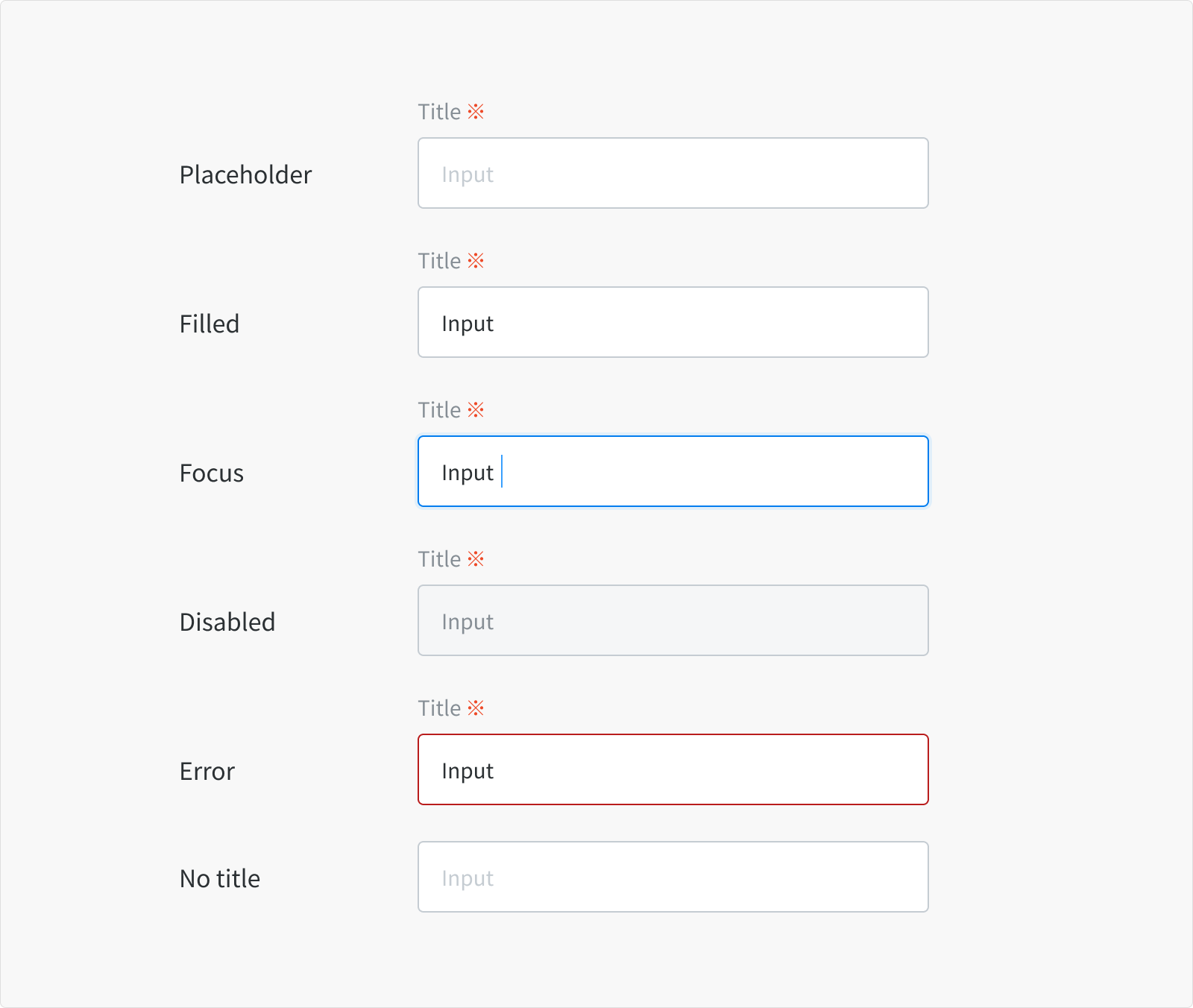
Placeholder
- When a text input or text area is live but a user is not directly interacting with it (commonly referred to as the default or normal state of the component)
- An enabled text input field can contain no content, placeholder text, or user-generated content.
Filled
- When a user has typed content into the field.
Focus
- When a user clicks on the text input or text area
- When a user is actively typing content into the field
- Indicating the user has successfully navigated to the component.
Disabled
- When the user cannot interact with a component and all interactive functions have been removed.
- Disabled states are not read by screen readers, and do not need to pass visual contrast
- Visual contrast check (Figma plugin):
- Contrast Ratio: min 3.0:1
- APCA algorithm: Spot Text safe
Error
- When the user input is invalid or a required text input or text area has not been filled in. It can also be triggered due to a system error.
- This state requires a user response before data can be submitted or saved.
No title
- There are instances that the context of an input negates the need for a visible label, in this case, please check accessibility before proceeding with a label-less design.
Content
- Textfields should indicate that users can input information.
- Textfields should easy to understand the requested information and address any errors.
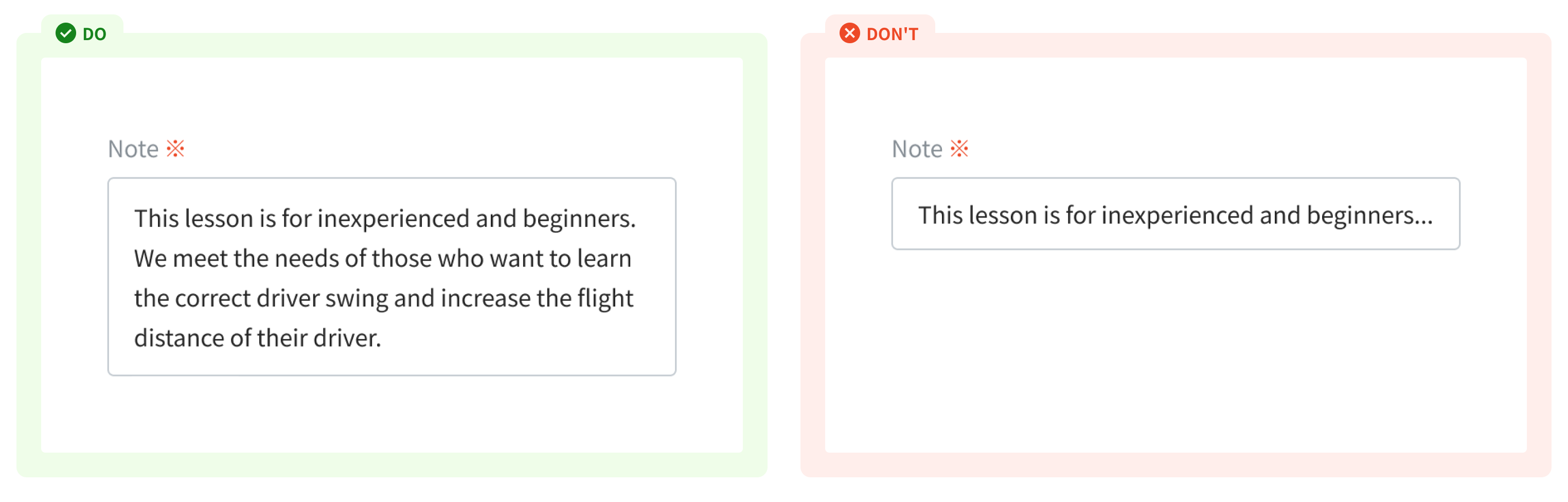
Title
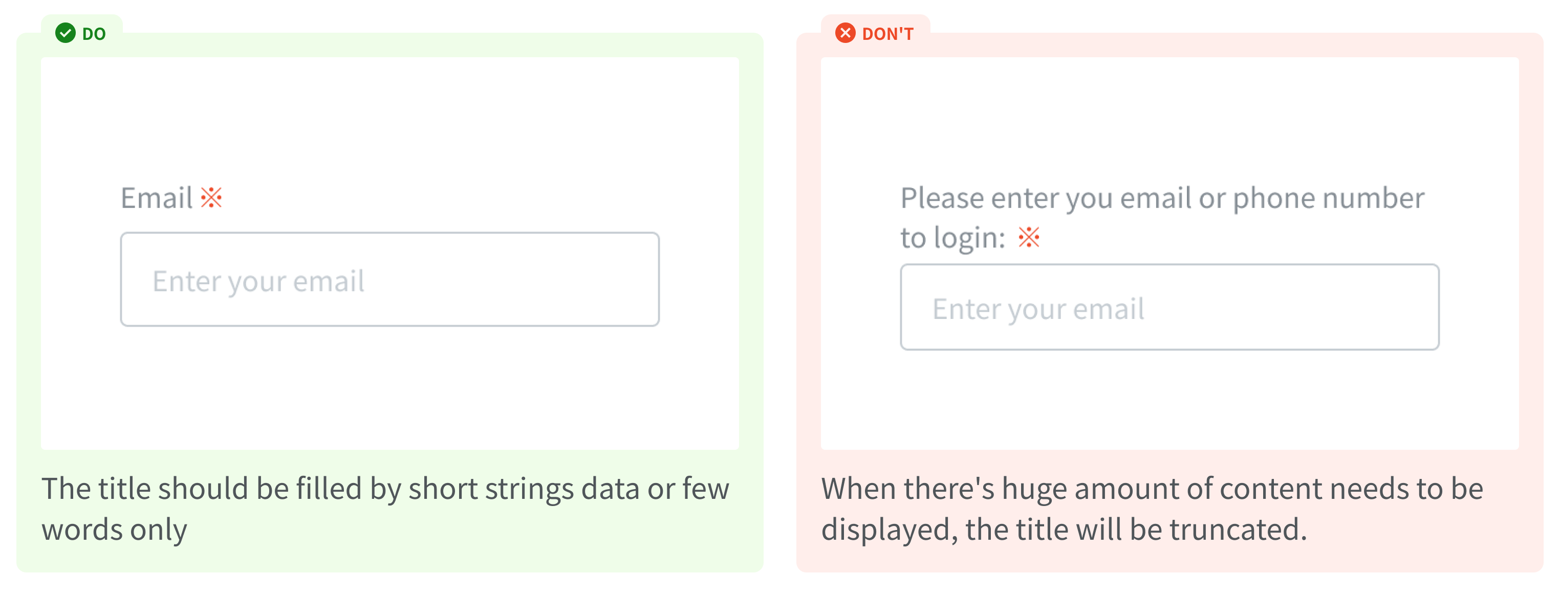
Effective title helps users understand what information to enter into a text input.
- Keep the title short and concise.
- Do not use colons after title names.
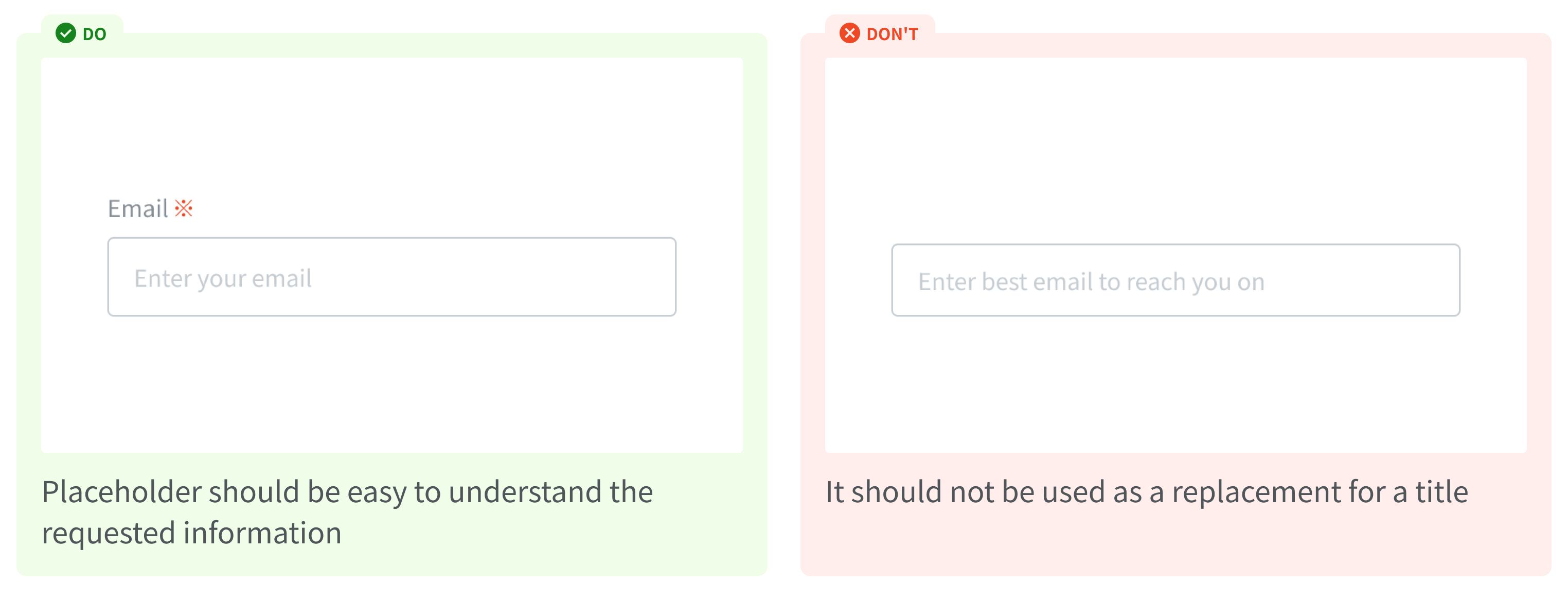
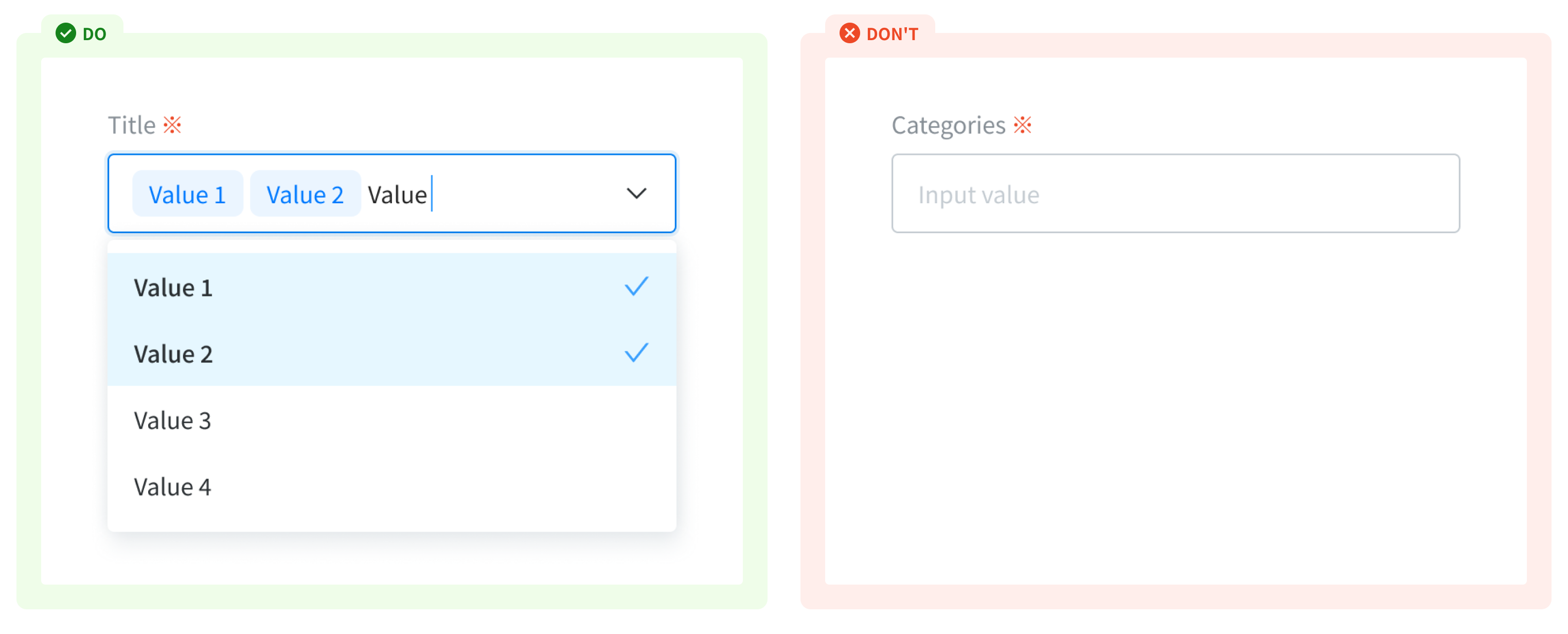
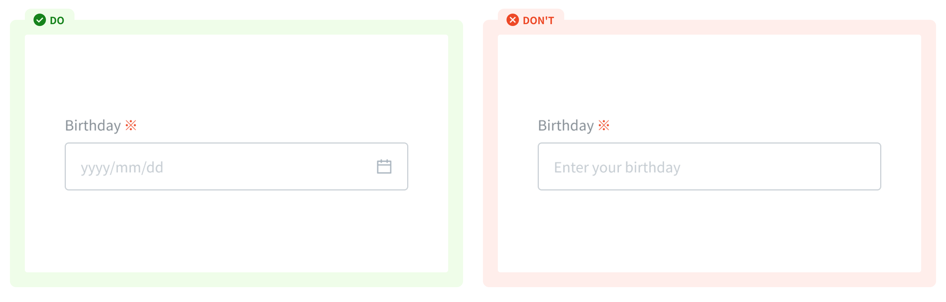
Placeholder text (Input area)
Placeholder text should provide hints or examples of what to enter, and disappear after the user begins entering data into the input.
- It should not be used as a replacement for a title
- Encourage user to type in (in a form)
- Guide user on how to enter a valid input in term of format, length of input. If the guidance is too long, use the helper text below the title.
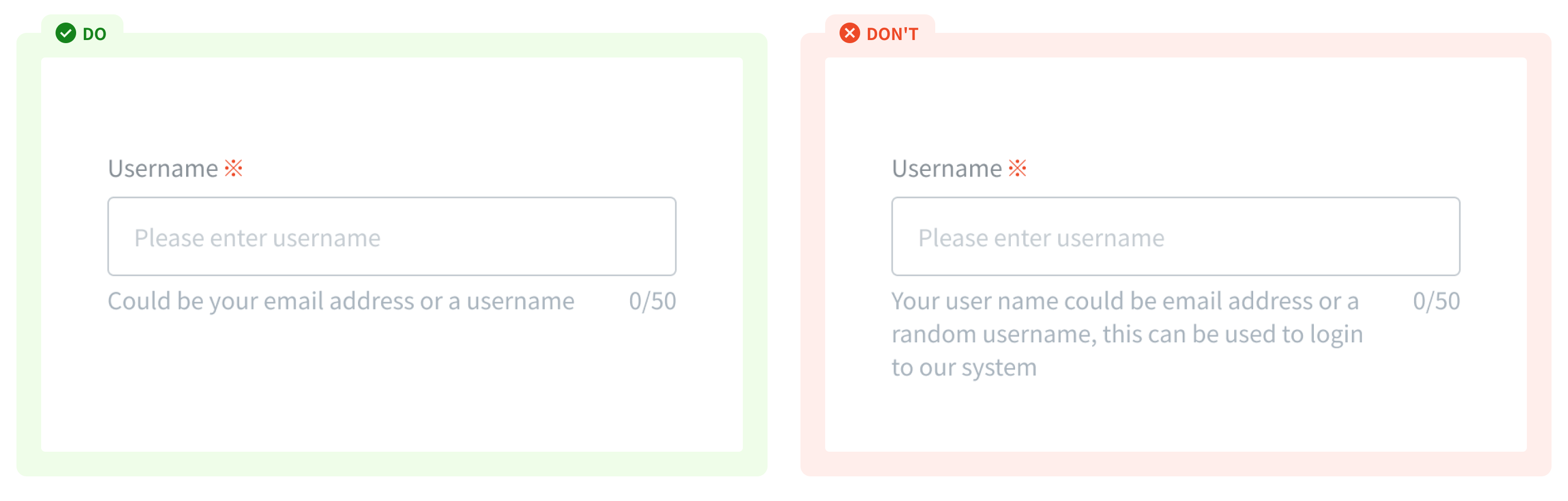
Helper text and Character counter
- Helper text conveys additional guidance about the input field, such as how it will be used. It should only take up a single line, being persistently visible or visible only on focus.
- Character counter indicate the number of characters being entered and the total number of characters allowed
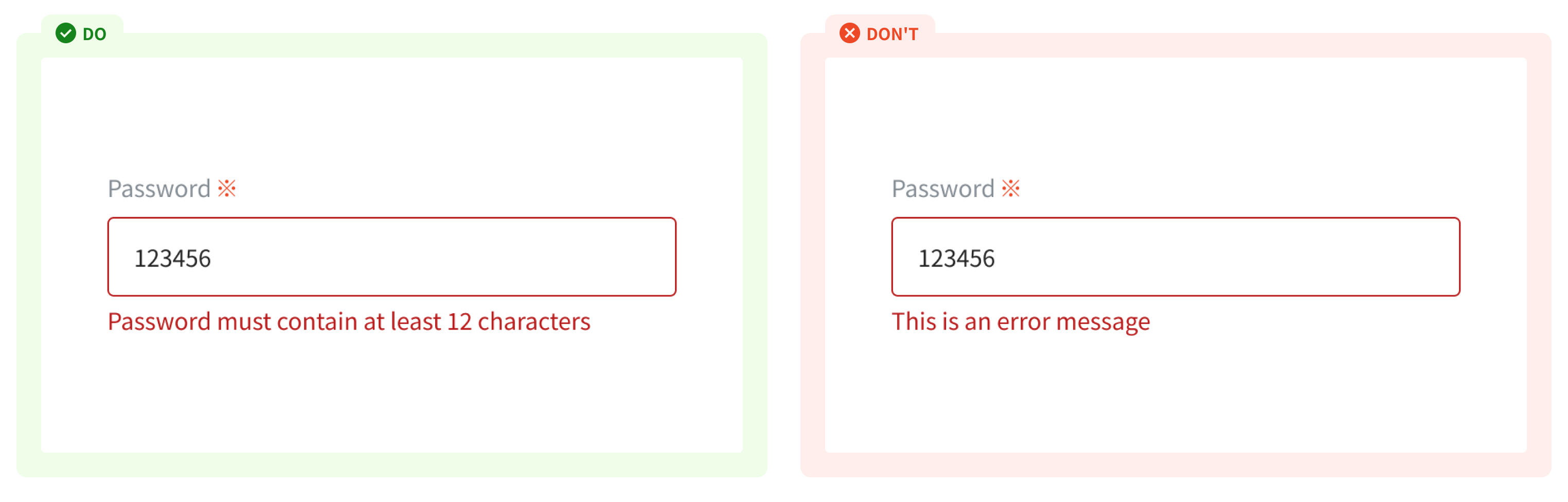
Error message
When text input isn't accepted, an error message can display instructions on how to fix it. Error messages are displayed below the input line, replacing helper text until fixed.
Icons (Prefix/Suffix)
Icons in textfields are optional. Text field icons can describe valid input methods (such as a calendar or dropdown icon), provide affordances to access additional functionality (such as clearing the content of a field)
Usage Guidelines
When to use
- To gather basic information from users.
- To specify what kind of data users can enter.
When not to use
- If you want longer user responses (such as feedback or notes) - use a text area.
- If you want to use advanced features like filtering a pre-defined list of options - use a combo box.
- If you want user to choose and select a specific date - use a date picker
References
Ant design - Input
Doctolib - Text input
Orbit - Input field
Carbon design system - Text input
Material - Textfield