Tabs
Overview
Tabs are used to group different but related content, allowing users to navigate views without leaving the page. They always contain at least two items and one tab is active at a time. Tabs can be used on full page layouts or in components such as modals, cards, or side panels._
Anatomy
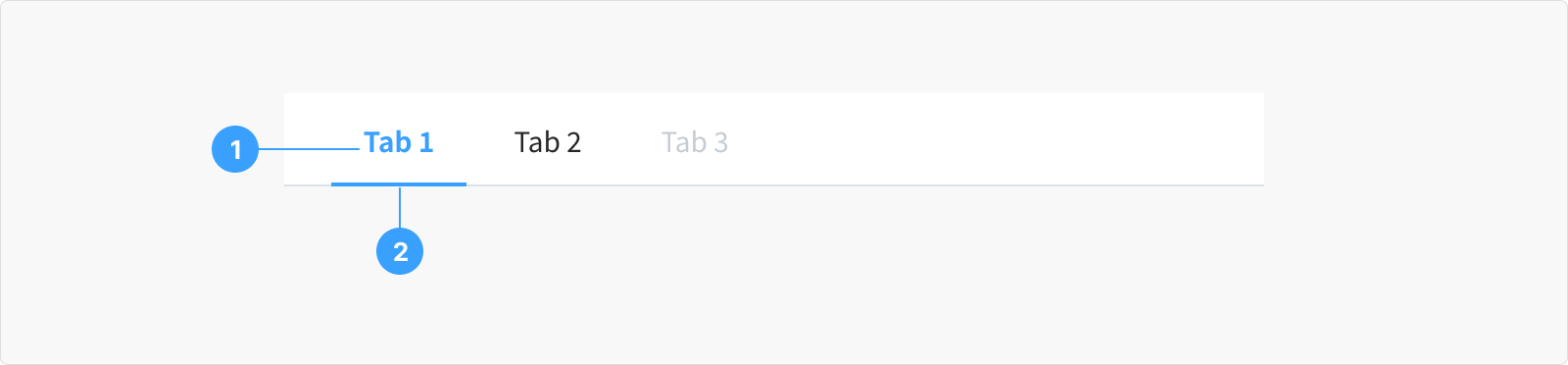
- Tab Labels or Titles: These labels or titles are visible on each tab, offering a brief description or title indicating the content that will be shown when the tab is selected.
- Active Tab Indicator: There's usually an indicator, such as an underline or change in color, to signify which tab is currently active or selected.
State
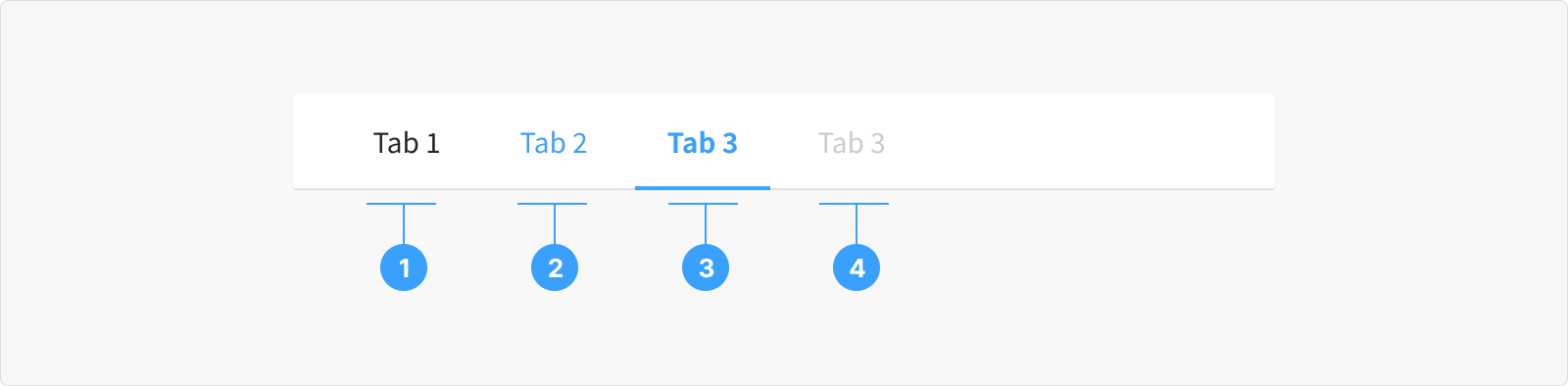
- Default/Normal State: This is how tabs look when you first see them. They don't show any signs that you can click them.
- Hover State: When you move your mouse over a tab, it might change a bit to show you it can be clicked. It could change color and have an underline.
- Active/Selected State: This is the tab you've clicked on. It looks different from the others, usually with a special color or underline, to show you're looking at its content.
- Disabled State: Some tabs can't be clicked at certain times. They look different from the normal tabs, showing you can't interact with them right now.
Content
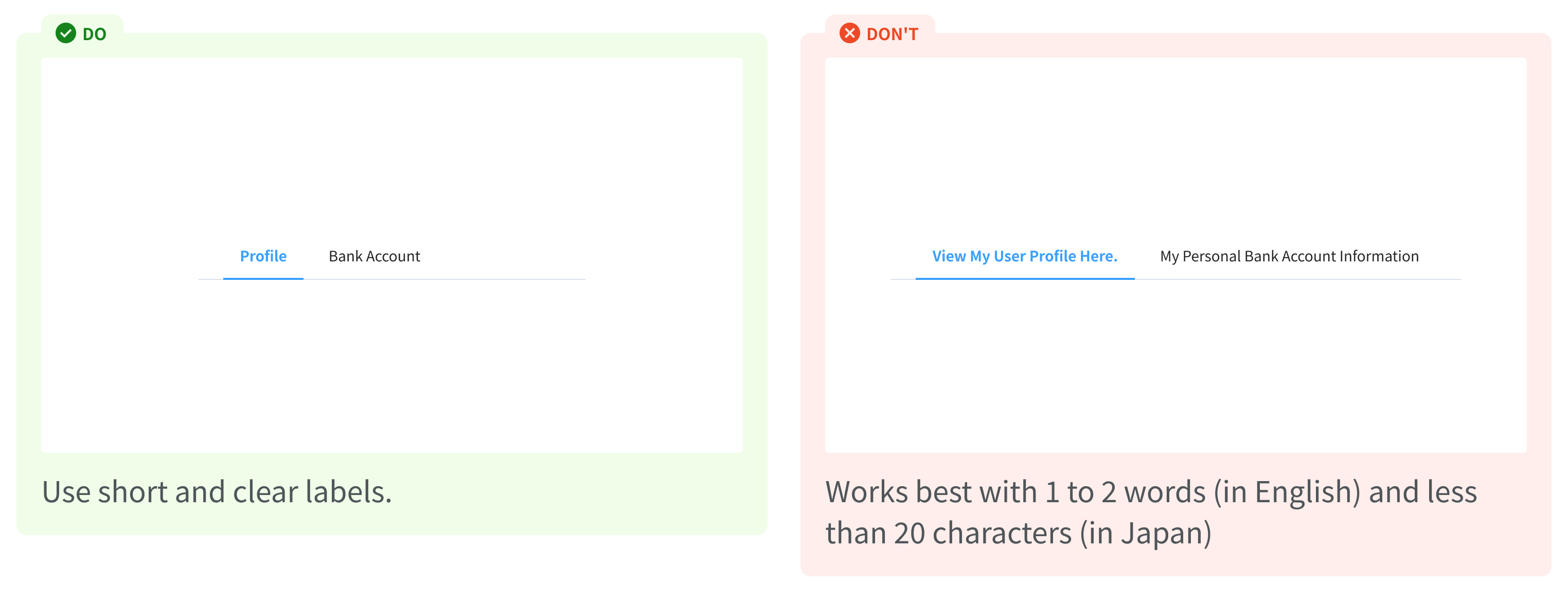
Content should clearly state exactly what happens when users interact with it. The label must be able to represent what it contains, for example: “Profile, Bank Account"