Radio
Overview
Allows user to select a single option from a number of choices, only one radio button can be selected at a time.
Anatomy
`
- Title (Optional)
- Radio input
- Radio label
States

- By default, depending on specific context, designer has to decide whether the radio button has a pre-selected value or not.
- Pre-selected value when:
- There's 1 option preferred to set default
- Or the option is based on most common or expected response.
- No pre-selected value when:
- It’s crucial for users to consciously make a choice deliberately
- Or there's no option preferred
- Pre-selected value when:
- Error when:
- A set of selections needs to be chosen in order to move forward
- Or that a selection that was made is invalid.
- Disabled when:
- Indicating that an option is not currently available, though may be available later
- Another action has to be completed before the checkbox is usable
Variants
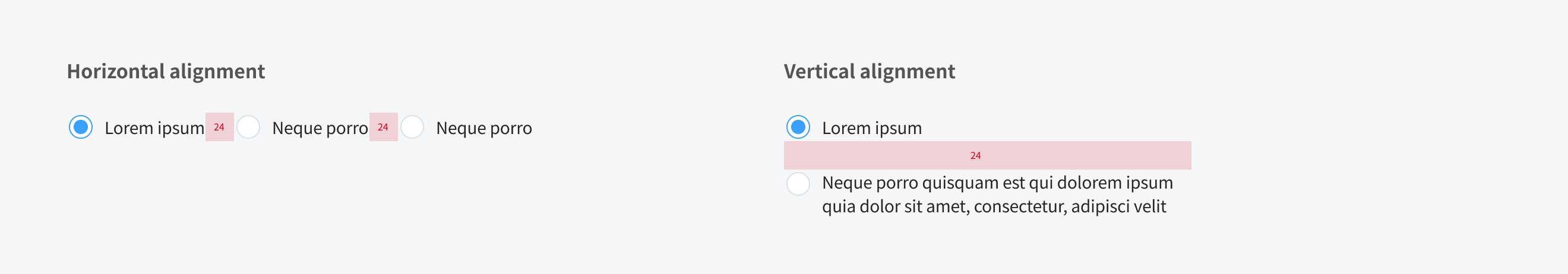
Alignment
Content
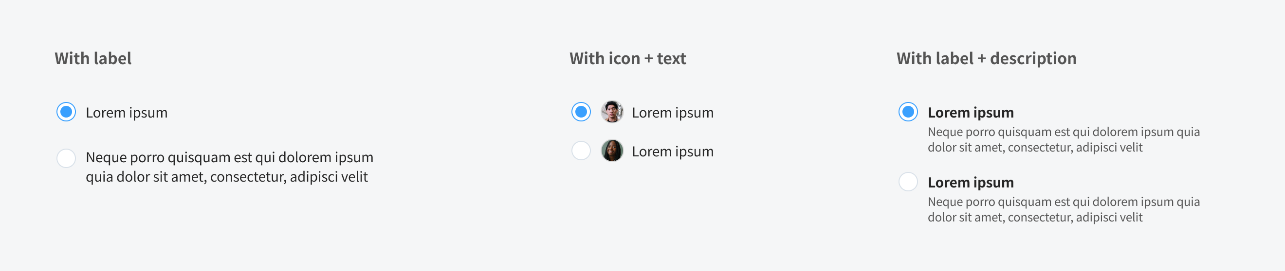
Title
- In most cases, the title provides further context or describes what actions to take below.
- In some cases, a group of radio buttons may be within a larger group of components that already have a group title. In this case, the title is not needed.
Radio labels
- Should use clear and concise labels for radio buttons.
- In most cases, labels appear to the right of radio inputs.
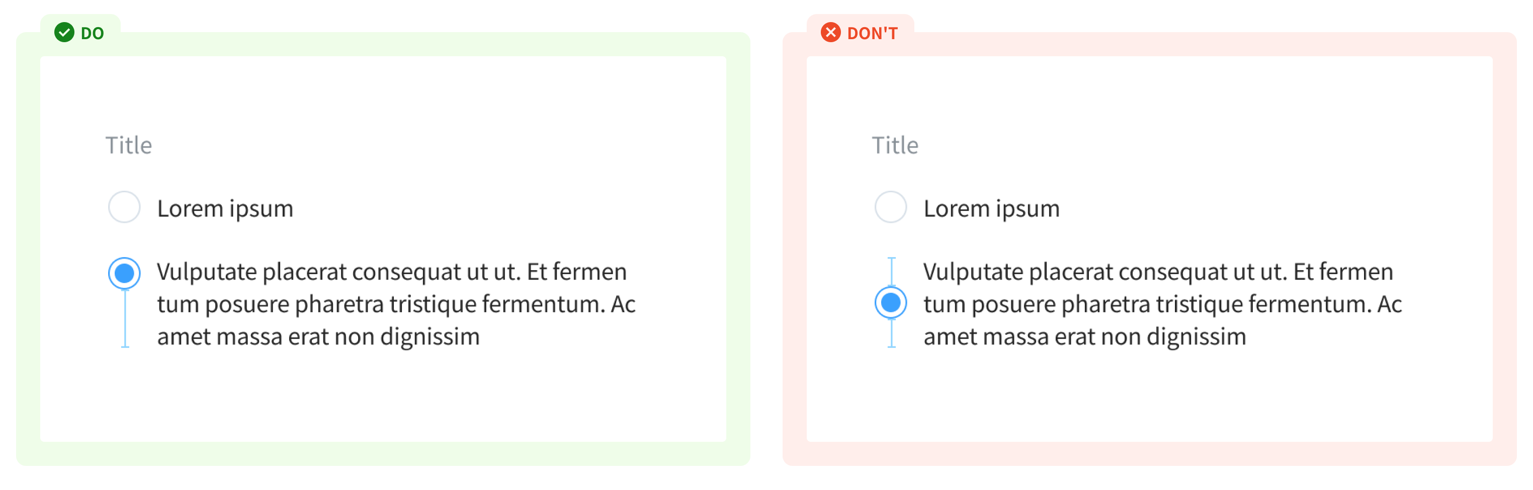
- When using a line break, the radio is horizontally aligned with the first line of the label
Usage Guidelines
When to use
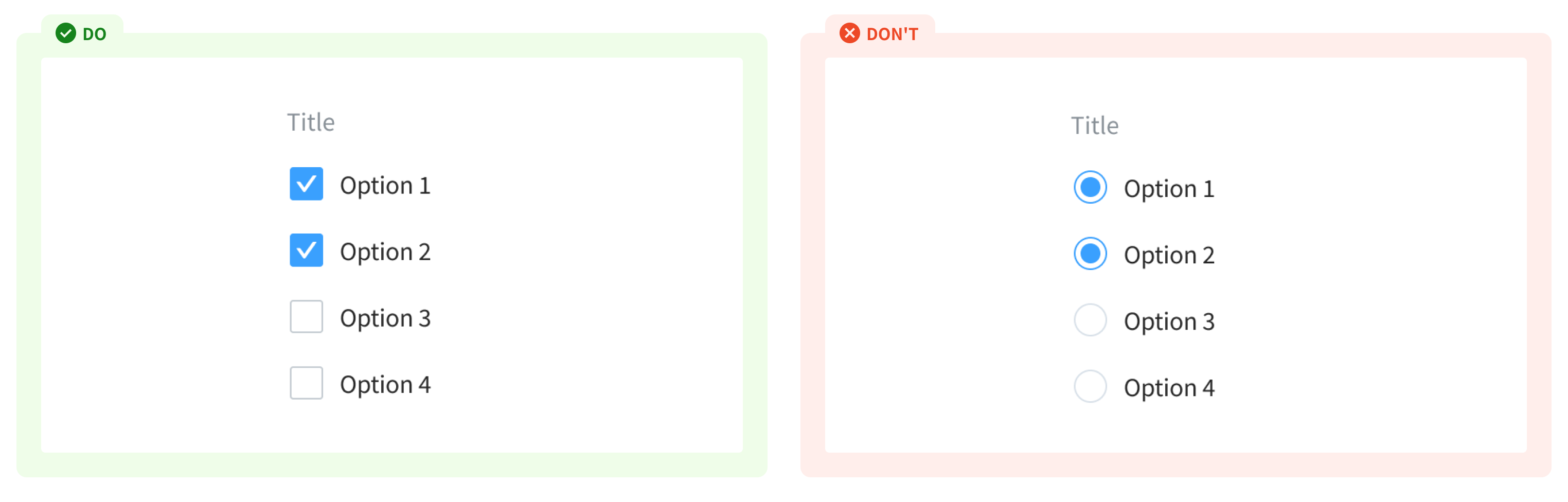
- To present a few options where only one can be selected.
- Can be used in forms on a full page, in modals, or on side panels (to filter data either on a page, or in a menu), or within a component
When not to use
- If user can select multiple options from a list - use checkbox
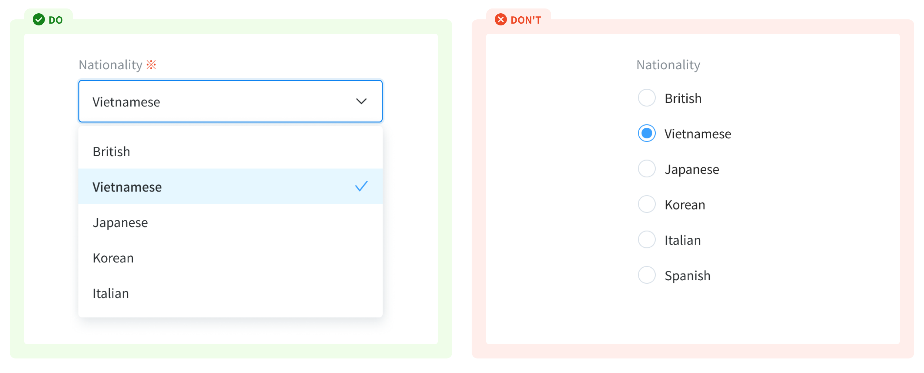
- If user has to input an option from a long list of items - use dropdown input
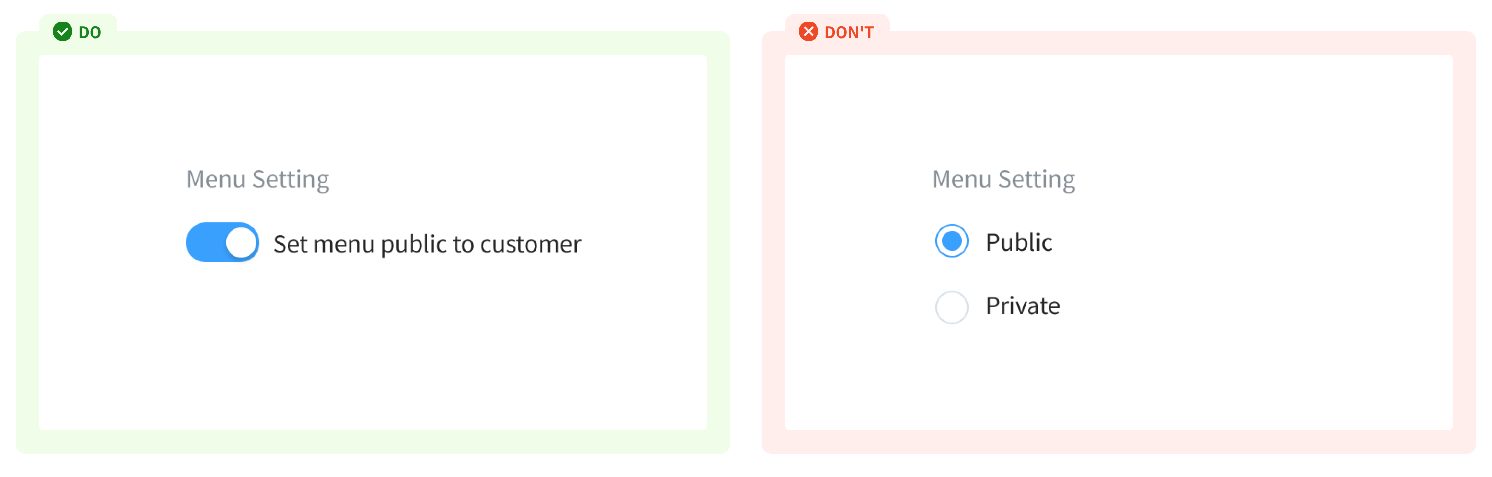
- If there is only single on/off settings with an instant response - use a switch.
References
Doctolib - Radio Carbon design system - Radio button Material - Radio button