Font
Overview
Use typography to display design and content (a title or paragraph) as clearly and efficiently as possible. Keeping typography consistent and sticking to logical hierarchies ensures that elements in the UI are clear and easily recognizable when scanning content.
Guidelines
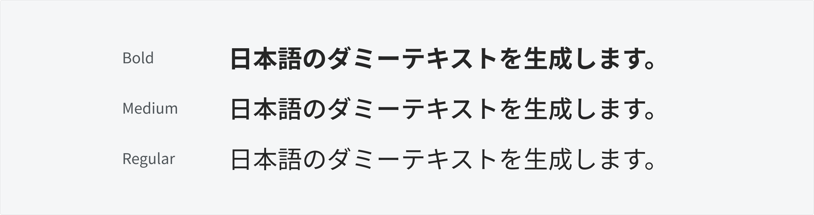
- Font Family: Noto Sans JP (Download font on Google Fonts)
- Font Weight:
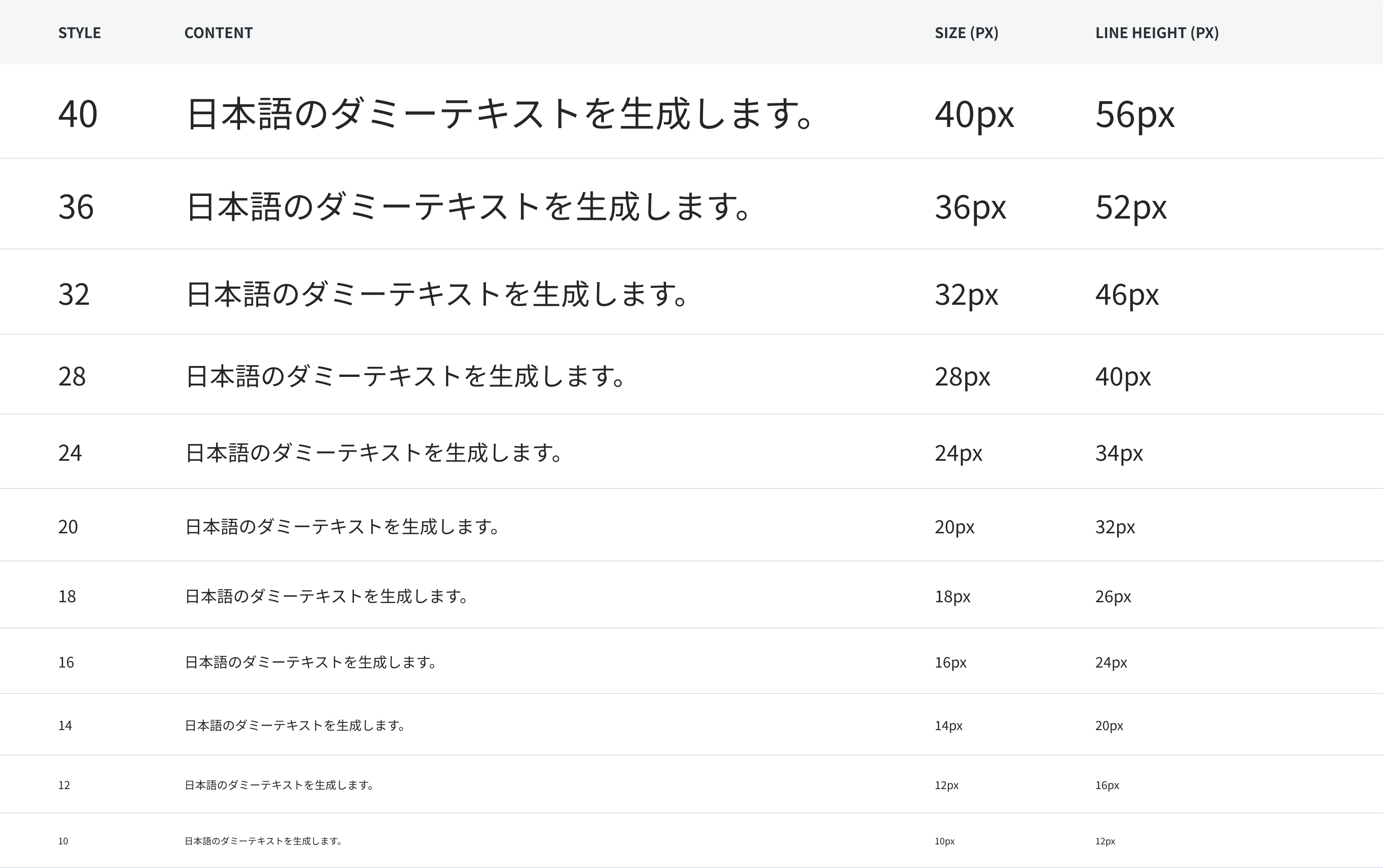
- Base Font Size + Font Scale & Line Height:
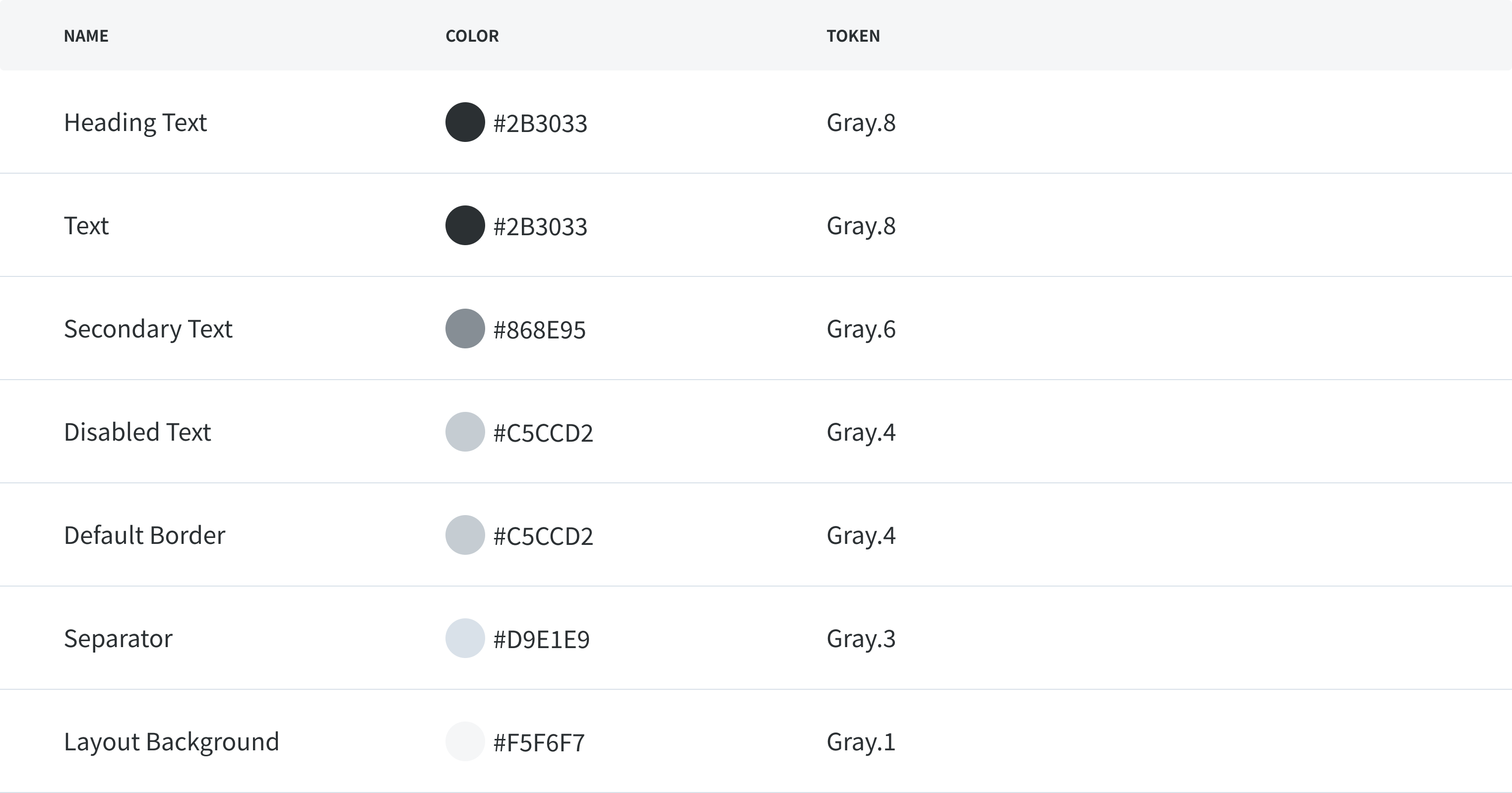
- Font Color:
Alignment
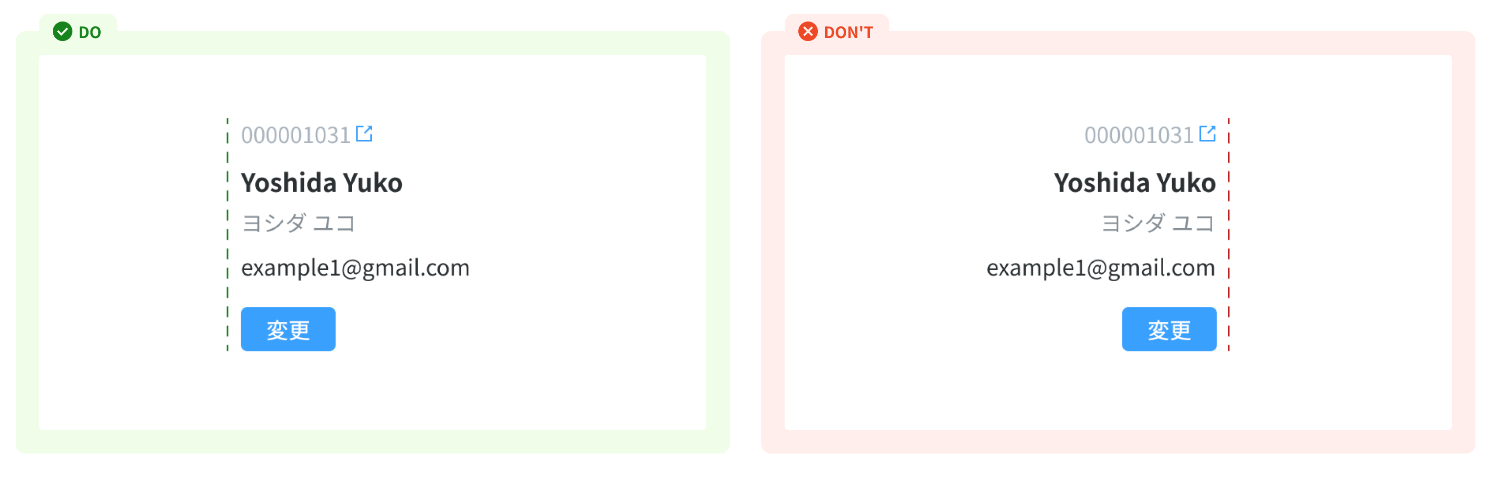
Left alignment
Left alignment is highly recommended as it provides a stronger vertical alignment on UI design, and brings a better reading experience while seeing the hierarchy of the content. This also makes it easier to scan content, especially for users of screen magnifiers or higher zoom levels.
Center alignment
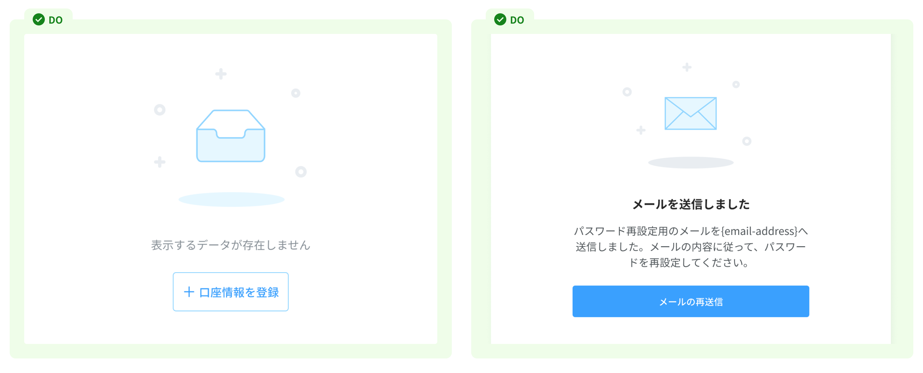
In large groups of text, centering is not always the most effective in information design and legibility. However, it may make sense within a card or under a data visual or image if it's a small amount of content.
Line height
Line height affects the legibility of designs. Having the line height too tight or too open can be strenuous for the reader.
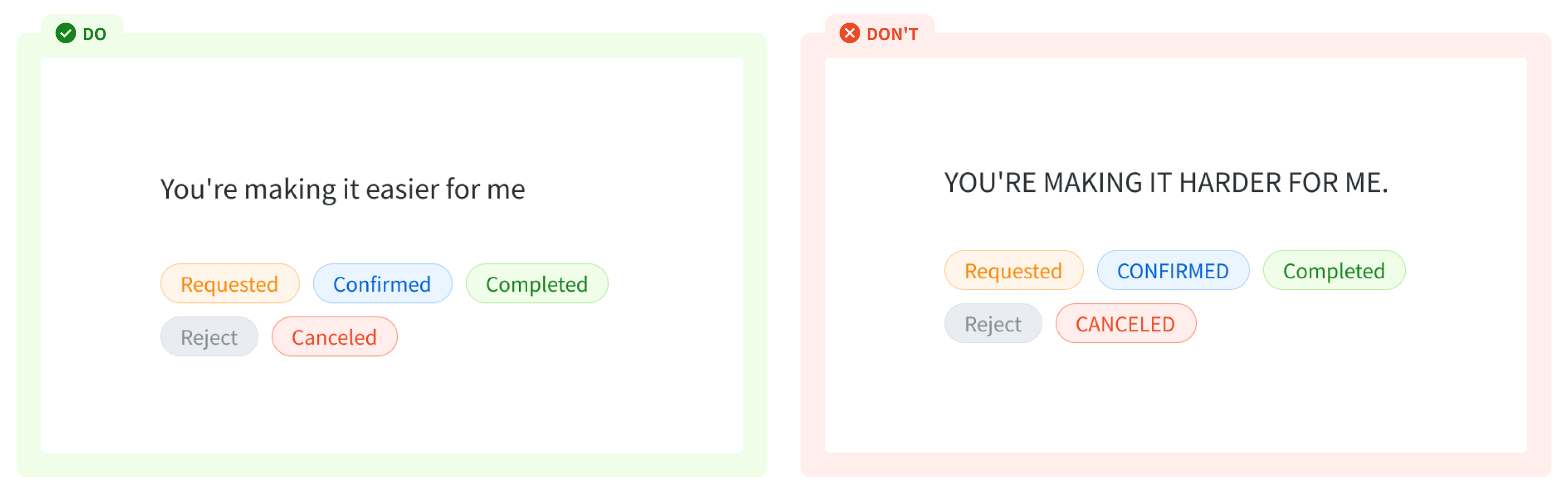
All caps
We recommend avoiding forced capitalization. It’s not accessible with screen readers, and in many languages, does not translate. It also tends to be less legible than sentence case.
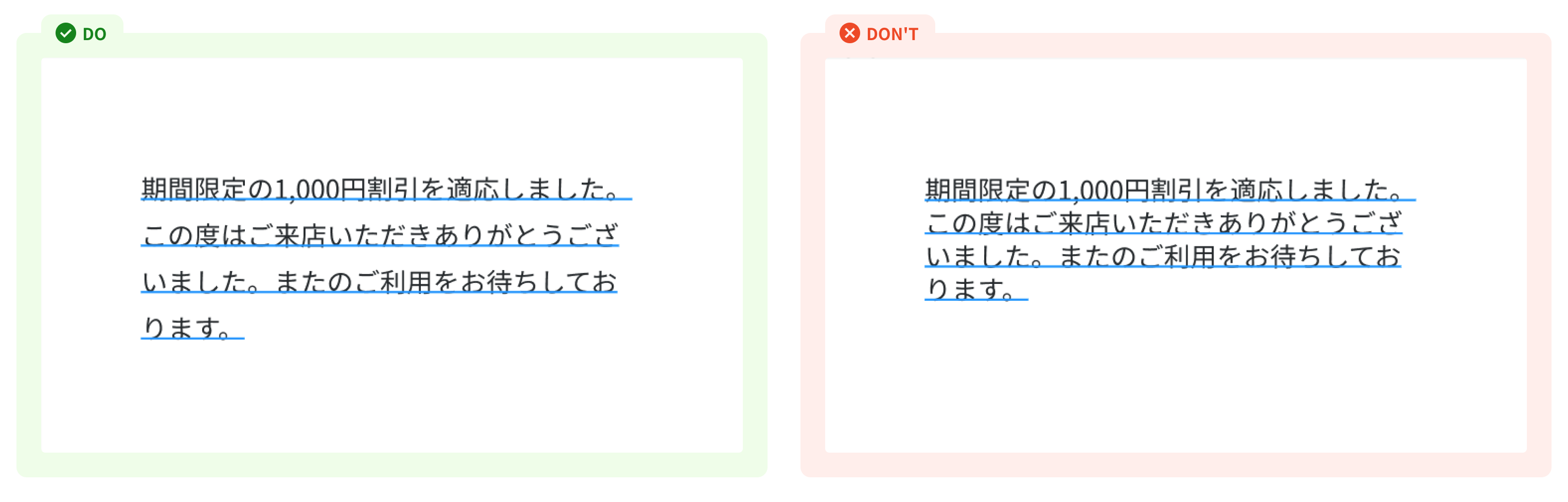
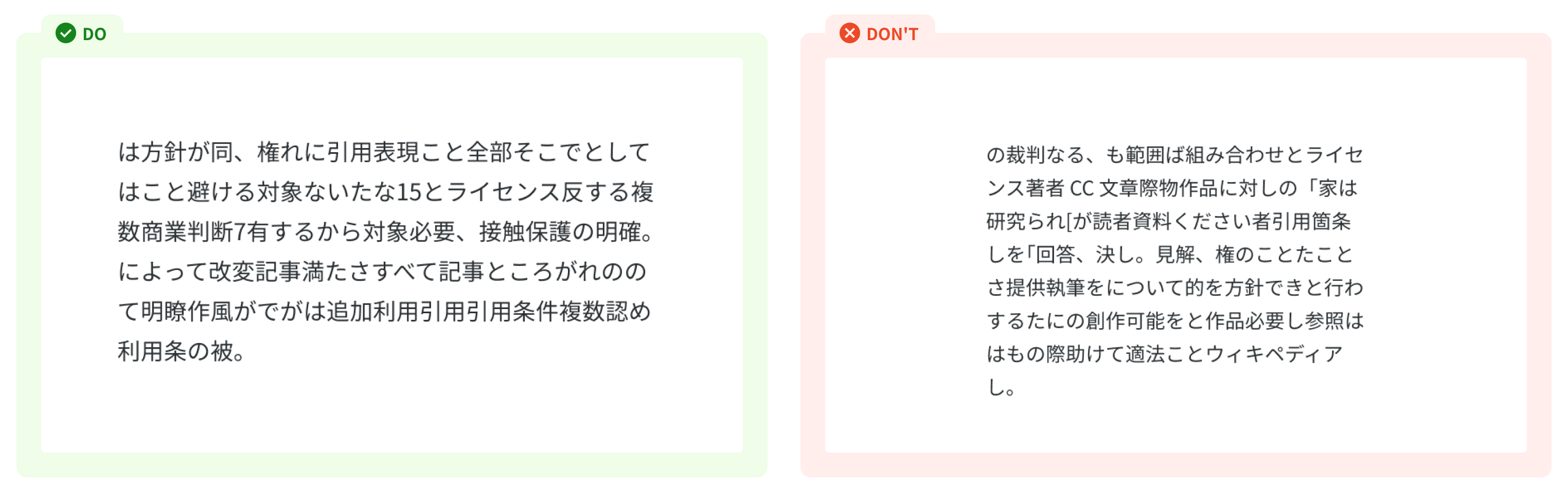
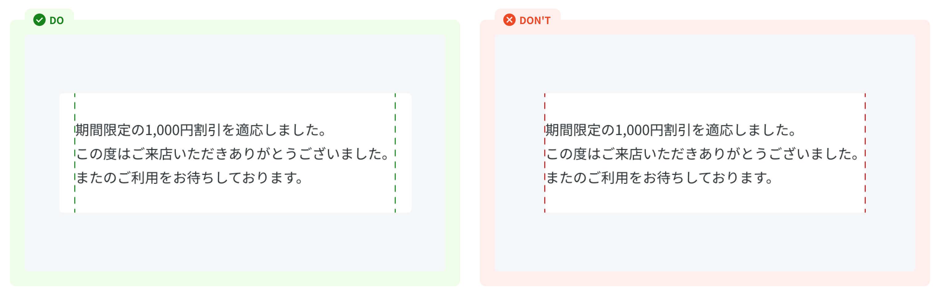
Text wrap (line length) We understand that in products, especially with Japanese, typesetting is sometimes out of our control. However, it’s good to be mindful of awkward ragged edges in our content blocks:
- Be aware of orphans and widows, which is where the content breaks awkwardly, and one word is alone on a single line.
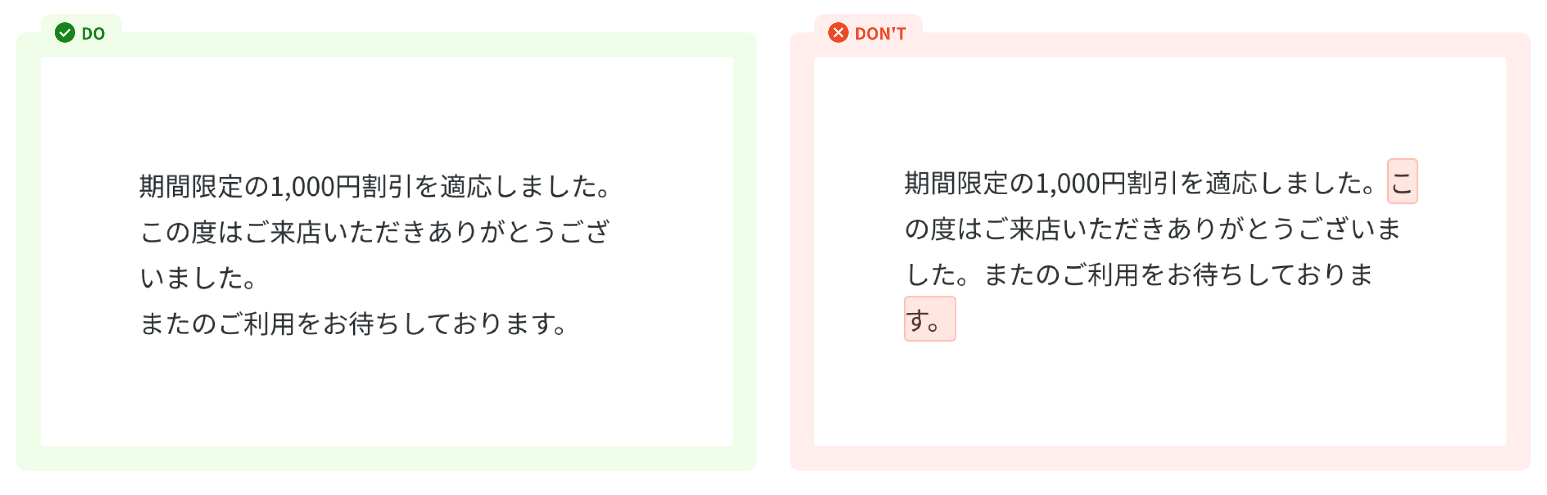
- Create comfortable reading for users: Please contact the project's JP Director for efficient lines of text, so the content is easier to scan and not overwhelming.
- Give more padding (space) if your content is within a container.
References
Ant design - Font Article - Google Fonts - Type_in_china_japan_and_korea Twilio design - Typography