Switch
Overview
Allow users to turn an individual option On/Off, usually used to immediately activate or deactivate a specific setting.
Anatomy

- Title (Optional)
- Switch input
- Switch label
States

- By default, depending on specific context, designer has to decide whether the switch button is checked or unchecked.
- Checked value when:
- This setting option is preferred to be set on
- Or the option is based on most common or expected response.
- Unchecked value when:
- It’s crucial for users to consciously make a choice deliberately
- Or there's no option preferred
- Checked value when:
- Loading:
- Mark a pending state of switch, when the system is responding to user-triggered action.
- This sstate should be used only if the user action needs more time to be completed. Otherwise, use basic switch (without loading state).
- Disabled when:
- Indicating that an option is not currently available, though may be available later
- Another action has to be completed before the checkbox is usable
Size

Medium (Default size):
- Commonly used in forms and can appear within full pages of information that are not restricted in space.
- Default switch is required to display visible labels and action text.
Small
- Often used in condensed spaces and appears inline with other components or content, for example, inside a table content
Variants
Alignment
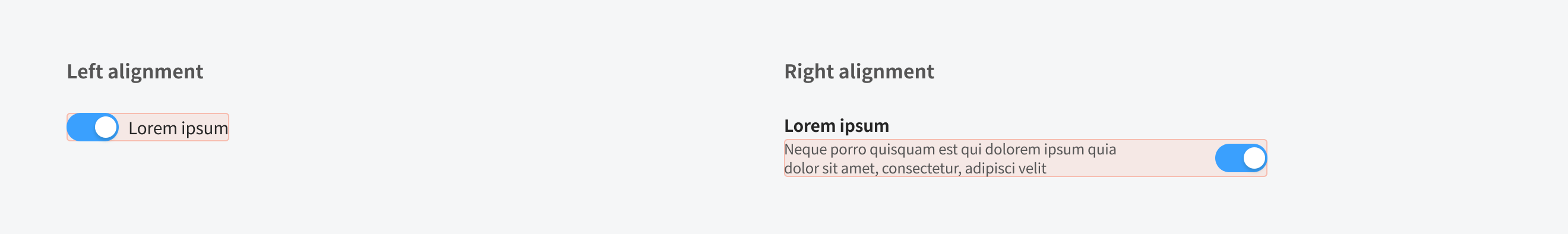
Left alignment
- Recommend to use when the switch label is short
Right alignment
- Recommend to use when it has a title and short description to provide further context or describe what actions to take below.
Content
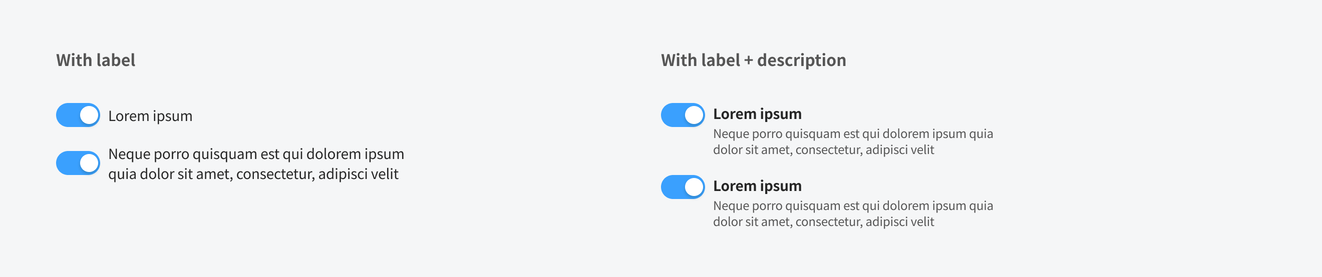
Title
- In most cases, the title provides further context or describes what the switch performs.
- In some cases, a group of switch buttons may be within a larger group of components that already have a group title. In this case, the title is not needed. Switch label
- To describe the binary action of switch so that the action is clear.
- The label is displayed on the side of switch.
Usage Guidelines
When to use
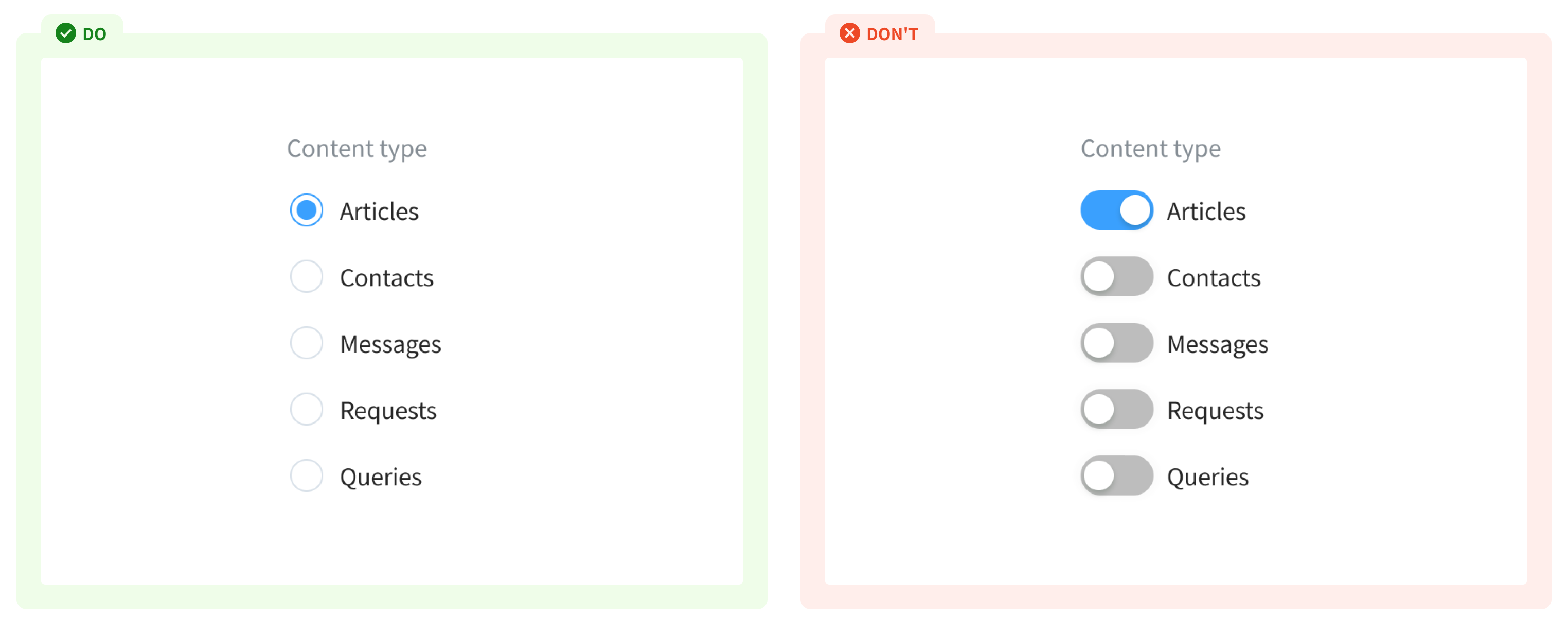
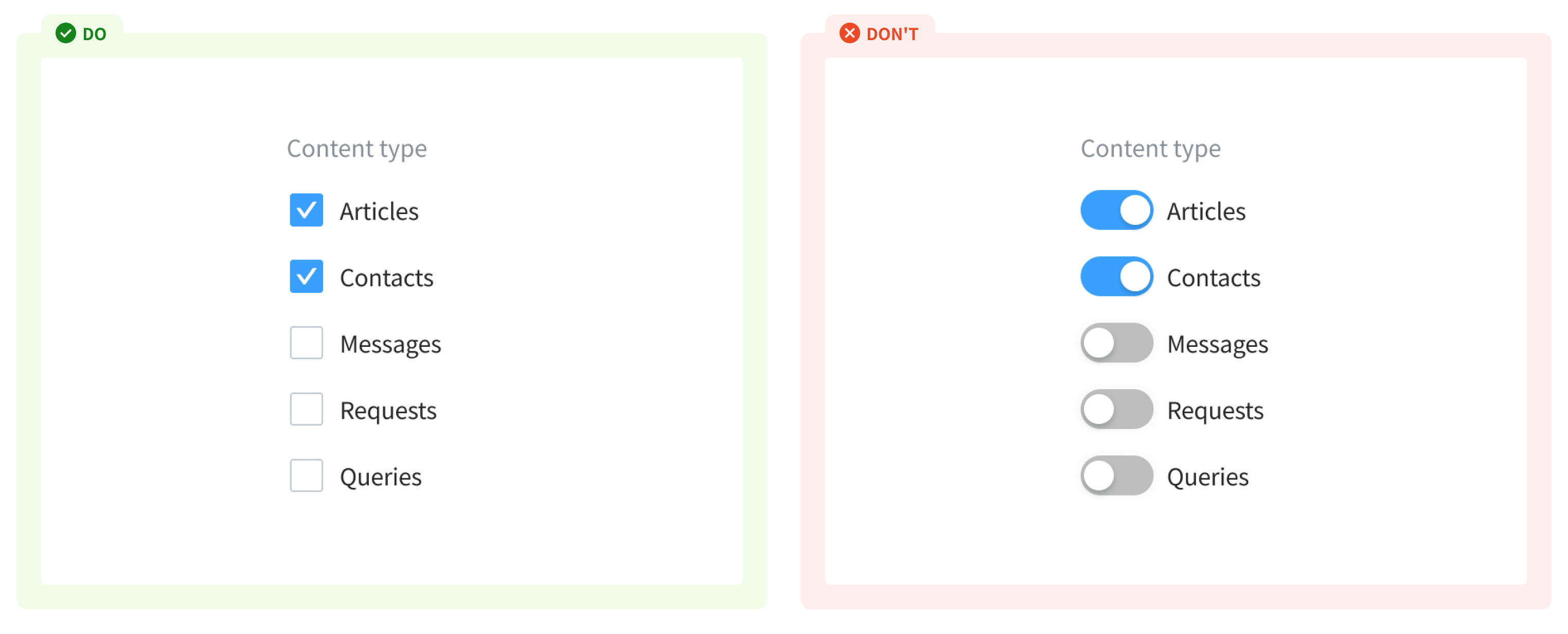
- To enable users to change a single setting to be on/off, or between two opposing states
- For changes that have an instant response (such as disabling a form field).
When not to use
- If user has to select option(s) from a list of related items - use checkbox or radio button (if user can select 1 option only)
References
Ant design - Switch Doctolib - Toggle Carbon design system - Toggle Material - Switches