Grids & Layouts
Overview
Grid and layout styles create visual consistency and balance across display sizes and product features.
Use defined layout styles for all display sizes to create visual consistency and balance across our products. Be careful to not deviate from established spacing and layout patterns.
The base
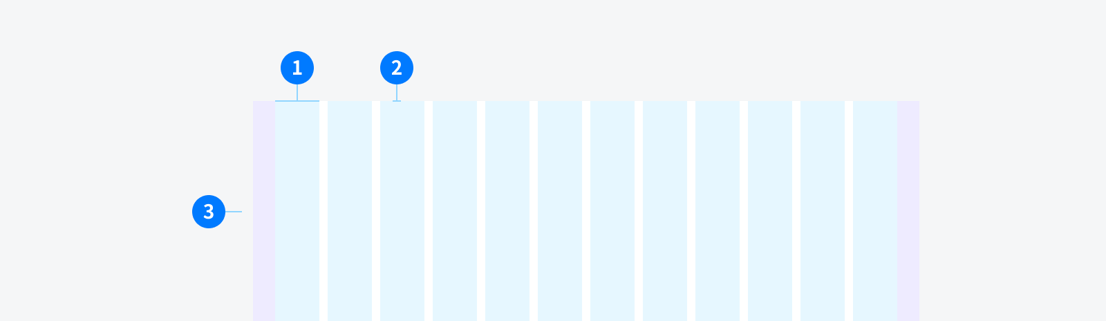
Apply Ant Design 24 Grids system
-
The column grid system is a value of 1-24 to represent its range spans. For example, three columns of equal width can be created by
<Col span={8} />. -
If the sum of
colspans in aroware more than 24, then the overflowingcolas a whole will start a new line arrangement. -
Utilize Flex layout to allow the elements within the parent to be aligned horizontally - left, center, right, wide arrangement, and decentralized arrangement. The Grid system also supports vertical alignment - top aligned, vertically centered, bottom-aligned.
About Grid
To learn more about the concept, read Basic Grid and CSS Flex.
-
Width
-
Gutter
-
Margin
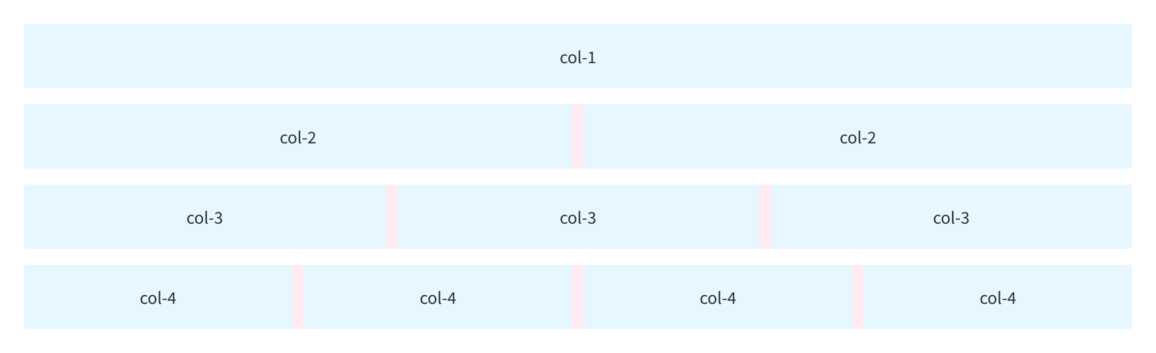
Basic grid
From the stack to the horizontal arrangement.
You can create a basic grid system by using a single set of Row and Col grid assembly, all of the columns must be placed in row.
Responsive
In current version 2.0, the Dashboard can support to Tablet size (768px). Smaller than this screen size, weirdness can be expected.
Usage Guidelines
List view
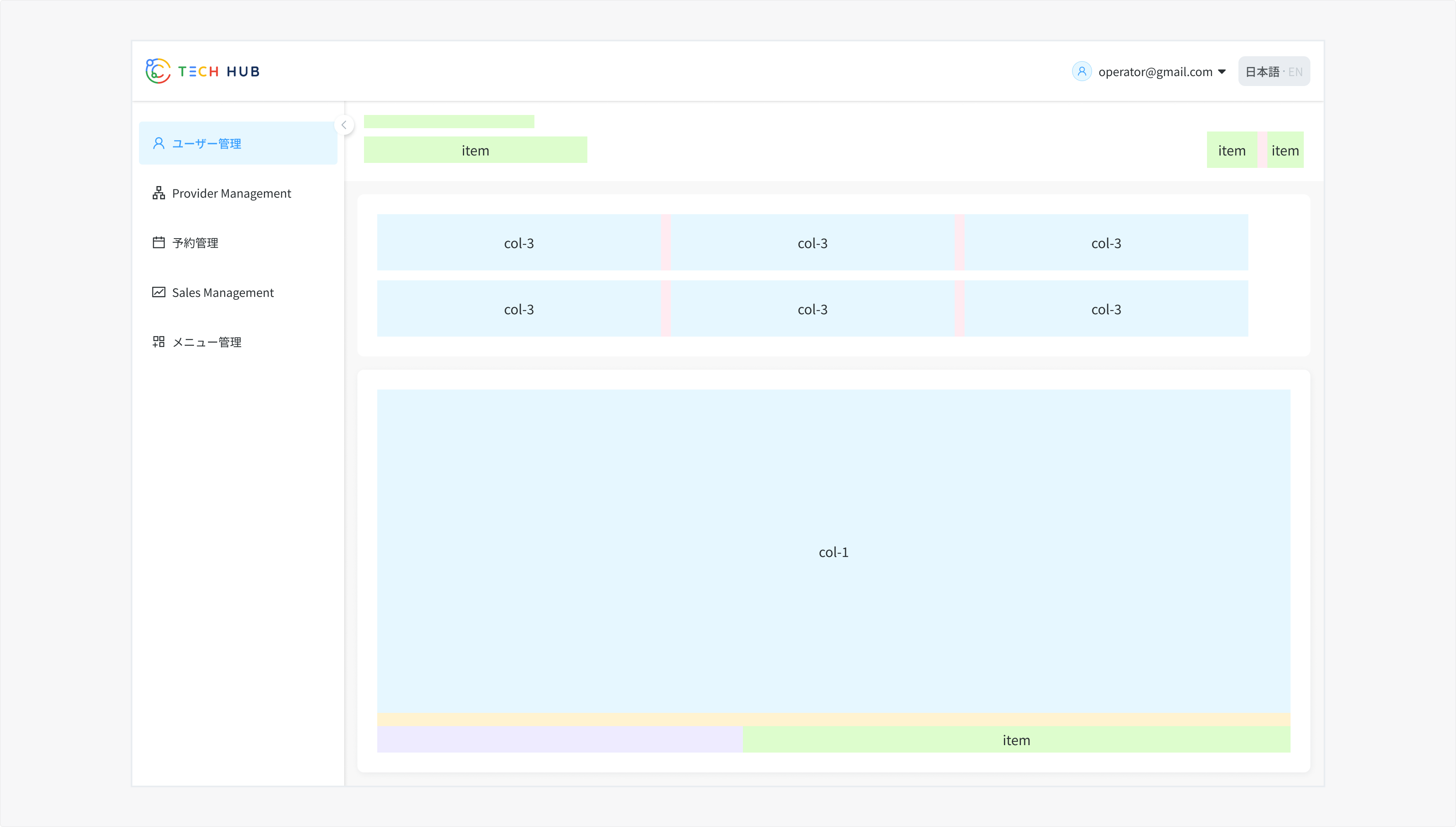
- Usually seen in Management pages: Booking, Provider, Sales Mananagement
Detail view
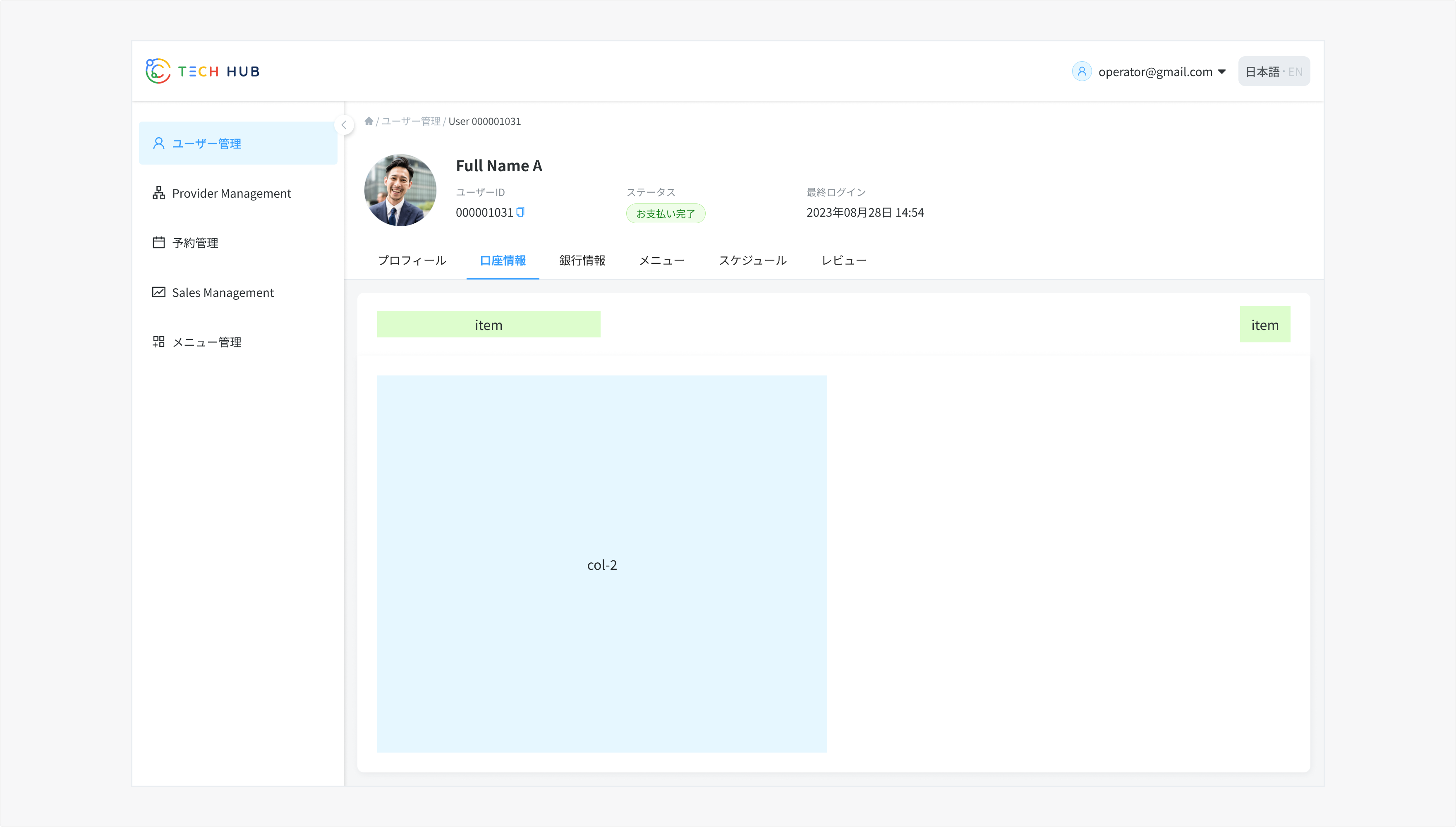
- Usually seen in Detail pages.
Edit view
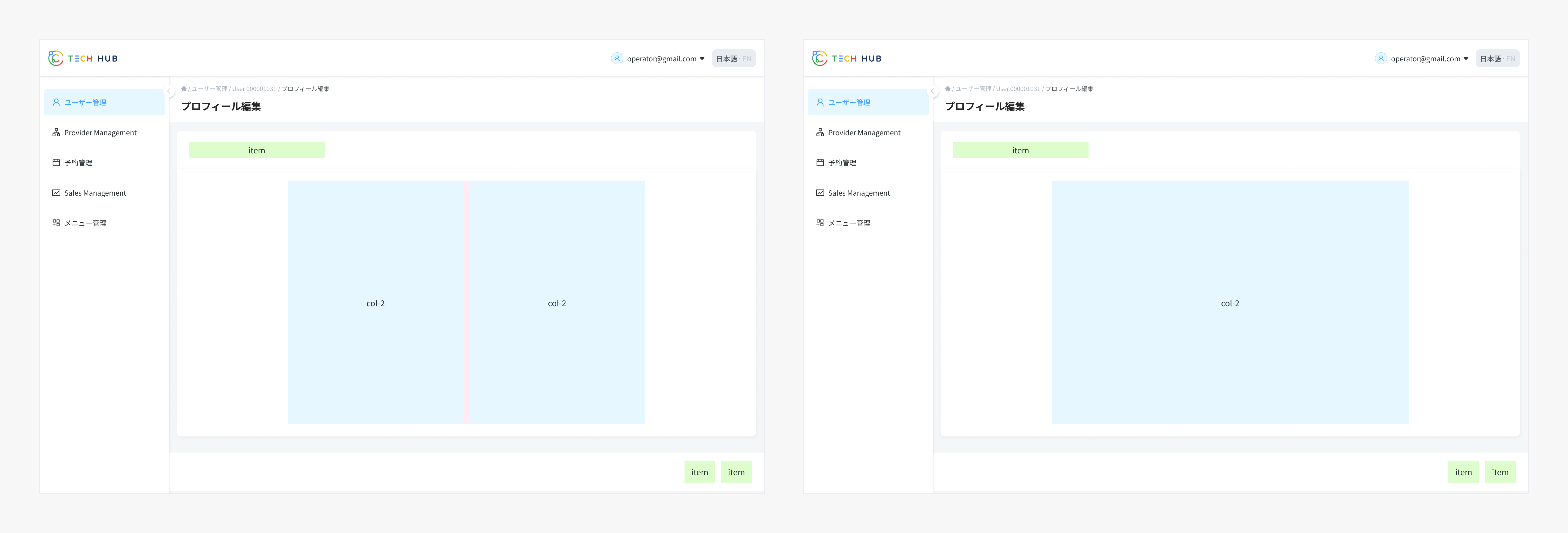
- Usually seen in Edit pages, depending on the number of fields: 2-column or 1-column layout can be applied.
References
Ant Design - Grid CSS Tricks - A Guide to Flexbox Nebula Design System - Grids and Layouts