Button
Overview
Buttons allow users to take actions, and make choices, with a single click.
Anatomy

- Icon (Optional)
- Text label
- Container
Types
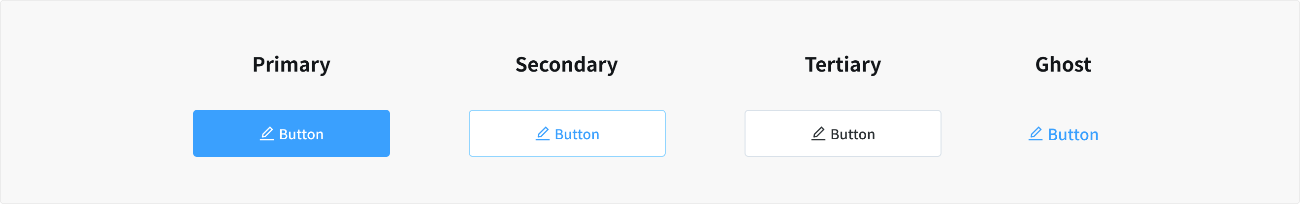
Primary button
- Indicate the main action with high-emphasis, distinguished by their use of elevation and fill
- Should only appear once per screen (not including the application header, modal dialog, or side panel)
Secondary button
- Indicate a series of actions with medium-emphasis
- Used in conjunction with a primary button to perform the negative action of the set (such as “Cancel” or “Back”)
- When there are multiple primary actions of the same importance in the same view
Tertiary button
- Indicate a series of actions with low-emphasis
- Used in isolation or conjunction with a primary button when there are multiple CTA
- Used for sub-tasks on a page where a primary button for the main and final action is present
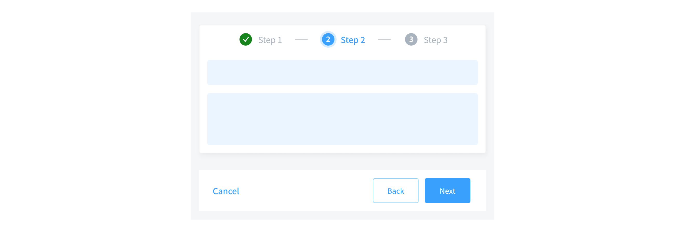
Ghost button
- Indicate the least priority actions
- Often used in conjunction with a primary button, such as a progress flow
- Where the Primary button is for “Next" action, the secondary button is for “Back”, and the ghost button is for “Cancel”.
Size
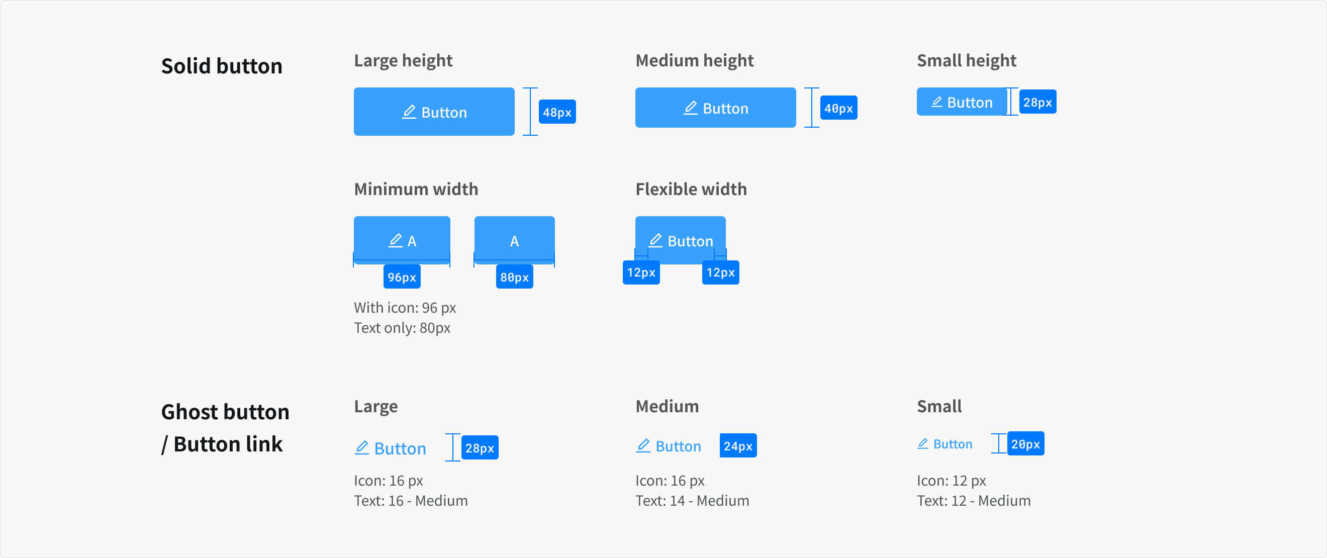
- Large: This is the most common button size
- Medium: Use when buttons are paired with input fields.
- Small: Use when there is not enough vertical space for the default or field-sized button.
States
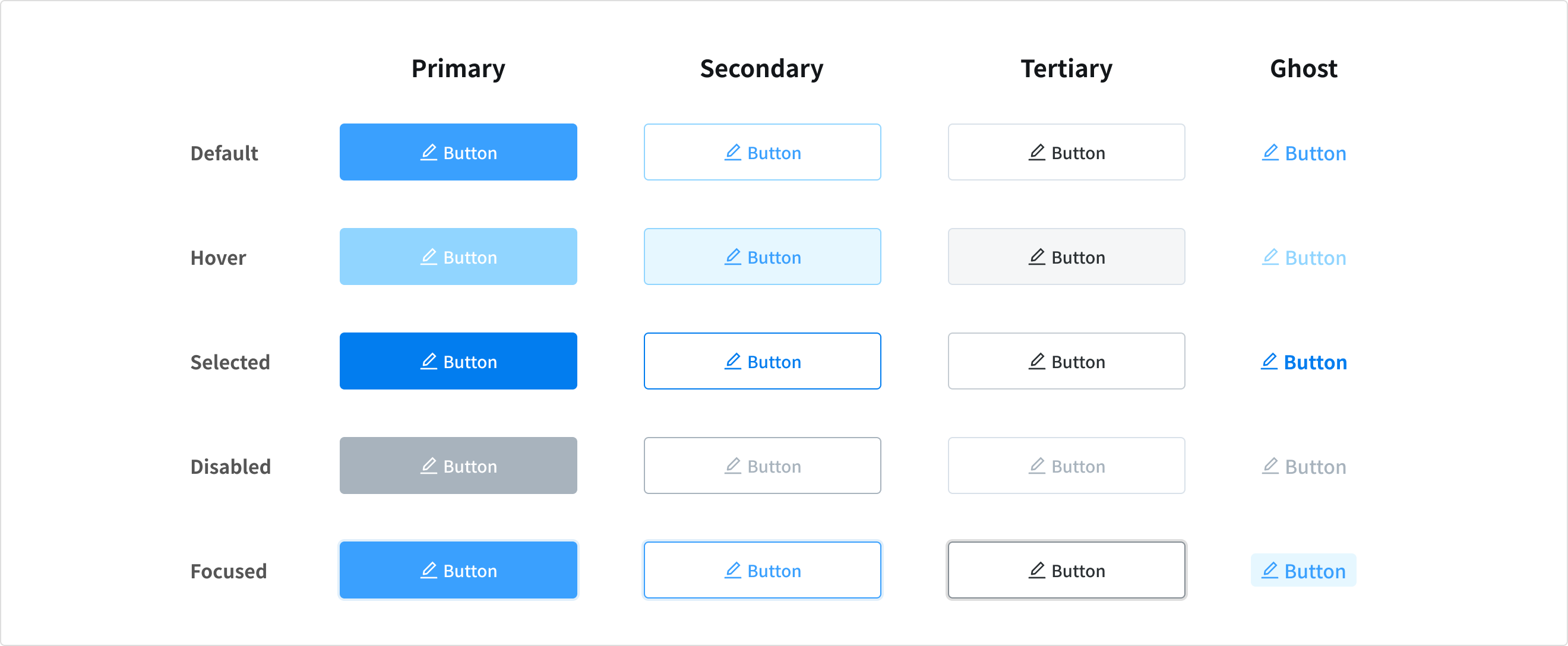
Default
- Normal state of the component, when button is enable but a user is not directly interacting with it (commonly referred to as the default or active).
Hover
- Hover state is initiated by the user pausing over a button using a cursor. It should be deemphasized to avoid distracting from content.
- This state is not available when button disabled
Selected
- Indicates that an action has just been performed. It should be receive medium emphasis so they are easily identifiable, but not distracting.
Disabled
- Indicates that an action is not currently available, though may be available later.
- Another action has to be completed before the button is enabled.
Focused
- Indicates that an action is highlighted or encouraged for users to take
- Focus state can be signified by an overlay. It can be applied to an entire component, elements within a component, or as a circular shape covering part of a component.
Content
Text label
- Button's label needs to be clear and predictable
- To provide enough context, use the [verb] + [noun] content formula on buttons (except in the case of common actions like “Done”, “Close”, “Cancel”, “Add”, or “Delete”)
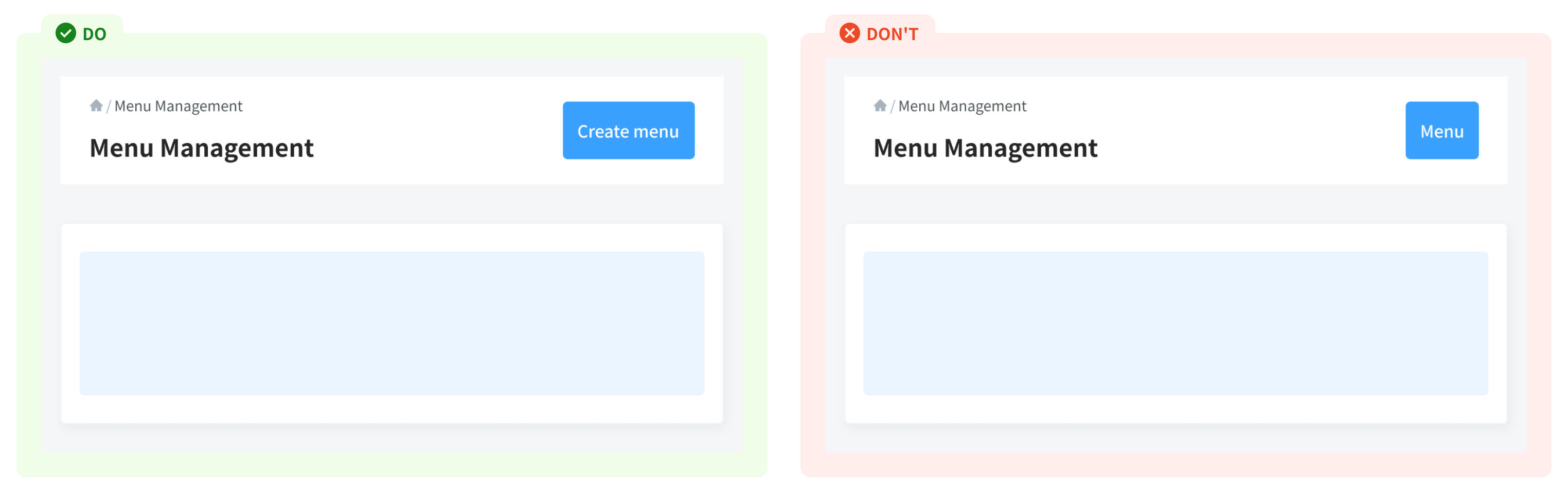
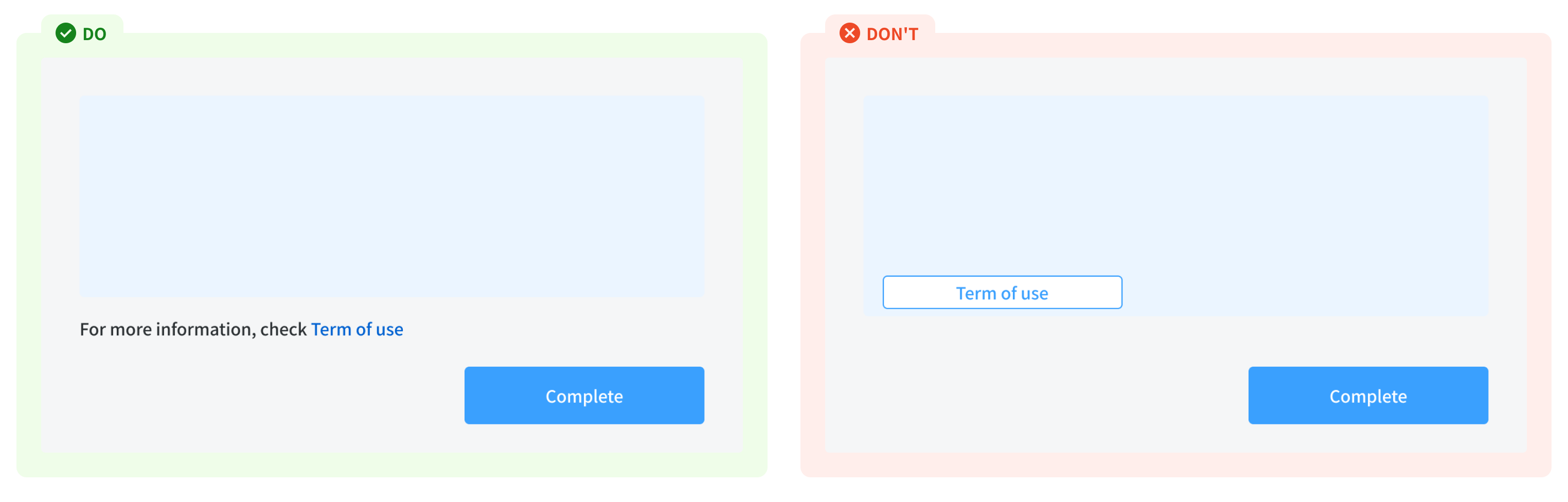
- Avoid long explanations in label text, it’s should be short and clear. If additional explanation is needed, add it above the button as text.
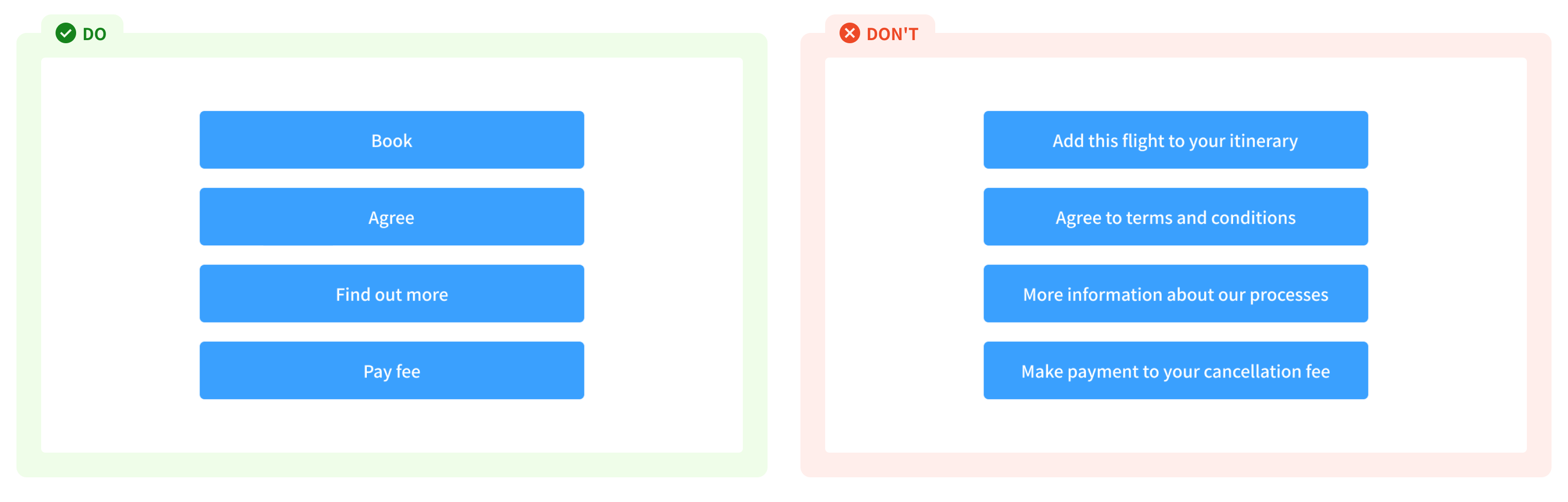
- For maximum legibility, a text label should remain on a single line. Keep content as concise as possible (refer to content guidelines or contact the Project’s JP director).
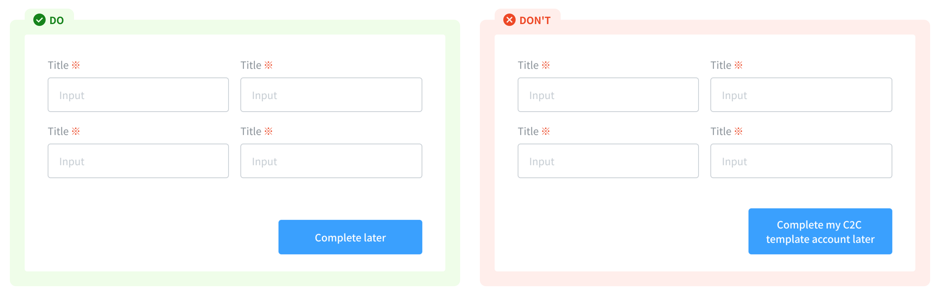
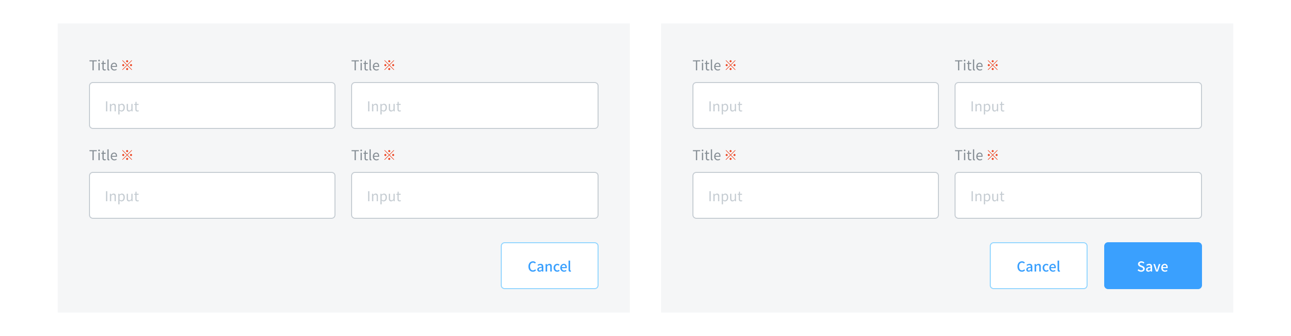
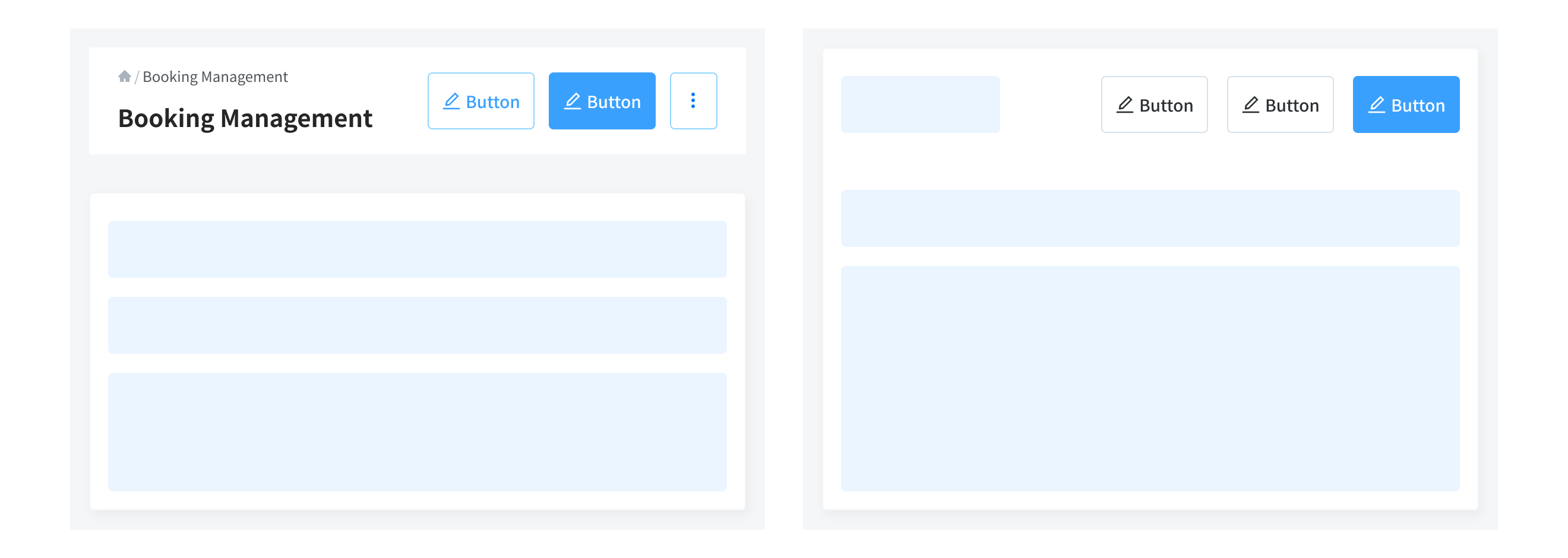
- Have only one primary action in the layout, as the high emphasis button aims to perform the most important action of the page or section - combine it with lower emphasis button's variant.
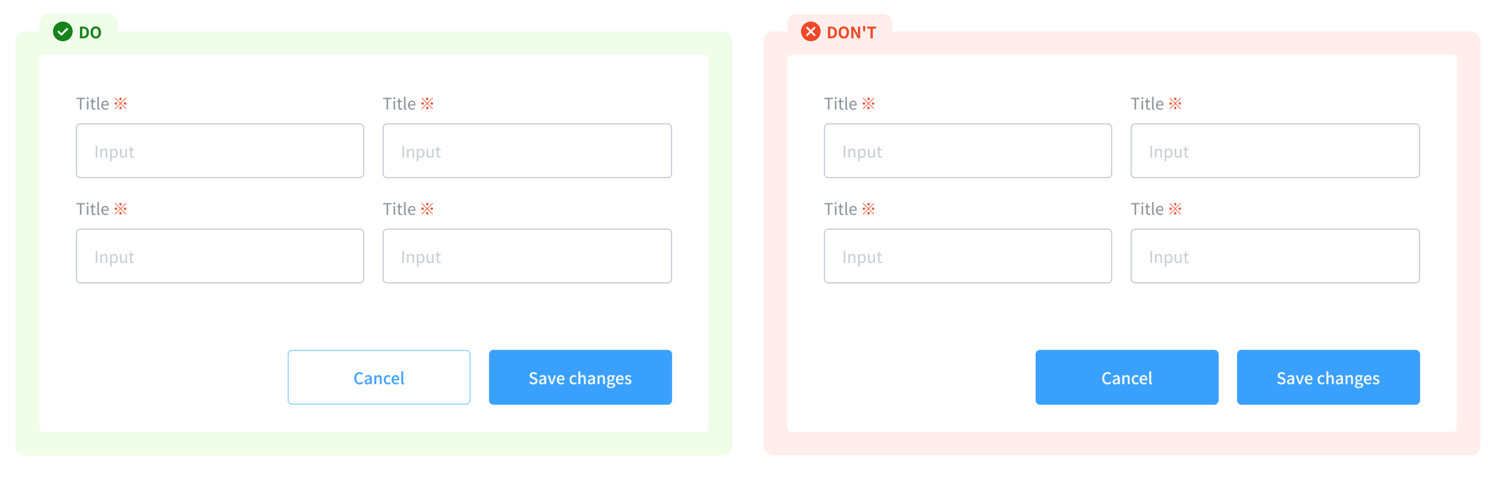
- When placing buttons side-by-side, place the button with more importance in the task on the right. Make sure the style of buttons is consistent in a combo buttons
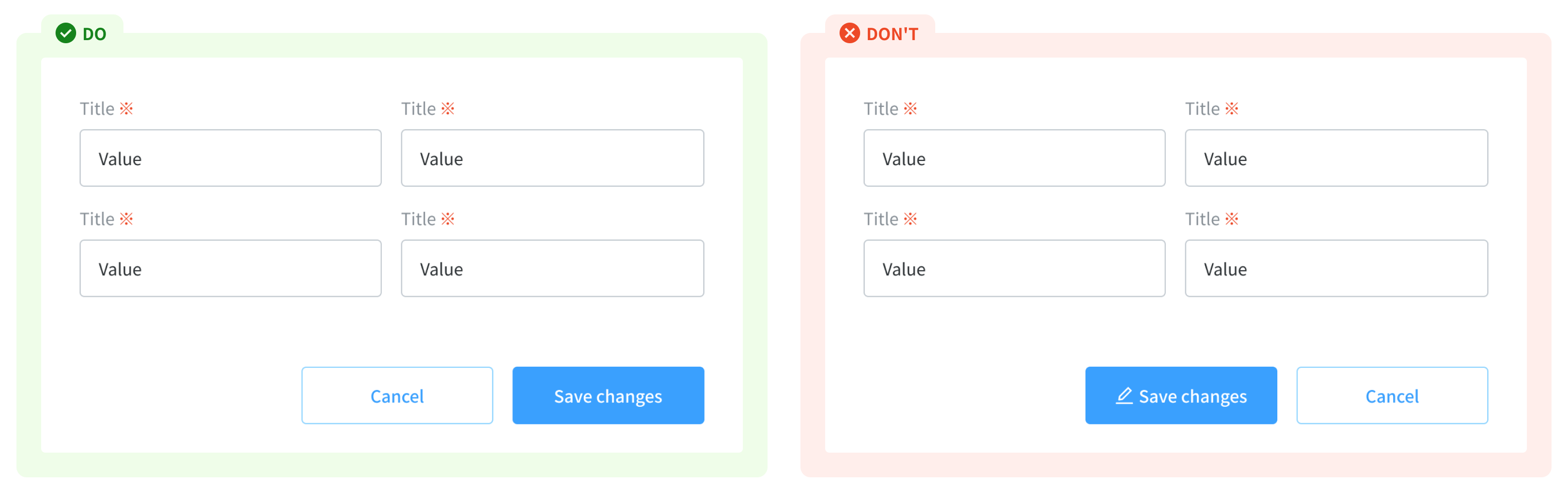
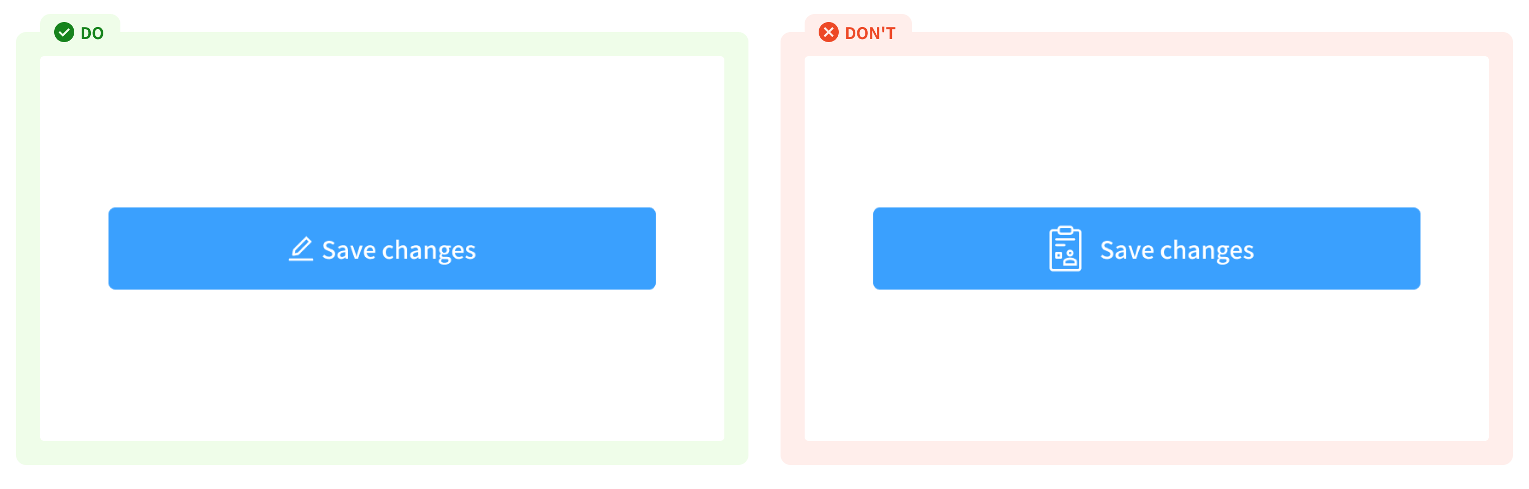
Icon
- Icons add additional context and makes the buttons more easy to scan.
- But it’s essential to not overuse these buttons, using simple iconography and convey correct meaning of the action.
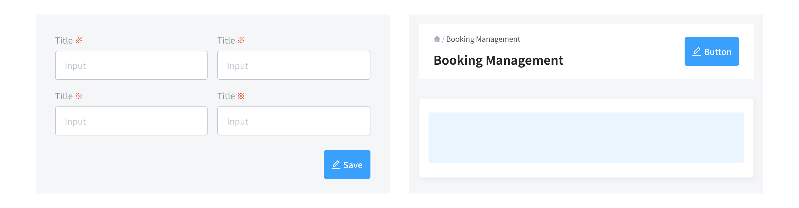
Usage Guidelines
When to use
- To communicate actions users can take and to allow users to interact with the page.
- Each page should have only one primary button, and any remaining calls to action should be represented as lower emphasis buttons.
When not to use
- If you want to navigate user to a new (external) page - use textlinks
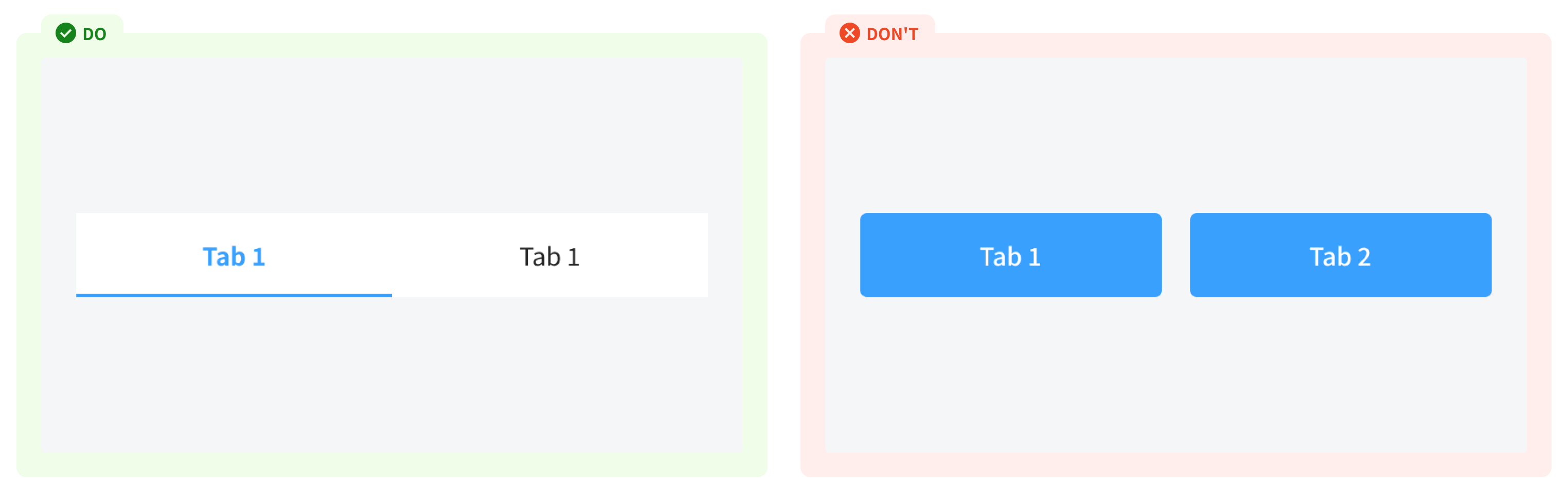
- If you want to switch between views and sort content in dedicated areas with the same level of hierarchy - use tabs
References
Ant design - Button Doctolib - ButtonOrbit - Button
Carbon design system - Button
Material - States