Search and Filter Input
Overview
The Search and Filter Input component provides users with various ways to refine their search results, ensuring they can quickly find the information they need.
Types
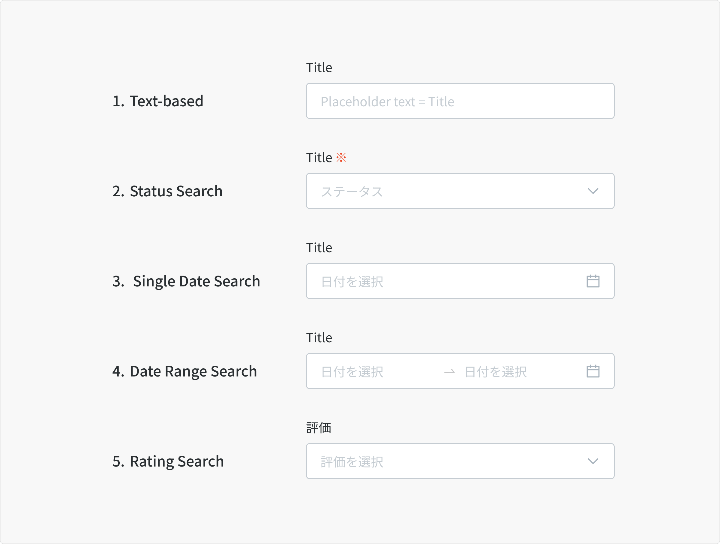
1. Text-based Search
Users can search for content by entering keywords or phrases in the search input.
2. Status Search
Users can filter the results by the status of the item (e.g., pending, approved, rejected).
3. Single Date Search
Users can search for content based on a specific date.
4. Date Range Search
Users can filter the results by specifying a date range.
5. Rating Search
User can filter the results by single / multiple rating levels.
Size
All of Search Filter input use input field size S - 40px.
Text-based Search
Anatomy
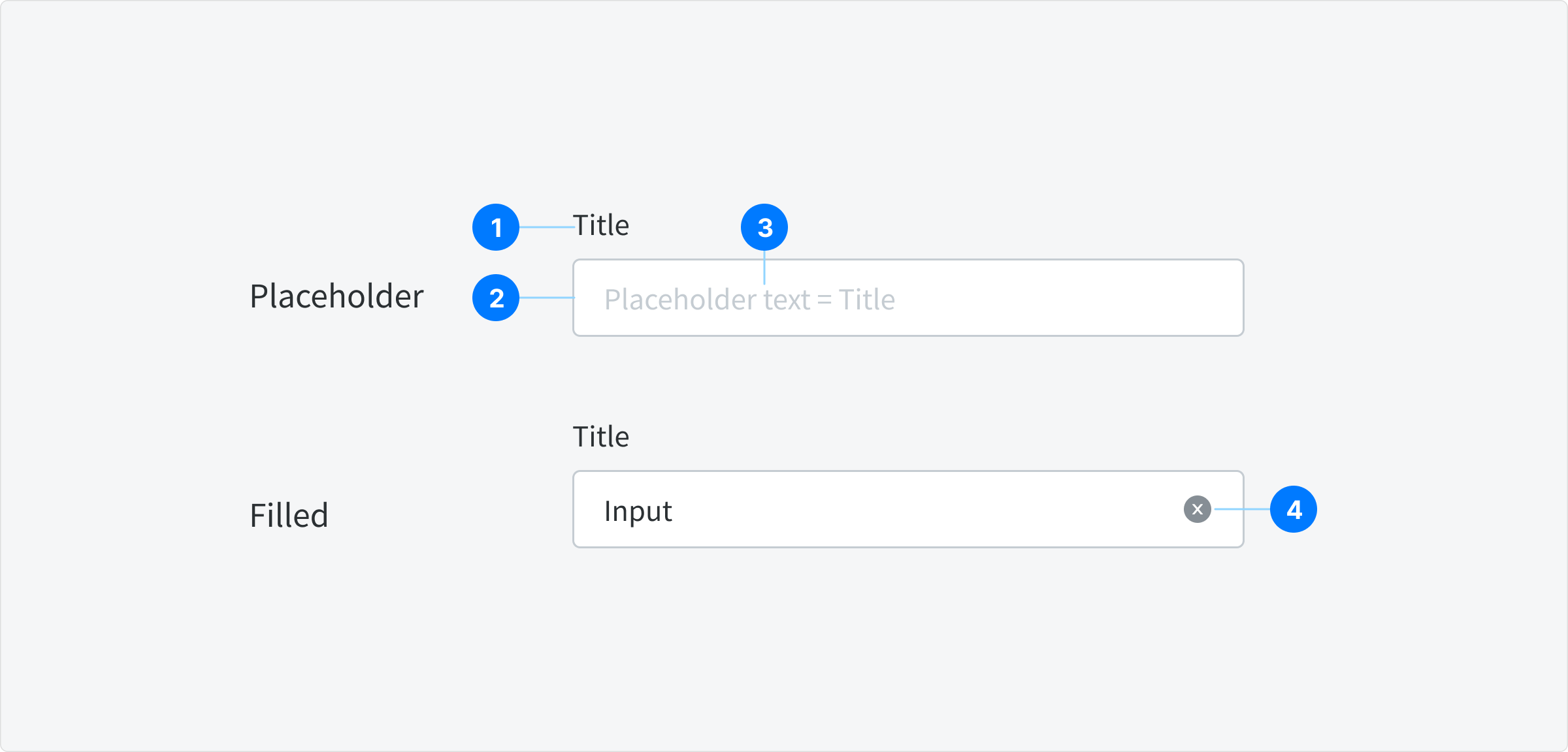
- Title
- Input Container
- Placeholder text
- Button Clear
State
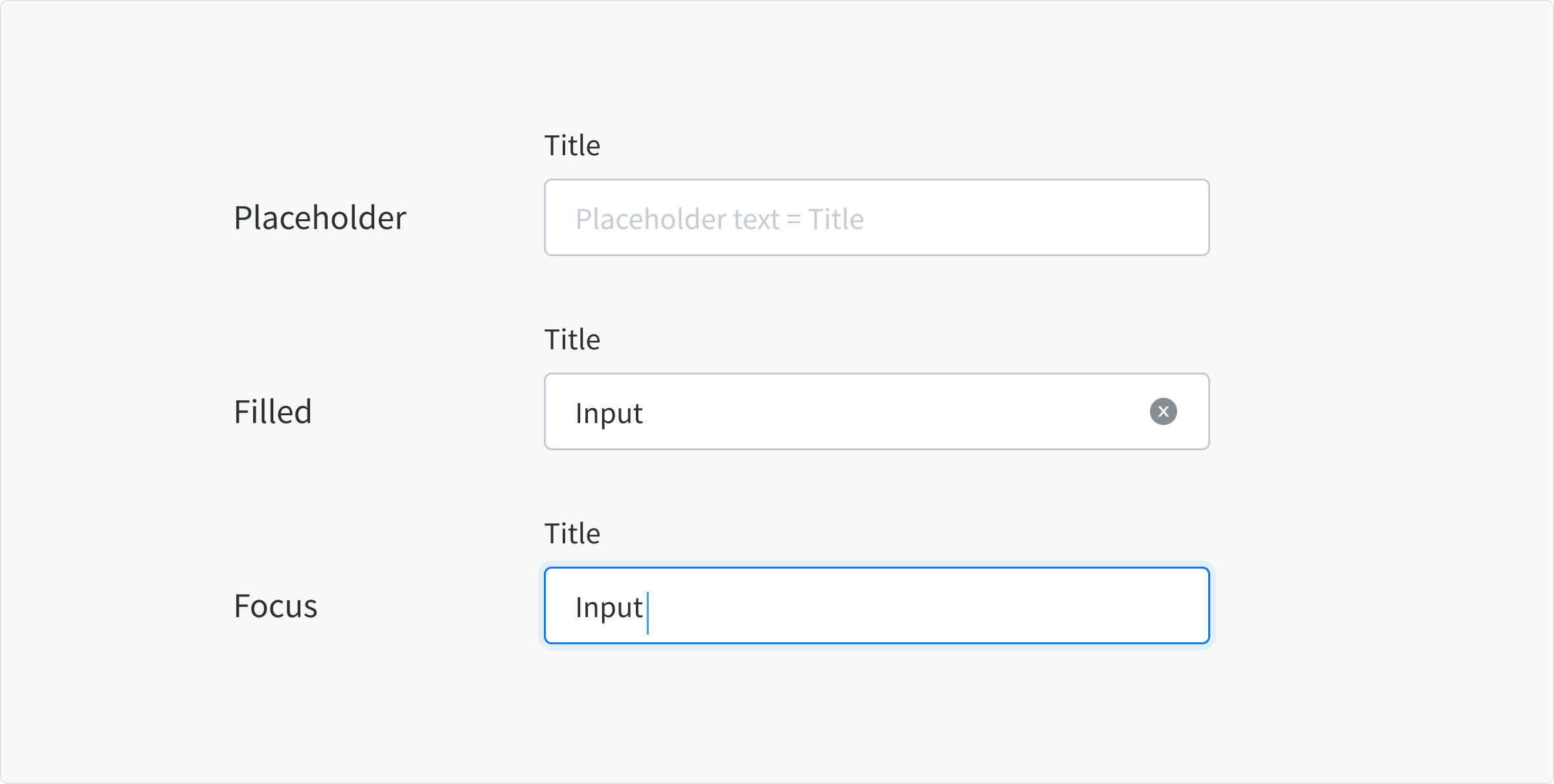
Placeholder
- When a input is live and user is not directly interacting with it.
- Single text-based search: display placeholder text same as title.
- Combined text-based search: display sample input, e.g. Search field in Coupon list use "(例) NEW12", in which NEW12 is a sample coupon code.
Filled
- When a user has typed content into the field.
Focus
- When a user clicks on the text input or text area
- When a user is actively typing content into the field
Error
- Don't check error for search input fields
- This state is hidden from UI
Status Search
Anatomy
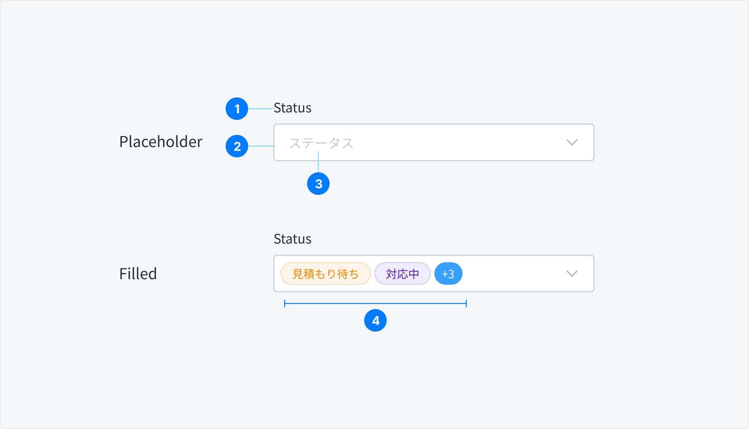
- Title
- Input Container
- Placeholder Text
- Status
State
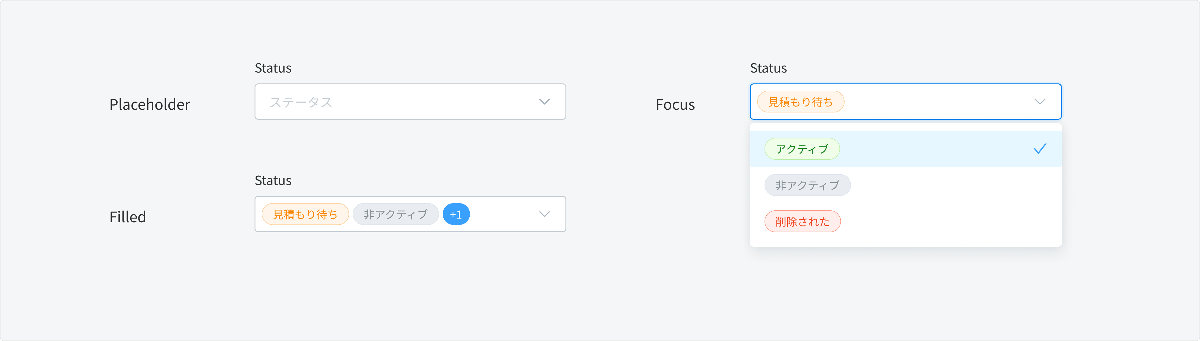
Placeholder
- When a input is live and user is not directly interacting with it.
- Placeholder text: always use text Select status for all status type
Filled
- Selected status tag is displayed in input container.
- Display order: by display order in dropdown menu.
- Truncation: if selected tags are longer than container width, display only 1-3 first statuses, the remaining ones will show up as
+Xtag.
Focus
- When the input is clicked, user can see a dropdown menu displaying all statuses
Error
- Don't check error for search input fields
- This state is hidden from UI
Behavior
- Dropdown Status: Clicking on a date opens the status list, showing statuses as tags.
- Default Behavior: When no status is selected, items with any status will be displayed.
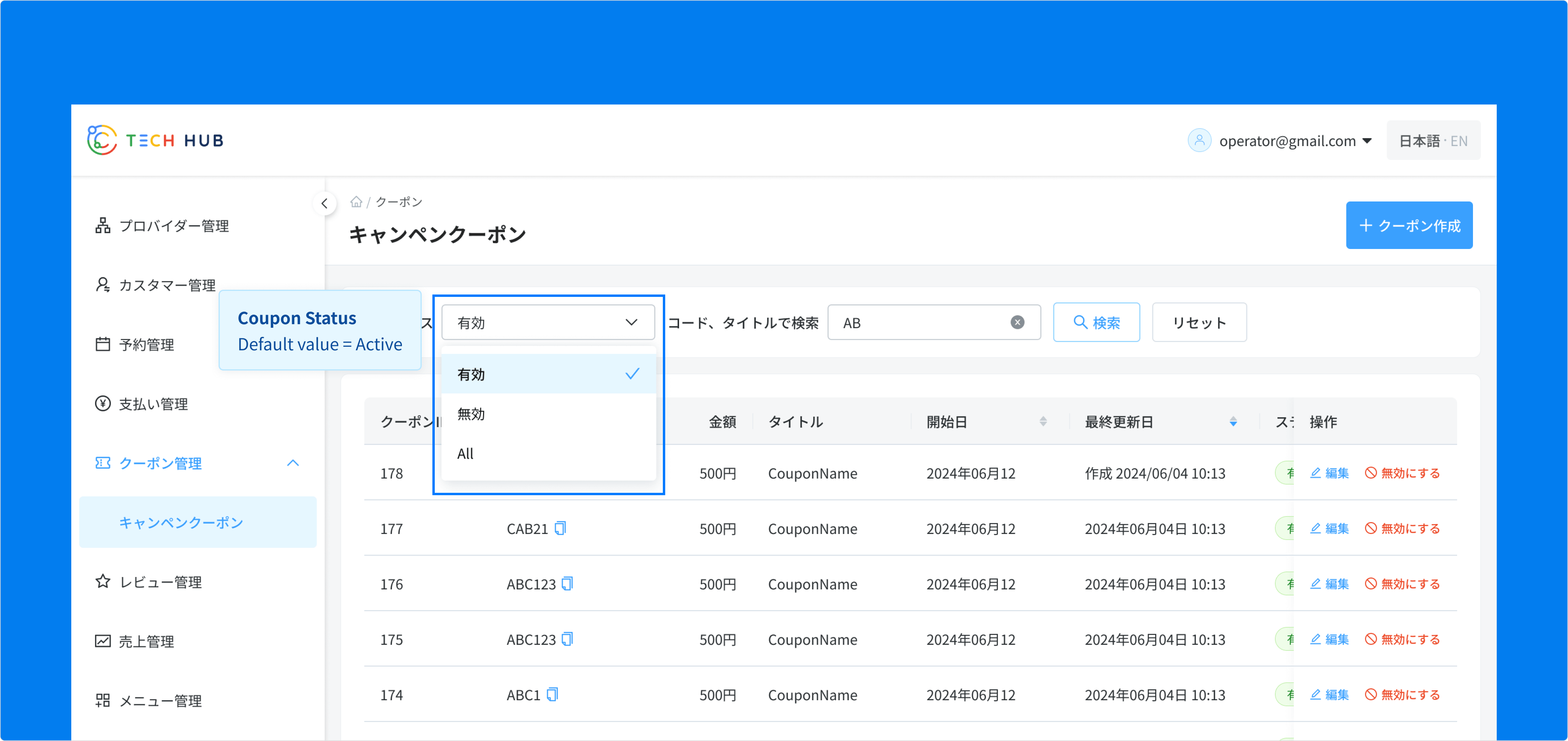
Special Case: Status Search in Coupon Management In the Campaign Coupon Management feature, only Active coupons will be shown.
- Users can choose to view Disabled coupons or all coupons using this Status search.
- A regular select dropdown will be used for this option.
Single Date Search & Date Range Search
Anatomy
Similar to Date Picker: single date component. See more: Date Picker
State
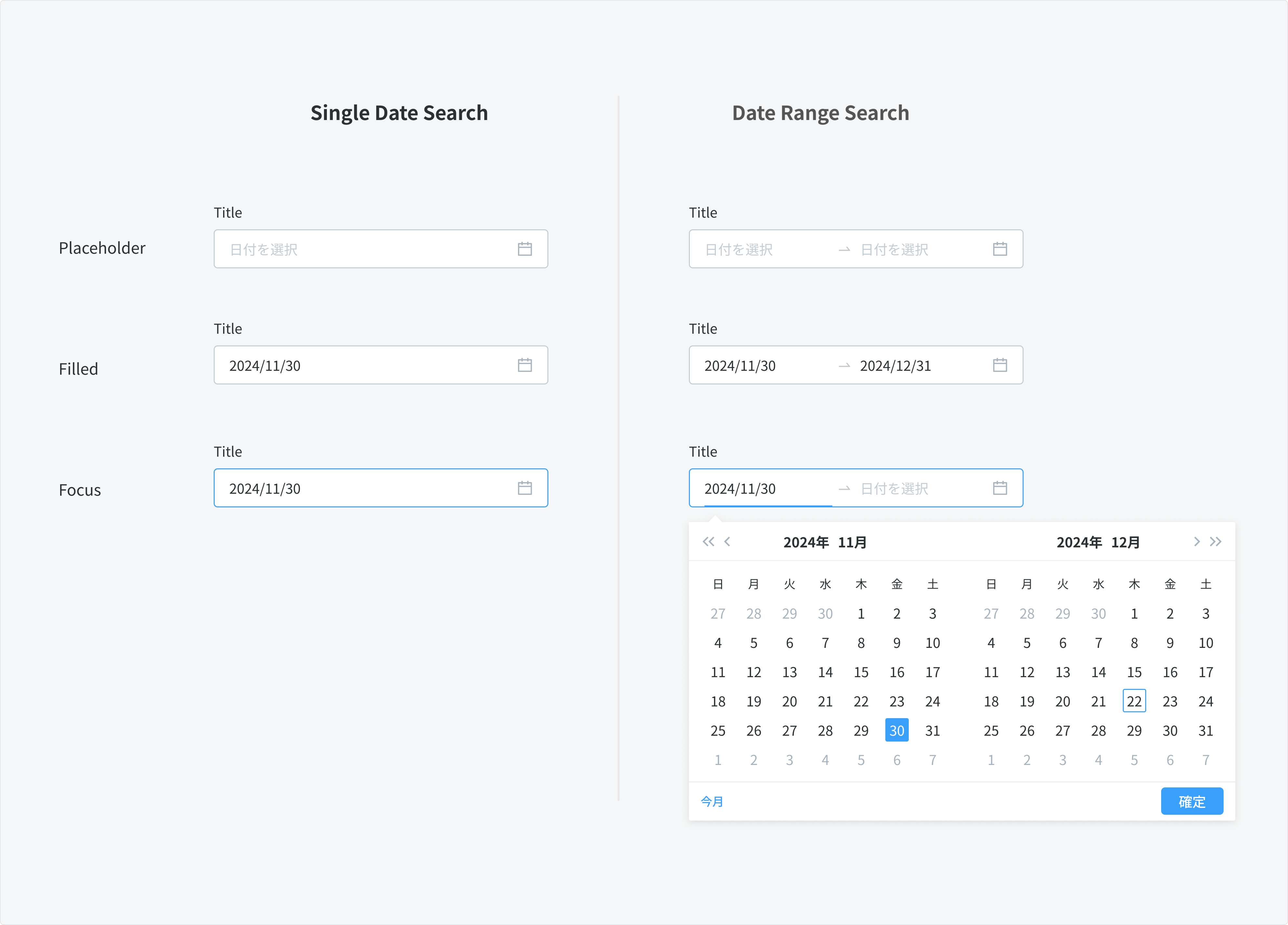
Placeholder
- When a input is live and user is not directly interacting with it.
- Placeholder text: always use text Select status for all status type
Filled
- When user select a date.
- Format: use "YYYY/MM/DD" or "YYYY/MM" (for fixed date range like Payout period)
Focus
- When the input is clicked, user can see a dropdown menu displaying all statuses
Error
- Don't check error for search input fields
- This state is hidden from UI
Behavior
- Default state: Initially, Single Date Search and Date Range Search will have no values input. Users can select a start date and an end date to filter results based on their desired range.
- Calendar Interaction: Clicking on a date will open the calendar, with the current month displayed first on the left.
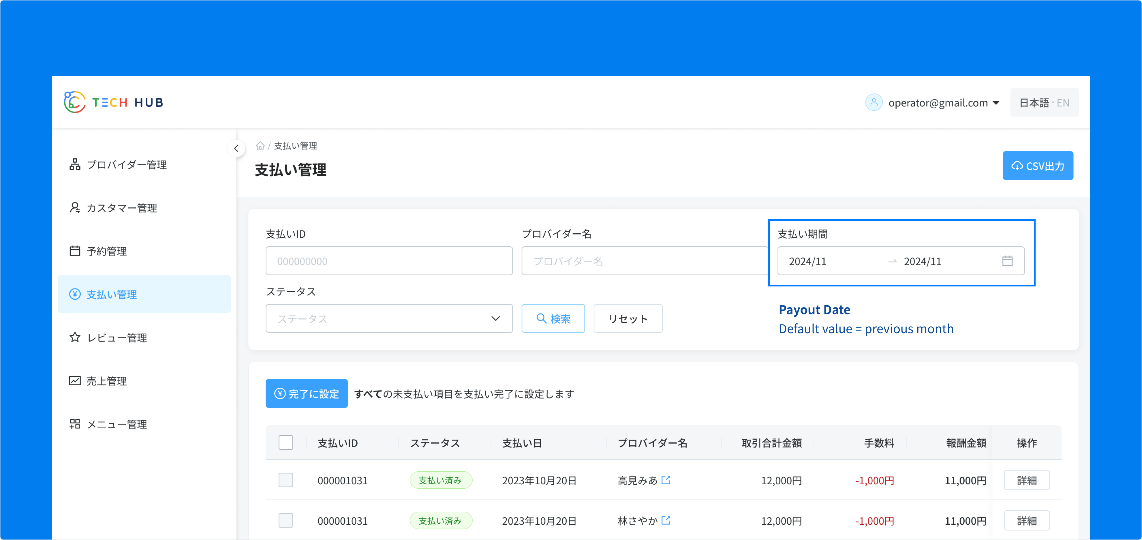
Special Case: Date Range Search in Payout Management In the Payout Management feature, the Payout Date Search will default to the previous month. This design choice helps users quickly view their most recent payout period details and efficiently narrow down the number of related payments displayed at once.
Rating Search
Anatomy
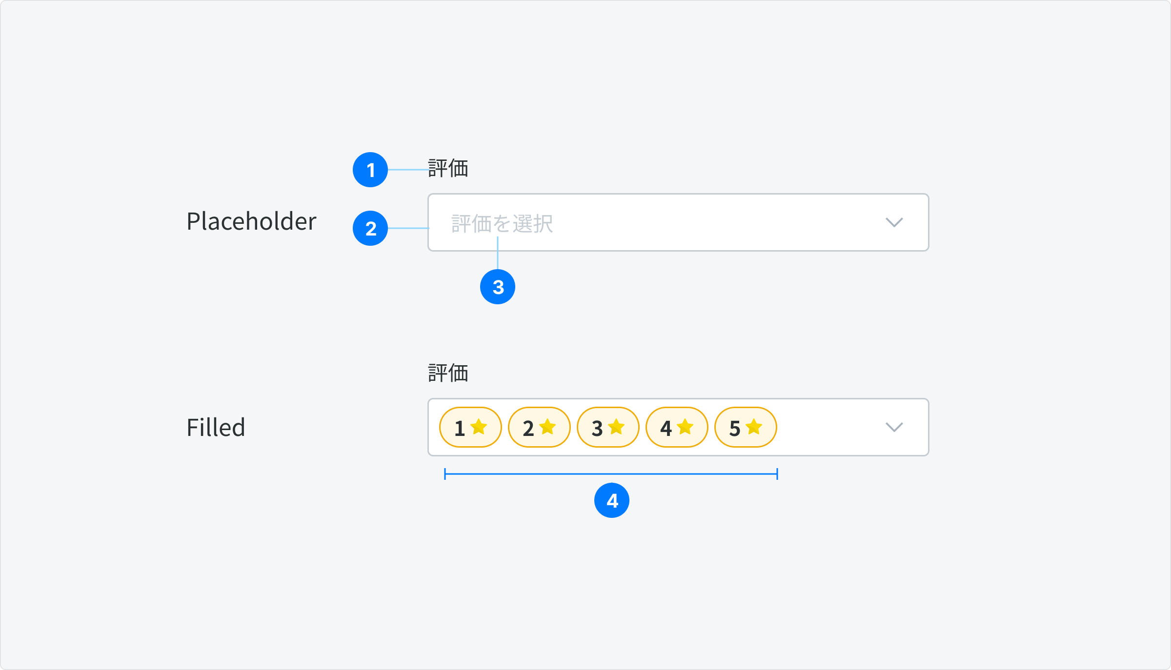
- Title
- Input Container
- Button Clear
- Rating Tag
State
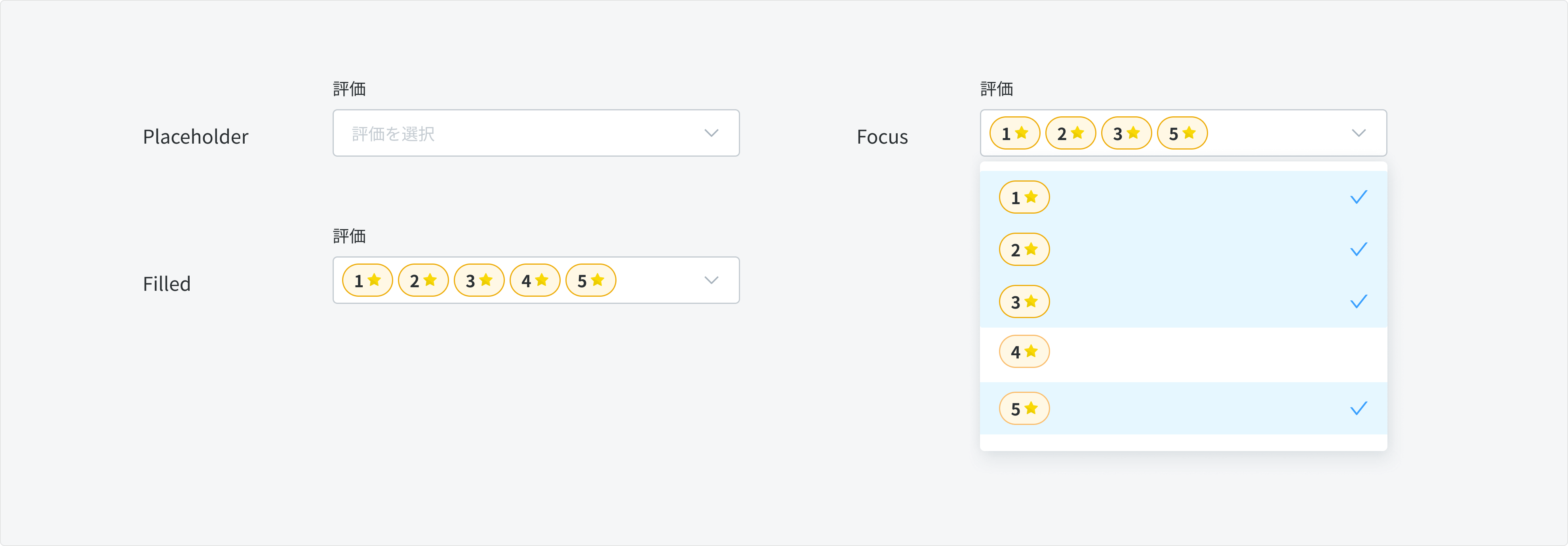
Similar to Status Search.
Behavior
- Default state: Initially, the Rating Search will have no values input. Users can one or multiple ratings to filter the result
- Select no ratings = View all reviews
Content
Title
- Use the same text as the table header to minimize recognition time and enhance user familiarity.
Placeholder text
- Text-based Search: Use the same text as the title to provide consistency and guidance for users.
- Date Search: Use unified text, such as "Select date" or "日付を選択," to provide clear instructions.
Input
- Text-based Search: Don't check error for maximum character input.
- Single Date Search & Date Range Search: use unified format "YYYY/MM/DD" or "YYYY/MM" to display date input.
Usage Guidelines
When to Use
- When users need to quickly find and access specific content within a large dataset.
- When the content or data being presented has multiple dimensions or attributes that users may want to filter by.
- When the application has a significant amount of content that can benefit from advanced search and filtering capabilities.
When Not to Use
- In situations where the dataset is relatively small, and simple sorting or pagination may be sufficient.
- When the search and filter functionality would add unnecessary complexity to the user experience.