Image Uploader
Overview
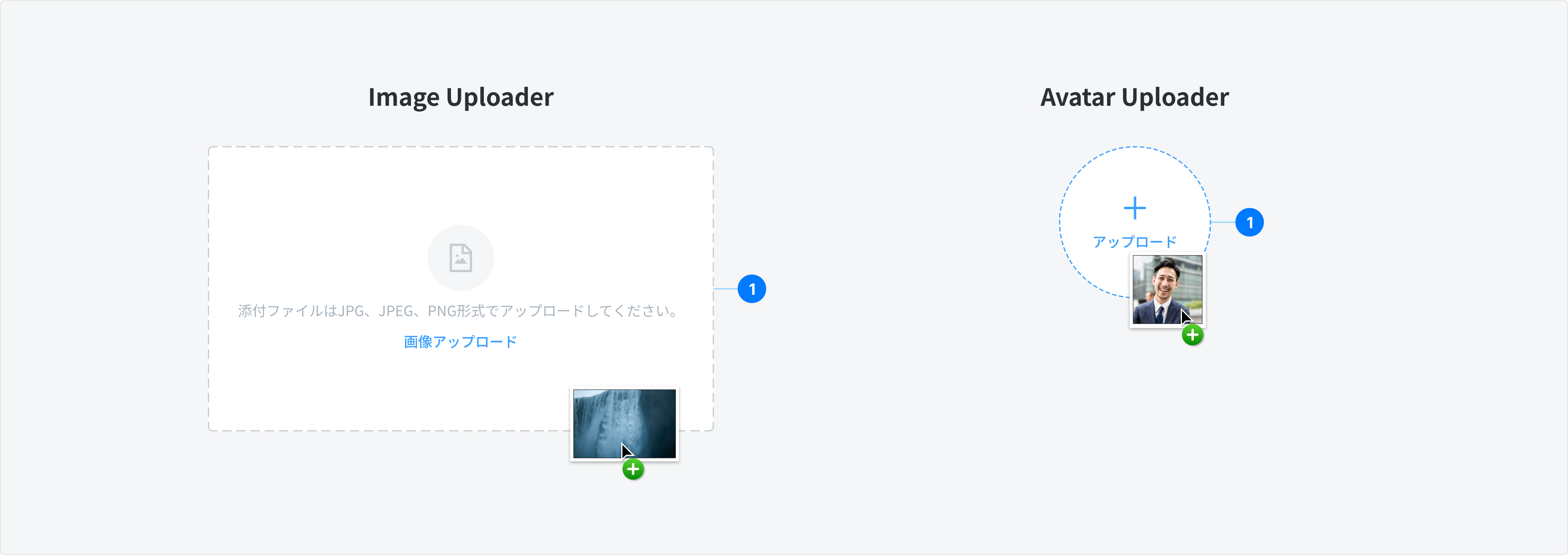
Image Uploader allows users to upload avatar, banner, product image, menu image…commonly found in forms, but can also live as a standalone element. There are 2 types of Image uploader: Avatar Uploader and Image Uploader
Avatar Uploader
Avatar Uploader allows users to upload a small, typically circular or square image that represents a user's identity or profile.
Anatomy
- Container: The main area where users interact with the uploader.
- Icon: “Add” Icon indicates upload action.
- Label: Action name. EN: “Upload”, JPN: アップロード ,
- Uploaded Image: After successfully uploaded, the image will be placed in the container.
- Action Group: Follow the default action of Ant Design. Include:
- View: Open image in a new tab to view at 100% size
- Delete: Remove the image, change the component back to Placeholder state
- Error: This state indicates a problem that requires user attention before data can be submitted or saved.
Types
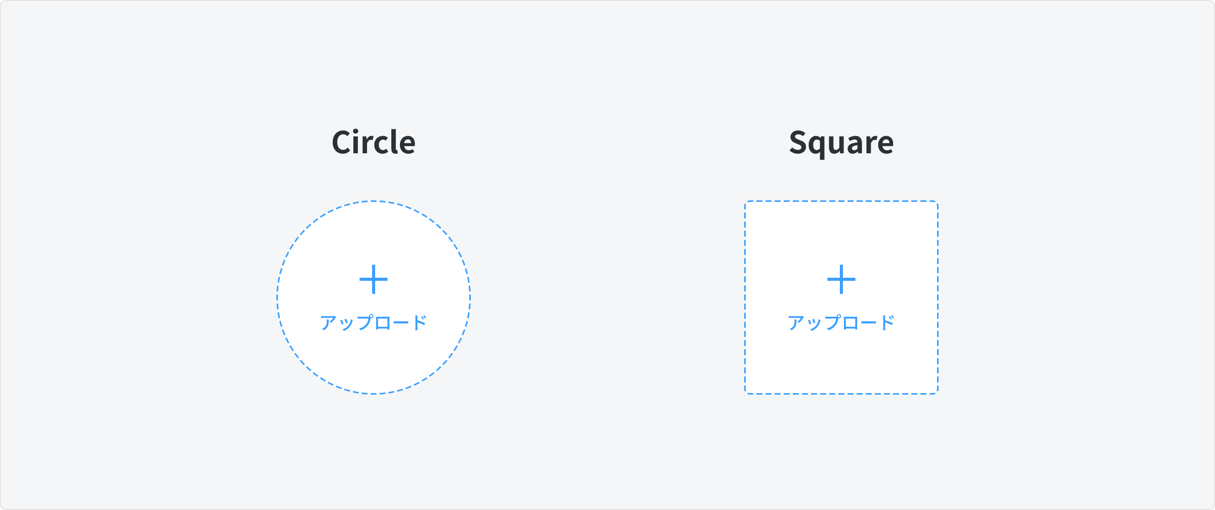
There are 2 types of Avatar Uploader:
- Circle: Represent individual people.
- Square: Represent non-human entities, such as bots, teams, or organizations.
States
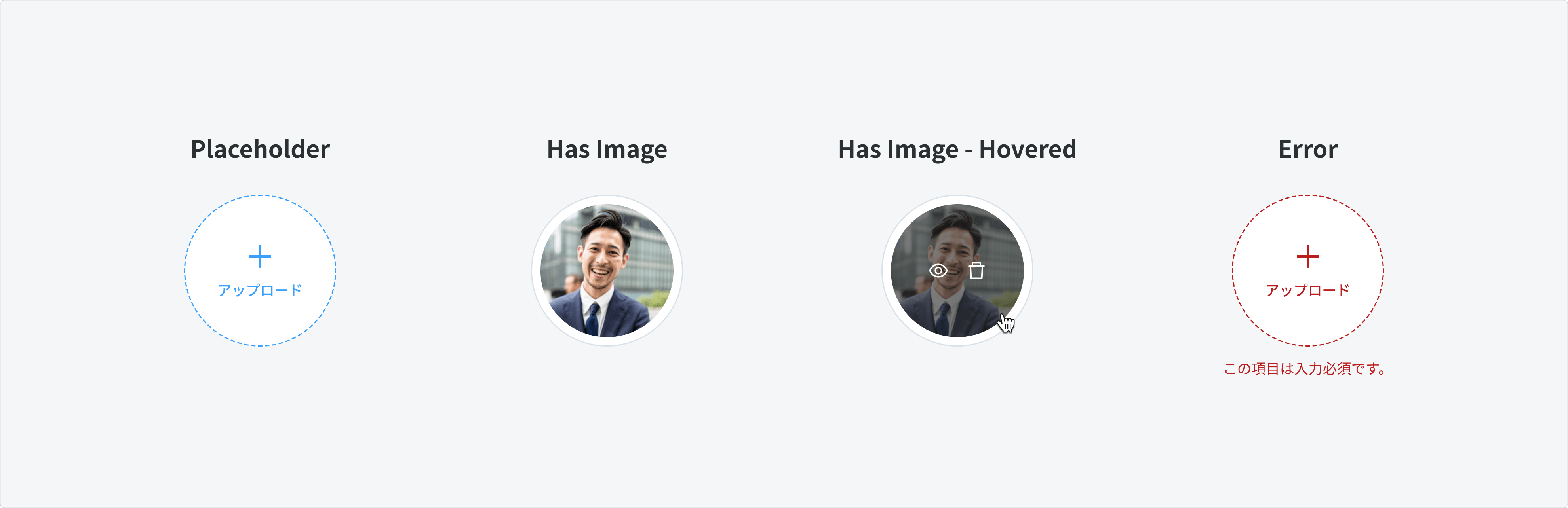
Placeholder
- When the user is not interacting with the avatar uploader, the default placeholder state should be shown.
Has Image (Uploaded)
- Follow the default action group behavior of Ant Design.
- Include the action group (View and Delete) when hovering over the image
- Preview: Open the image in a new tab to view it at 100% size.
- Delete: Remove the uploaded image and revert the component back to the placeholder state.
Error
- This state indicates a problem that requires the user's attention before data can be submitted or saved. An appropriate error message should be displayed to guide the user on how to resolve the issue.
Size
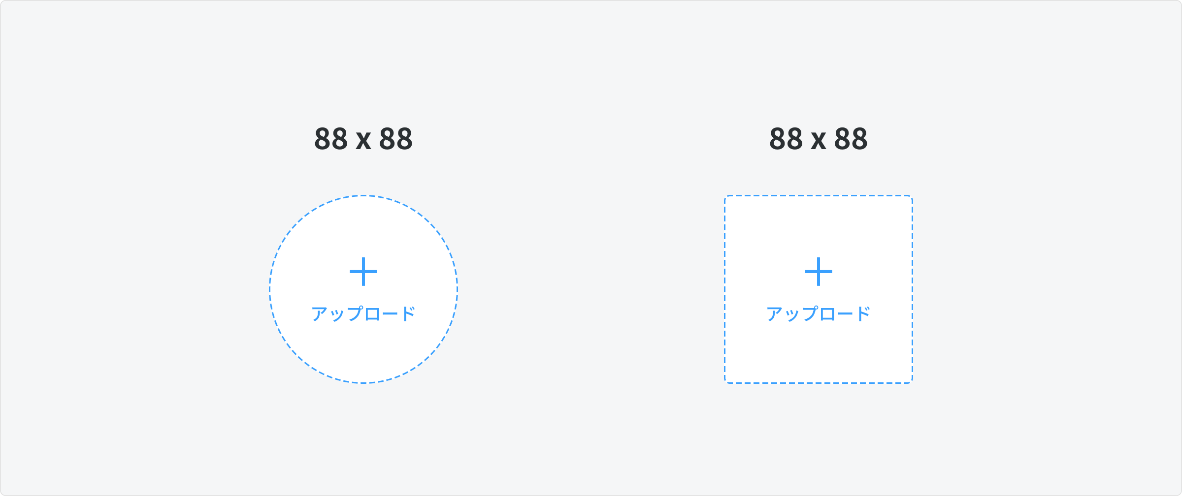
- Common Size (in pixel)
- Desktop and Mobile: 88 x 88
- Aspect Ratio: 1:1
Image Uploader
Image Uploader allows users to upload banner, product image, menu image.
Anatomy
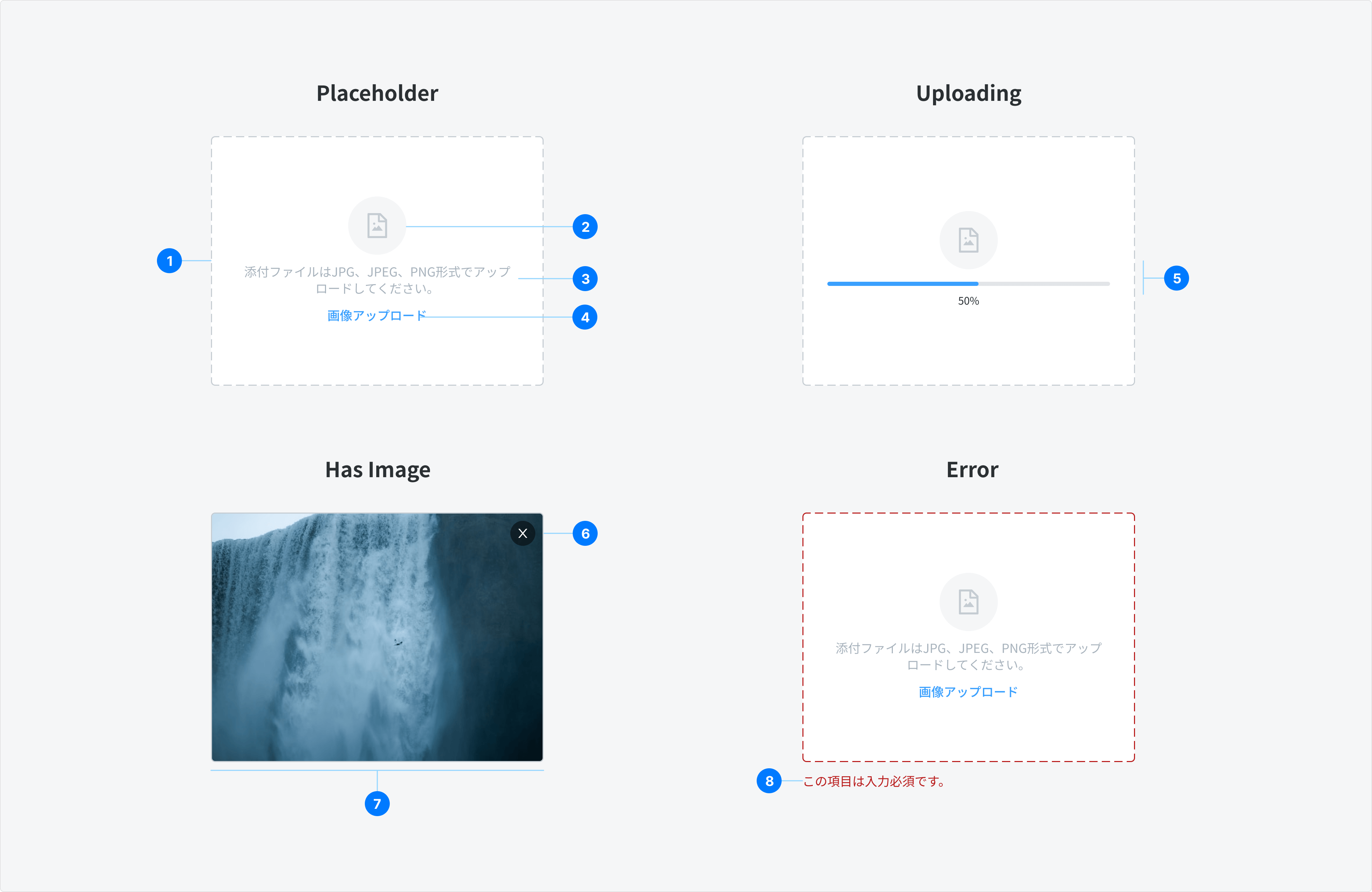
- Container: The main area where users interact with the uploader.
- Icon: A visual representation indicating an image file, helping users understand the functionality at a glance.
- Hint Text: Provides essential information, including:
- Accepted File Formats: Specifies which formats (e.g., JPEG, PNG) are allowed for upload.
- Size Limit: Indicates the maximum file size permitted for uploads.
- Aspect Ratio Requirements: Describes the preferred dimensions for optimal display.
- Ghost Button (CTA): A call-to-action button prompting users to select an image for upload, designed to be visually distinct yet unobtrusive.
- Progress Bar: A visual indicator of the upload progress
- Delete Icon Button: A button that allows users to delete the uploaded image
- Uploaded Image: Once successfully uploaded, the image will be placed in the placeholder
- Error: This state indicates a problem that requires user attention before data can be submitted or saved.
Type
There are 2 specific types:
- Banner Uploader: allow user to upload a larger image that serves as a visual header or background for a profile, page, or post.
- Product/Menu Image Uploader: allow user to upload an image for a product or menu item.
States
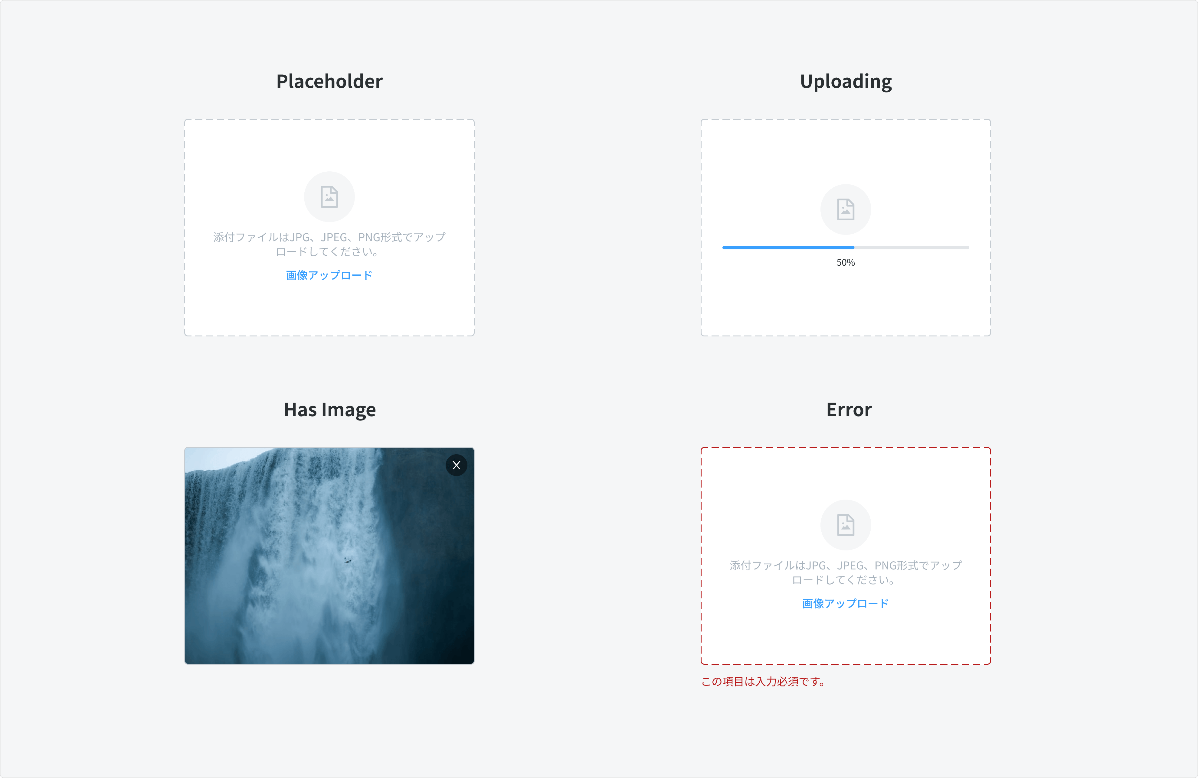
Placeholder
- When the user is not interacting with the image uploader, the default placeholder state should be shown.
**Uploading
- During the image upload process, show a loading bar to inform the user of the upload progress, providing visual feedback on the status of their action.
Has Image (Uploaded)
- Follow the default action group behavior of Ant Design.
- Show a button Delete, display as icon button X on top right. Clicking the button will remove the uploaded image and revert the component back to the placeholder state.
Error
- This state indicates a problem that requires the user's attention before data can be submitted or saved. An appropriate error message should be displayed to guide the user on how to resolve the issue.
Size
The size of Image Uploader can vary significantly depending on the image types:
Banner Uploader
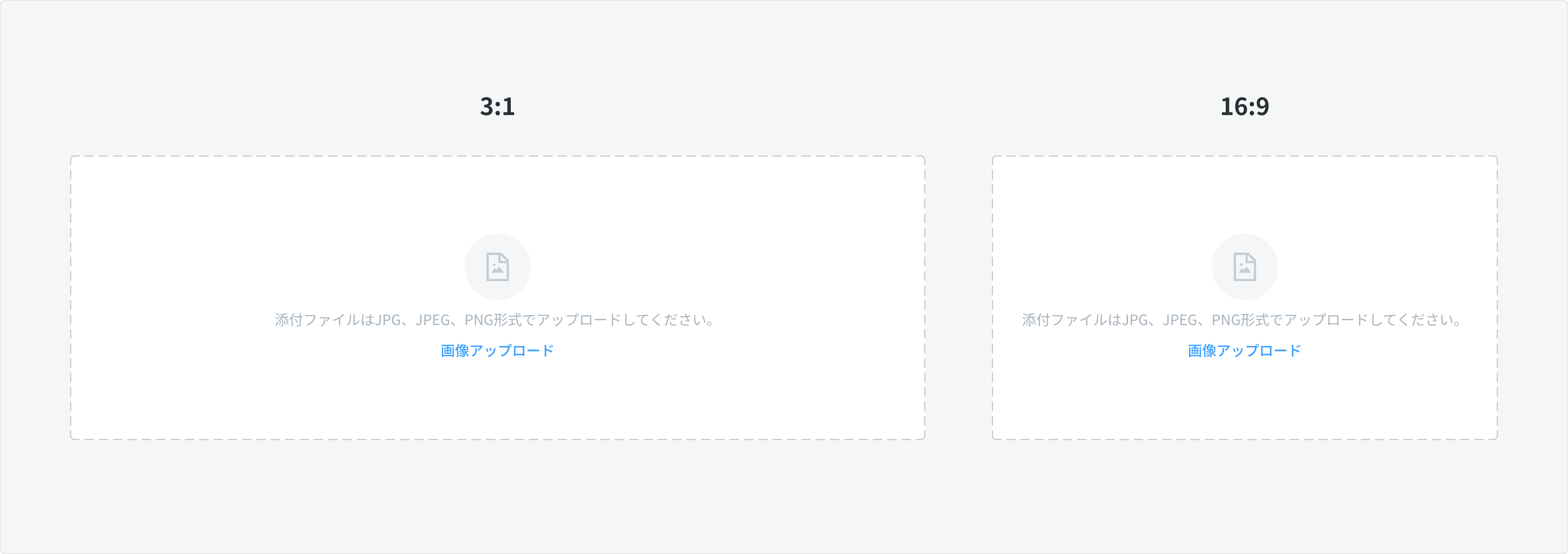
- The size of the Banner Uploader is determined by the defined aspect ratio of the image.
- Best practices:
- Profile banner / Website banner / Company profile banner: 16:9
- Campaign image / Coupon’s campaign banner: 3:1
Product / Menu Image Uploader
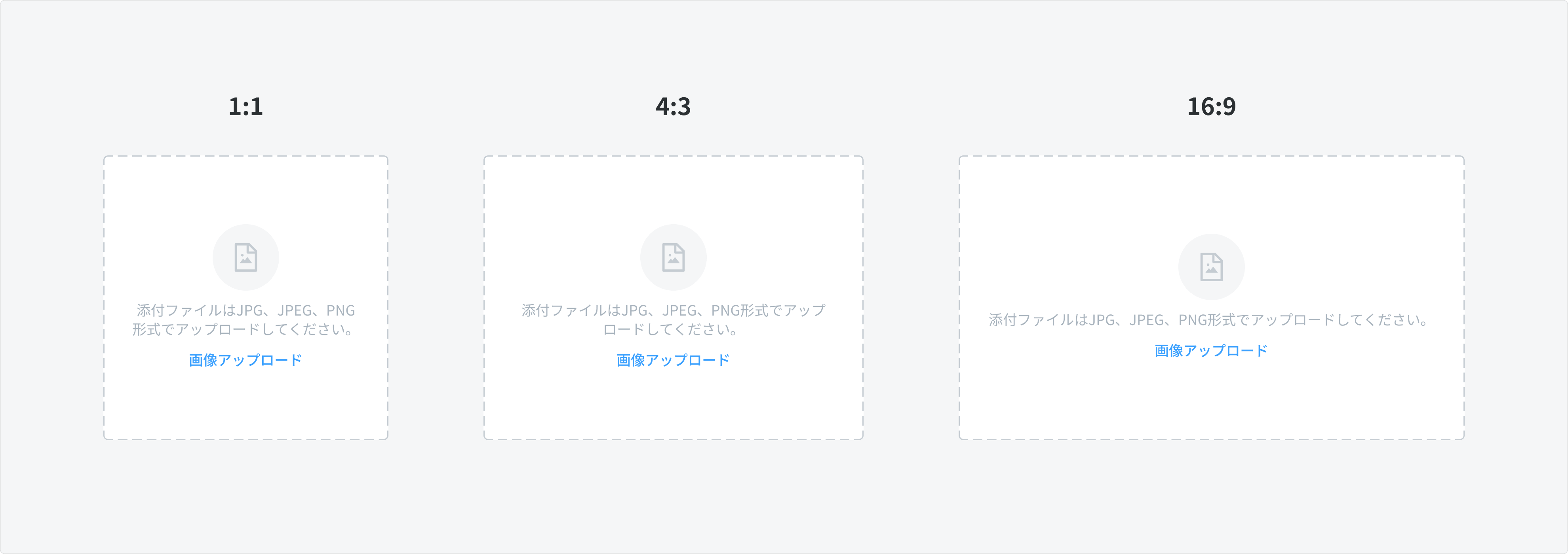
- The size of the Product/Menu Image Uploader depends on the defined aspect ratio of the image.
- Best practices:
- Product / Menu / List Item image: 1:1
- Article / Food Menu image: 16:9
- Alternate option for Food menu image if required by Partner: 4:3
Drag and Drop (Optional)
A drag-and-drop image uploader allows users to upload files directly by dragging and dropping them into a drop zone area.
Drag-and-drop functionality enhances image upload efficiency for platforms like social media, e-commerce, and content management systems, as well as cloud storage and file transfer applications.
- Drop zone area: The container is also an area that indicates where the user can drop an image to upload.
Content
Label
- The label should be concise and describe the action that will be taken upon click.
- Action name: EN: “Upload”, JPN: アップロード.
Hint text
- The hint text must be clear and supportive, following this structure
- [Recommended Aspect Ratio] + [Required File Format] + [Maximum File Size]
- Example: 縦横比 4:3、5MB以下のPNG、JPGをアップロードしてください。
- Aspect ratio of image: follow guidelines in section Size
- Maximum file size: 5MB
Error Cases
There are 2 ways to display error for the Image Uploader
Use Error State
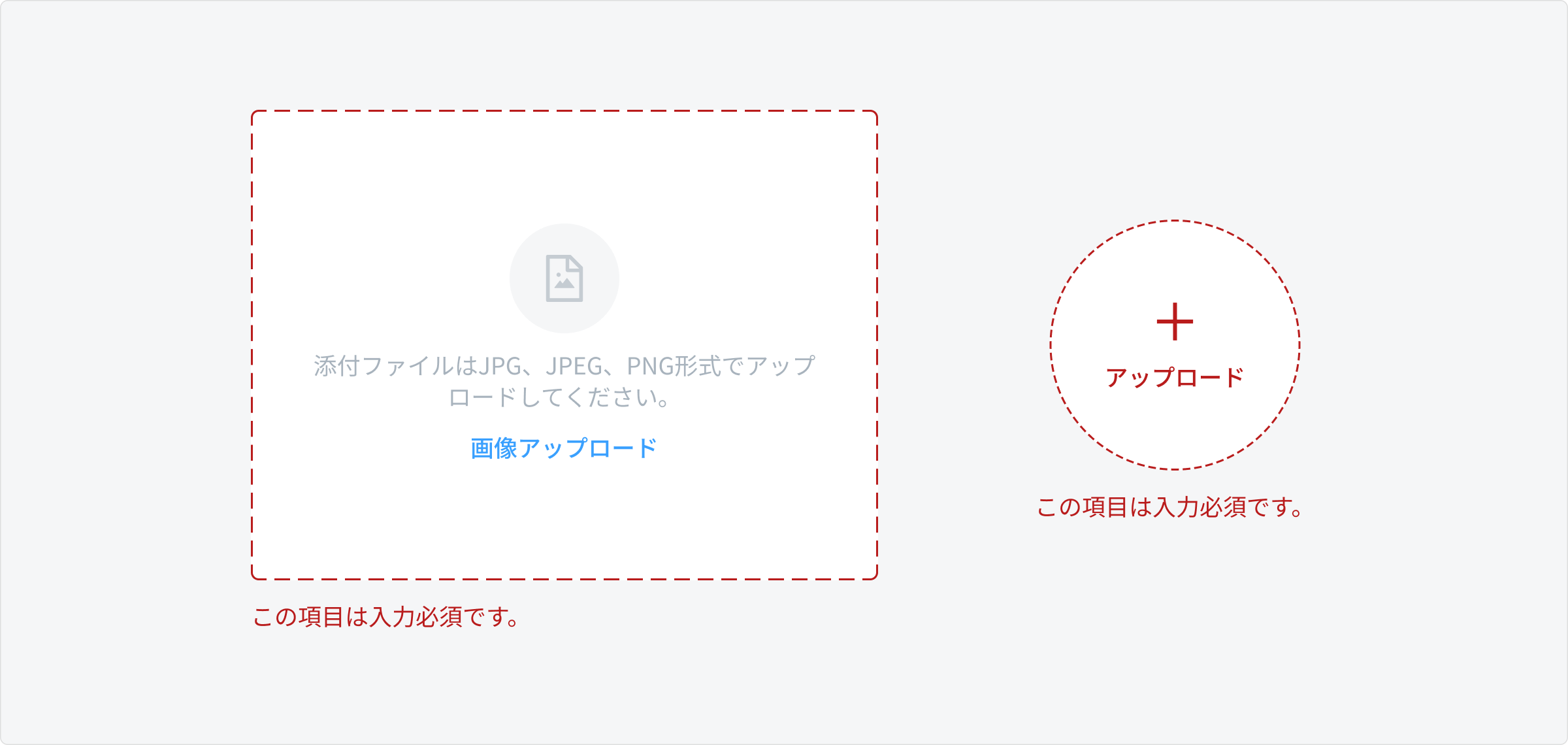
- When the user haven't uploaded the required image but save or submit data (Code: GIM02)
Use Error Toast Message
Refer to Toast Component
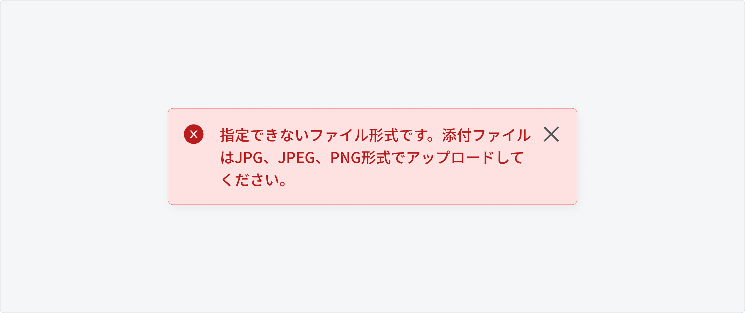
- Validation Error: When the uploaded Image does not meet the regulations such as exceeding the size limit or having an invalid format (Code: GTM38 or GTM35)
- No internet error (Code: GTM04)
Usage Guidelines
When to use
- Avatar Uploader
- To upload a profile image for a user or a company
- Image Uploader
- To upload a header banner, cover photos, or background banner
- To upload an image for a product or menu item
When not to use
- To upload a doc/pdf file - use File Uploader