Dropdown Menu
Overview
Dropdowns present a list of options from which a user can select one option, or several. A selected option can represent a value in a form, or can be used as an action to filter or sort existing content.
Anatomy
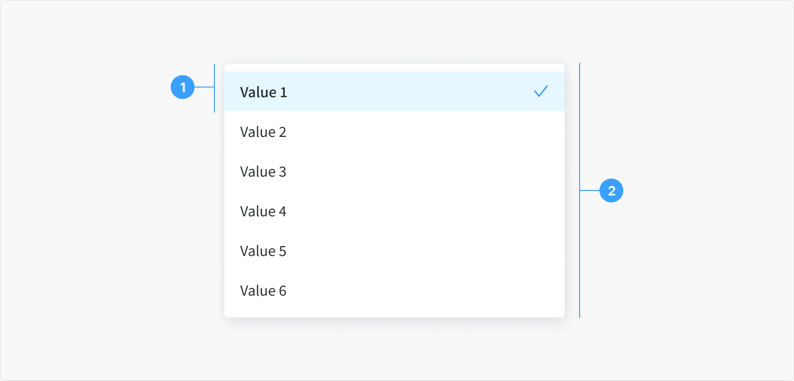
- Menu item: A choice for the user, shown with other choices in a menu.
- Menu list: A list of options to choose from, displayed as an open state.
Type
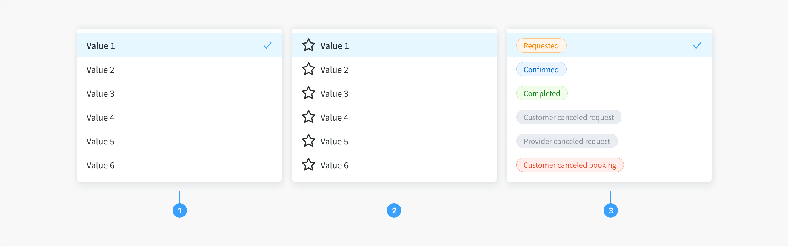
The dropdown menu has 3 types
- Text Only: In this type of dropdown menu, each option or item is represented solely by text. There are no accompanying icons or additional elements. Users see a list of text-based options to choose from when the dropdown is activated.
- Left Icon + Text: This type of dropdown menu displays each option with an icon positioned to the left of the text label. The icon is used as a visual aid or identifier along with the textual description. This visual cue can help users quickly recognize or associate the option with a particular icon, enhancing the usability and aesthetics of the dropdown.
- DisplayTag (Status): This type might refer to a dropdown menu that includes status indicators or tags associated with the options. For instance, it could display tags or labels indicating the status of each item, such as "Active," "Inactive," "Completed," or any other status indicator relevant to the context. These tags or status indicators provide additional information about the options listed in the dropdown.State
State
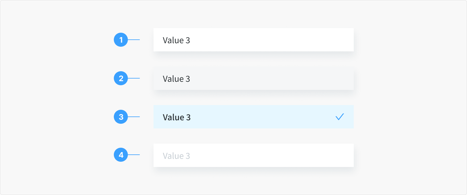
The item menu of the dropdown menu has 4 states
- Normal State: Default look of a dropdown item without user interaction. It appears as a regular option in the menu with standard styling.
- Hover State: When the mouse hovers over a dropdown item, the background will change color appearance, showing it can be selected.
- Active/Pressed State: When a user clicks an item, it visually indicates it's chosen.
- Disabled State: Some items may be inactive, appearing grayed to show they can't be selected.
Content
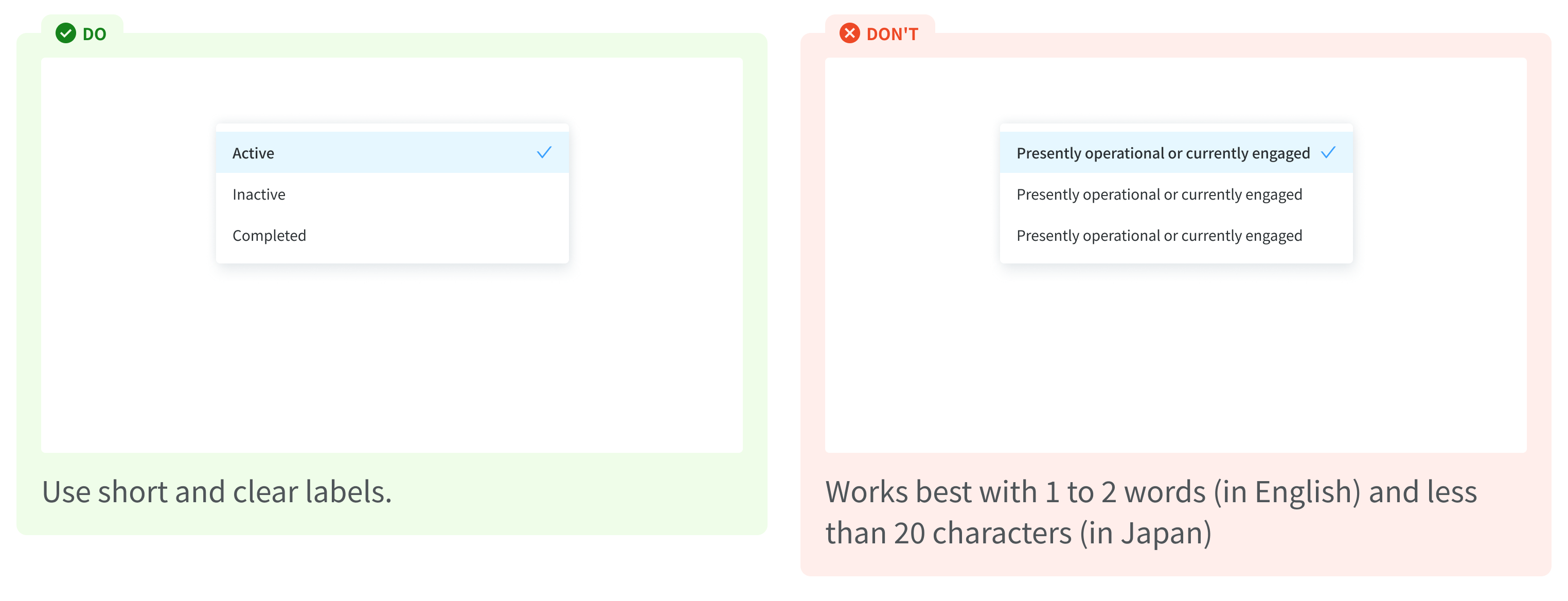
Label of Dropdown menu item should be descriptive and informative, concisely informing what user can mange with the the relevant page, for example: "Active," "Inactive," "Completed".