Checkbox
Overview
Allows user to select one or more options from a number of choices.
Anatomy

- Title (Optional)
- Checkbox input
- Checkbox label
States
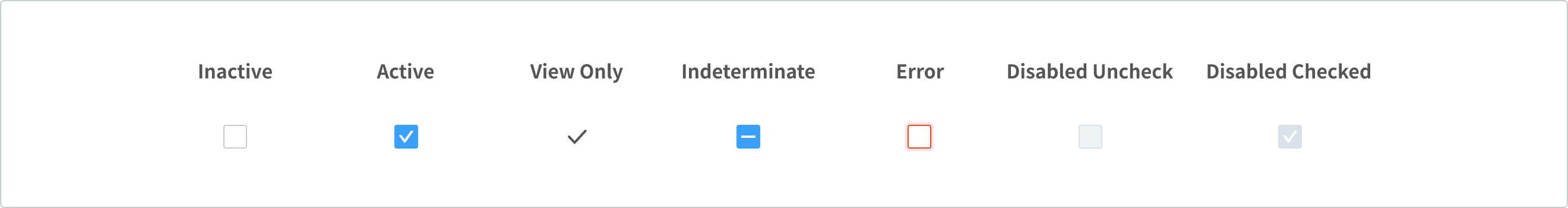
- Inactive: By default, (a set of) checkboxes have no option selected
- Active: when user interacts and selects the option
- View only: is a state transforms a component’s purpose to be purely informative
- Indeterminate: state when the checkbox contains a sublist of selections
- When the parent checkbox is checked, all child checkboxes are checked
- If it is unchecked, all child checkboxes are unchecked
- If some, but not all, child checkboxes are checked, the parent checkbox becomes an indeterminate checkbox
- Error when:
- A set of selections needs to be chosen in order to move forward
- Or that a selection that was made is invalid.
- Disabled when:
- Indicating that an option is not currently available, though may be available later
- Another action has to be completed before the checkbox is usable
Variants
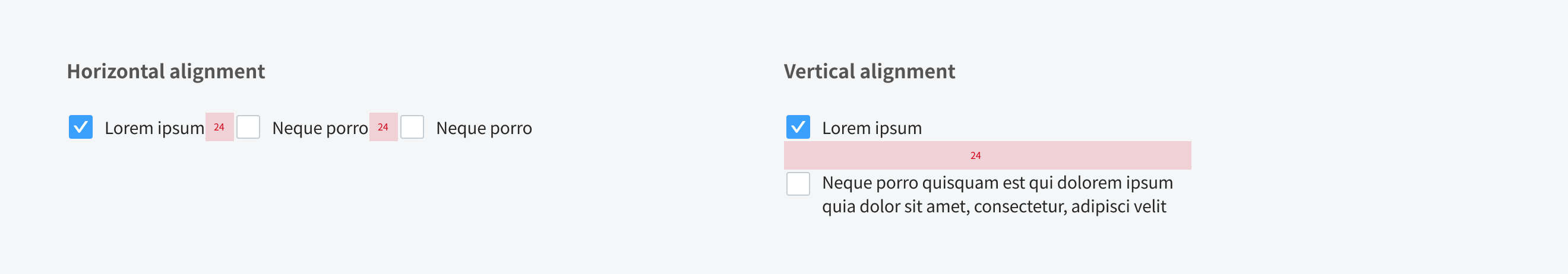
Alignment
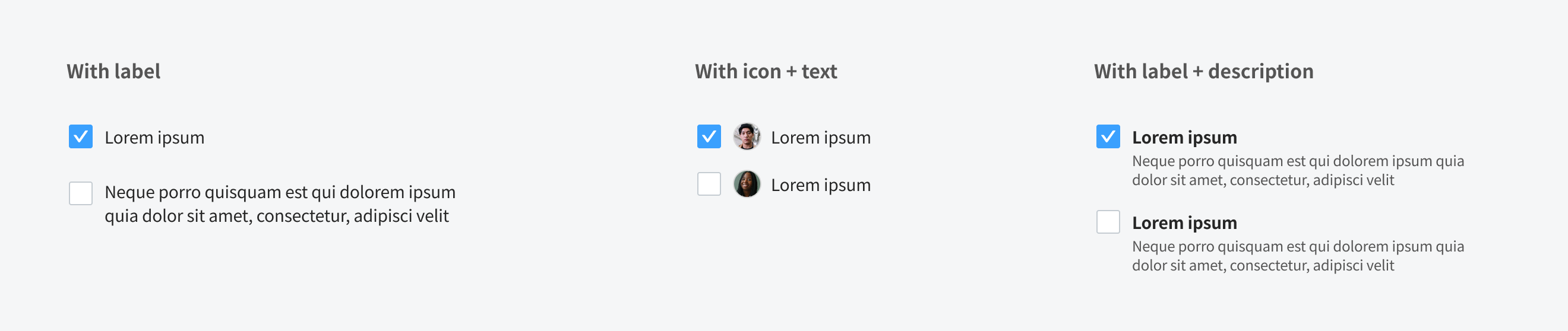
Content
Title
- In most cases, the title provides further context or describes what actions to take below.
- In some cases, a group of checkboxes may be within a larger group of components that already have a group title. In this case, the title is not needed.
Checkbox labels
- Should use clear and concise labels for checkboxes.
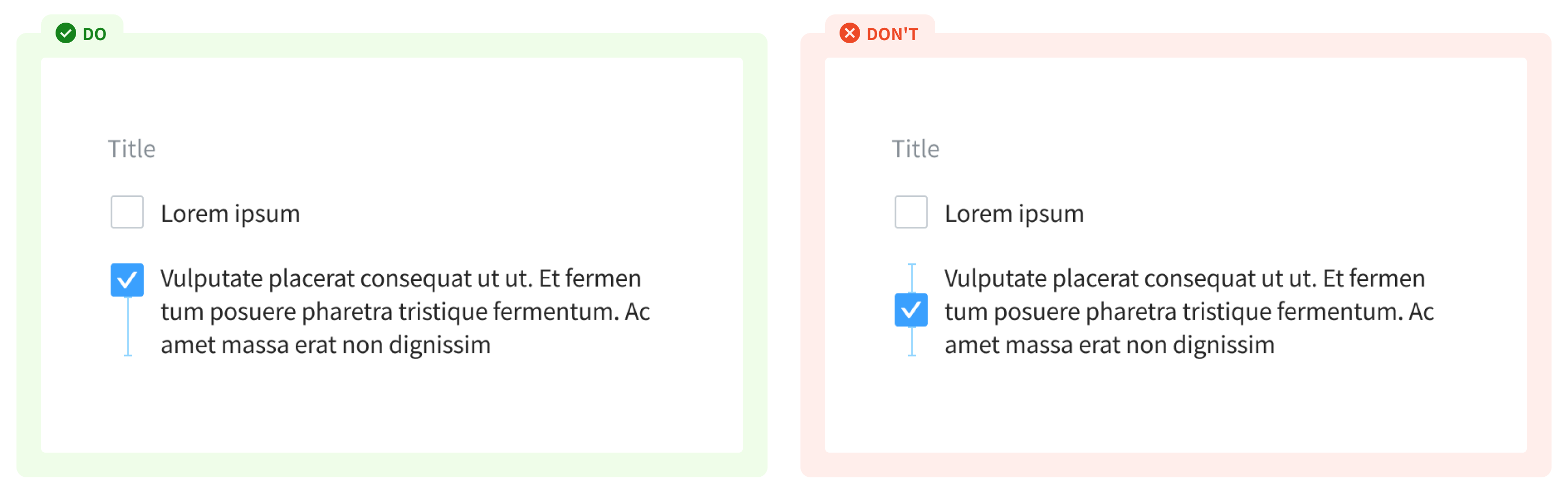
- In most cases, labels appear to the right of checkbox inputs.
- When using a line break, the checkbox is horizontally aligned with the first line of the label
Usage Guidelines
When to use
- Can be used in forms on a full page, in modals, or on side panels (to filter data either on a page, or in a menu), or within a component
- Turning the checkbox input Active or Inactive can indicate whether user agrees to the terms of service.
When not to use
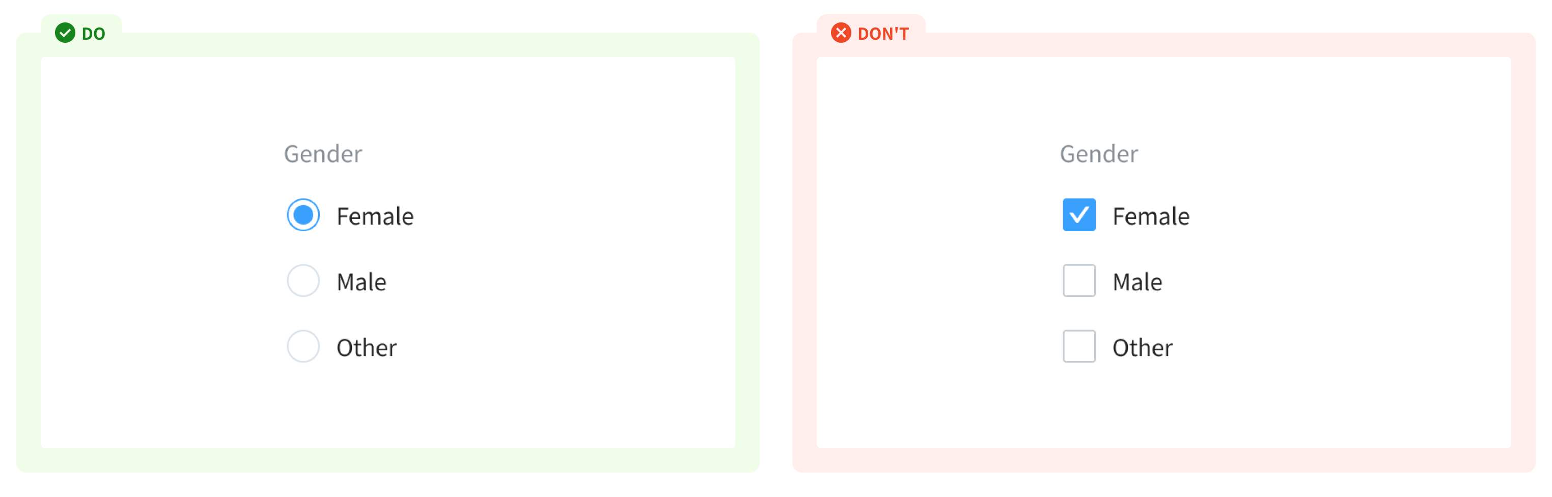
- If user can only select one option from a list - use radio buttons
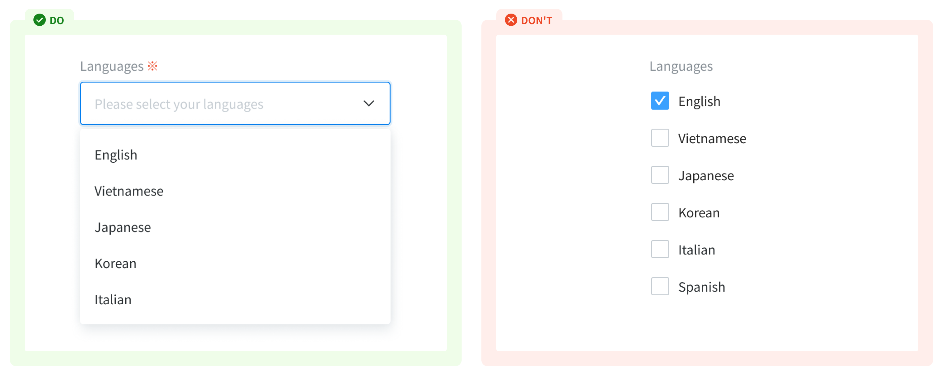
- If user has to input options from a long list of items - use dropdown input
References
Ant design - Checkbox
Doctolib - Checkbox
Carbon design system - Checkbox
Material - Checkboxes