Date Picker
Overview
Date picker lets users enter a specific date into a form by either selecting it from a calendar or typing it into a date input field.
Anatomy
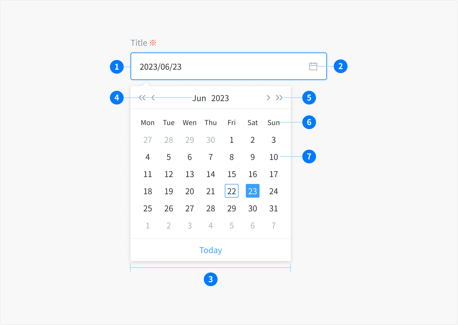
- Date input field: A text input field where the user can manually type the date.
- Icon: The calendar icon indicates the calendar menu is available.
- Calendar: A menu to select the date
- Month and year controls: Allow the user to navigate through past and future time frames.
- Previous and next month controls: Allow the user to move forward or backward one month at a time.
- Weekday: Days of the week.
- Day: Days in the month.
Types
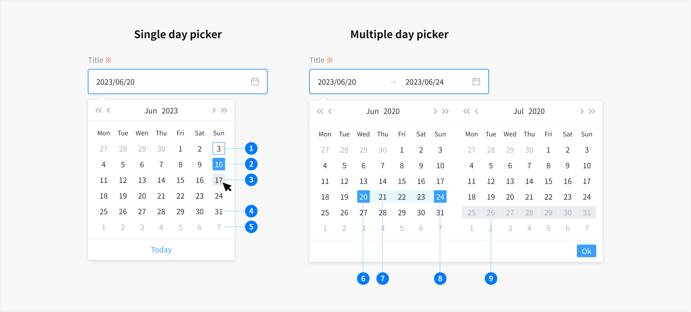
Date Picker: single date
- Users can either manually enter a date in textfield input or select a specific date from the calendar menu.
- The date must include a day, month, and year. The calendar picker displays only one month at a time and defaults to the current date when it is opened.
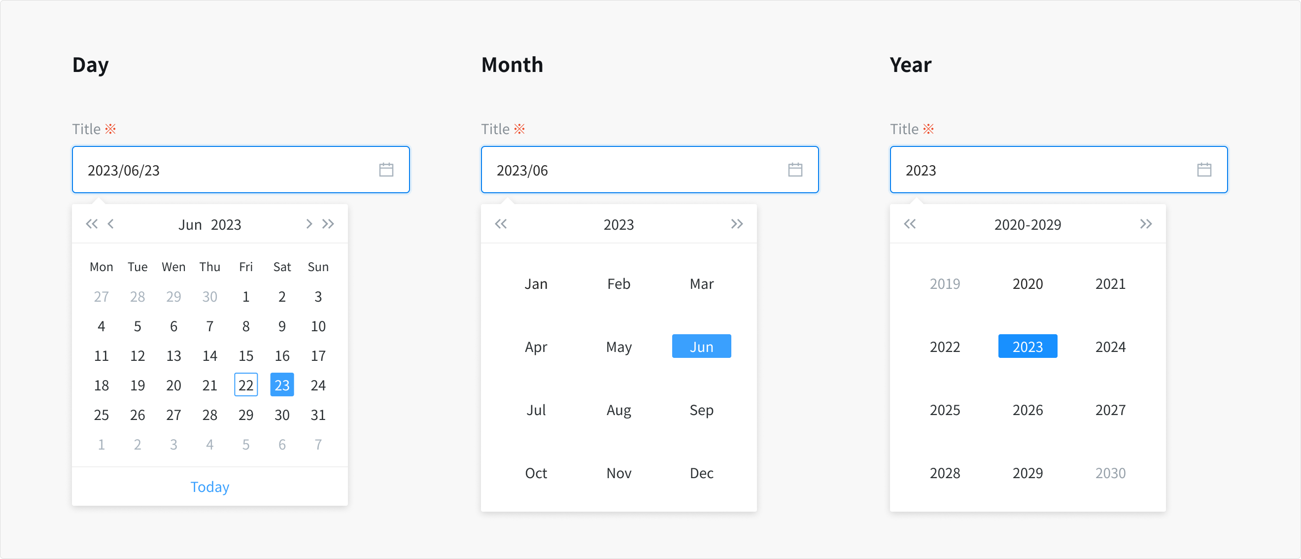
Note: Some users may find calendar pickers difficult to use. There should always be a simple way to enter dates in a text field when using calendar pickers.
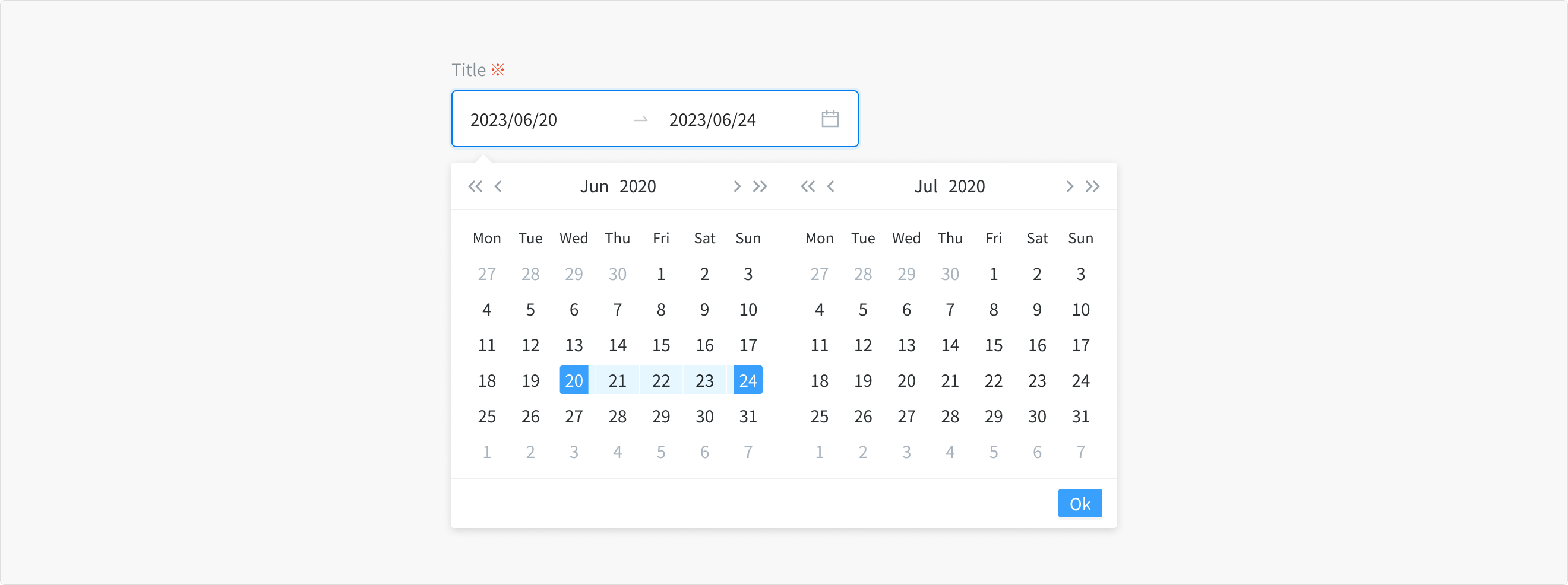
Range date picker: select start date and end date
- The date range picker functions much like the single date picker but instead of choosing just one date, user can choose a start and end date
- For each date in the range, similar to the single date picker, users have the option to manually enter the date in textfield input or select specific dates from the calendar menu
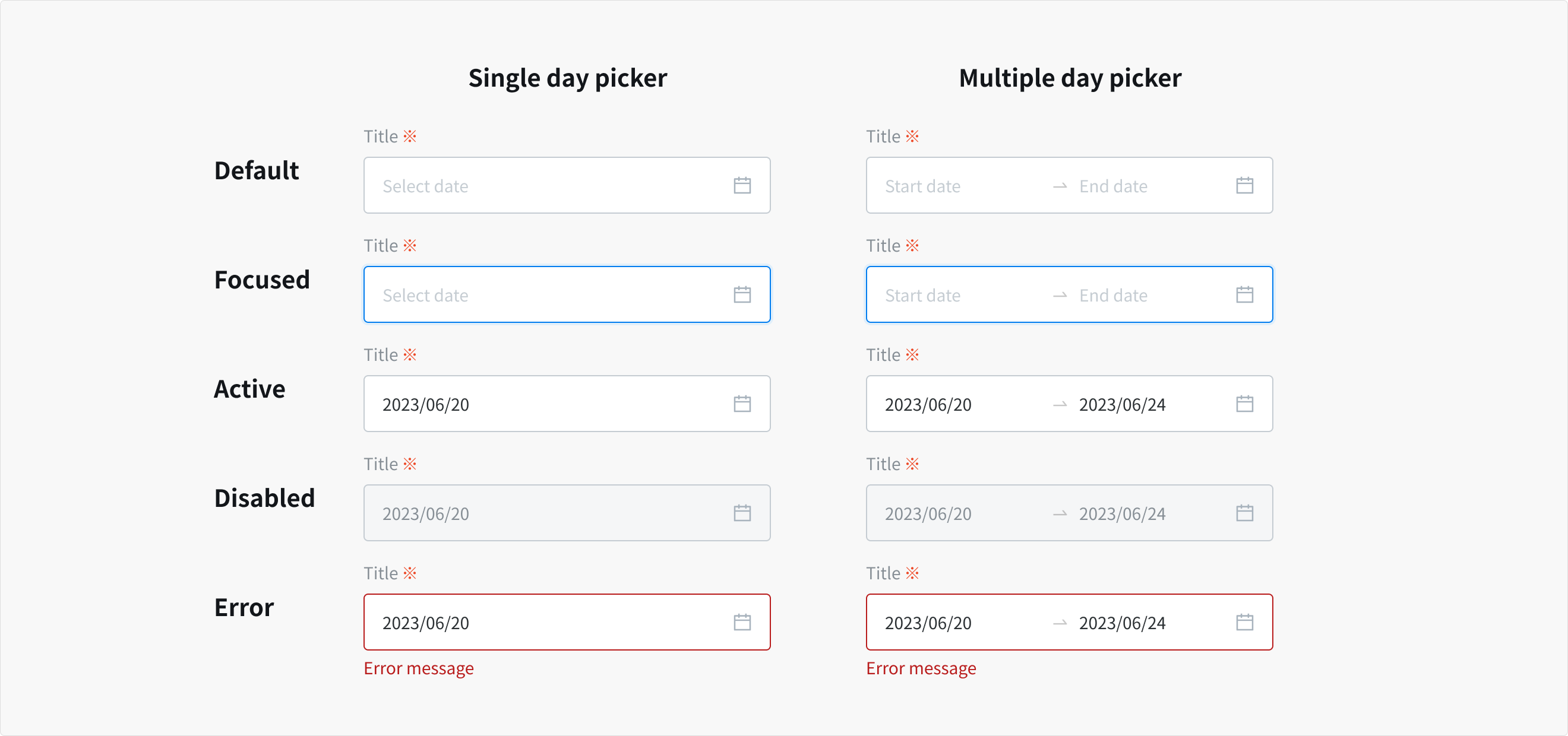
States
- Date input field
The date input is actually a textfield and has the same interactive state and behaviors. Only date pickers with calendars will have the calendar icon present on the right side of the input field
- Calendar item
- Today
- Selected
- Hover
- Default (day in month)
- Days in next/previous month
- Selected start date
- Day in range
- End date hover and focus
- Disable
Content
Date input field
- The date picker must be accompanied with title. Similar to textfield, the title should be clear and descriptive.
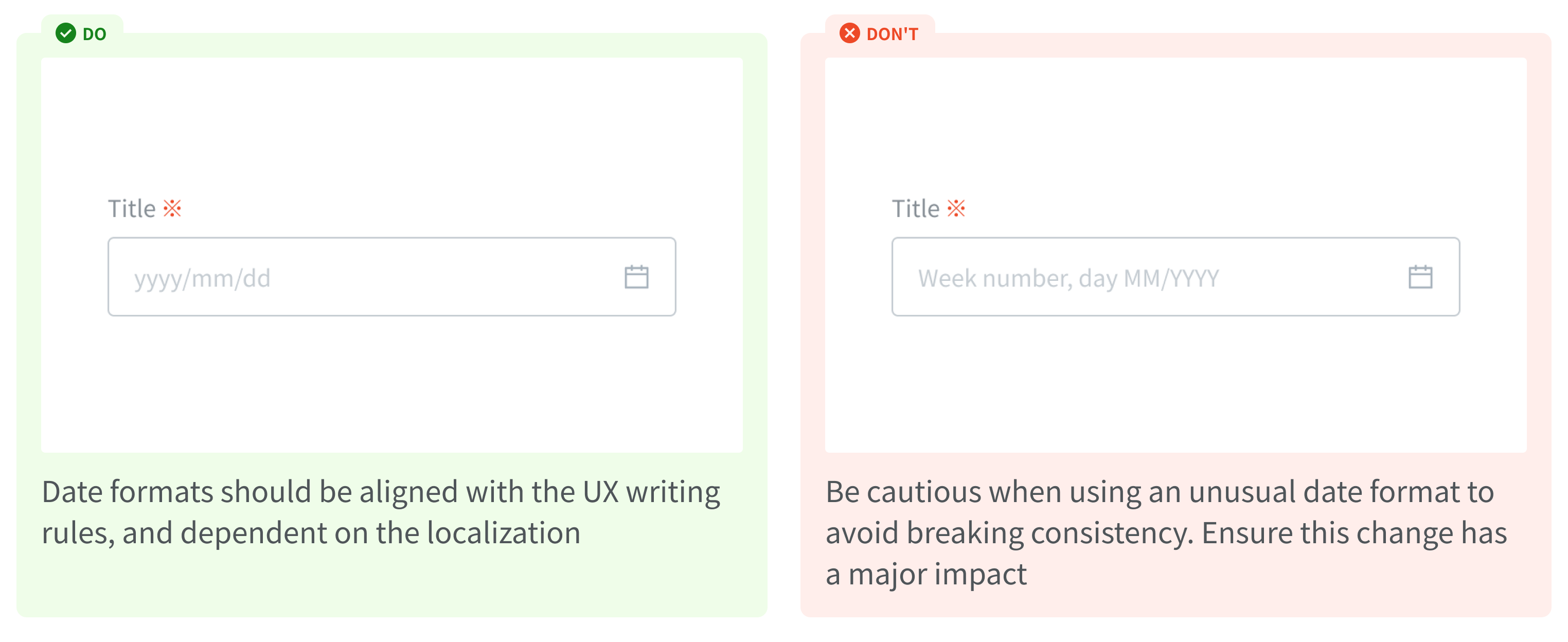
- Placeholder text should provide hints or accepted date format (yyyy/mm/dd), and disappear after the user begins entering/select data into the input field.
- Range inputs should be being properly labeled with a start and end label.
Usage Guidelines
When to use
- To input and select a specific date
When not to use
- If you want user to enter short string of characters, in one single line - use textfield
- Date formats should be aligned with the UX writing rules, and dependent on the localization.
References
Ant design - Date picker
Doctolib - Date input
Carbon design system - Date picker