Dropdown
Overview
Dropdowns present a list of options from which a user can select 1 option or several. A selected option can represent a value in a form, or can be used as an action to filter or sort existing content.
Anatomy
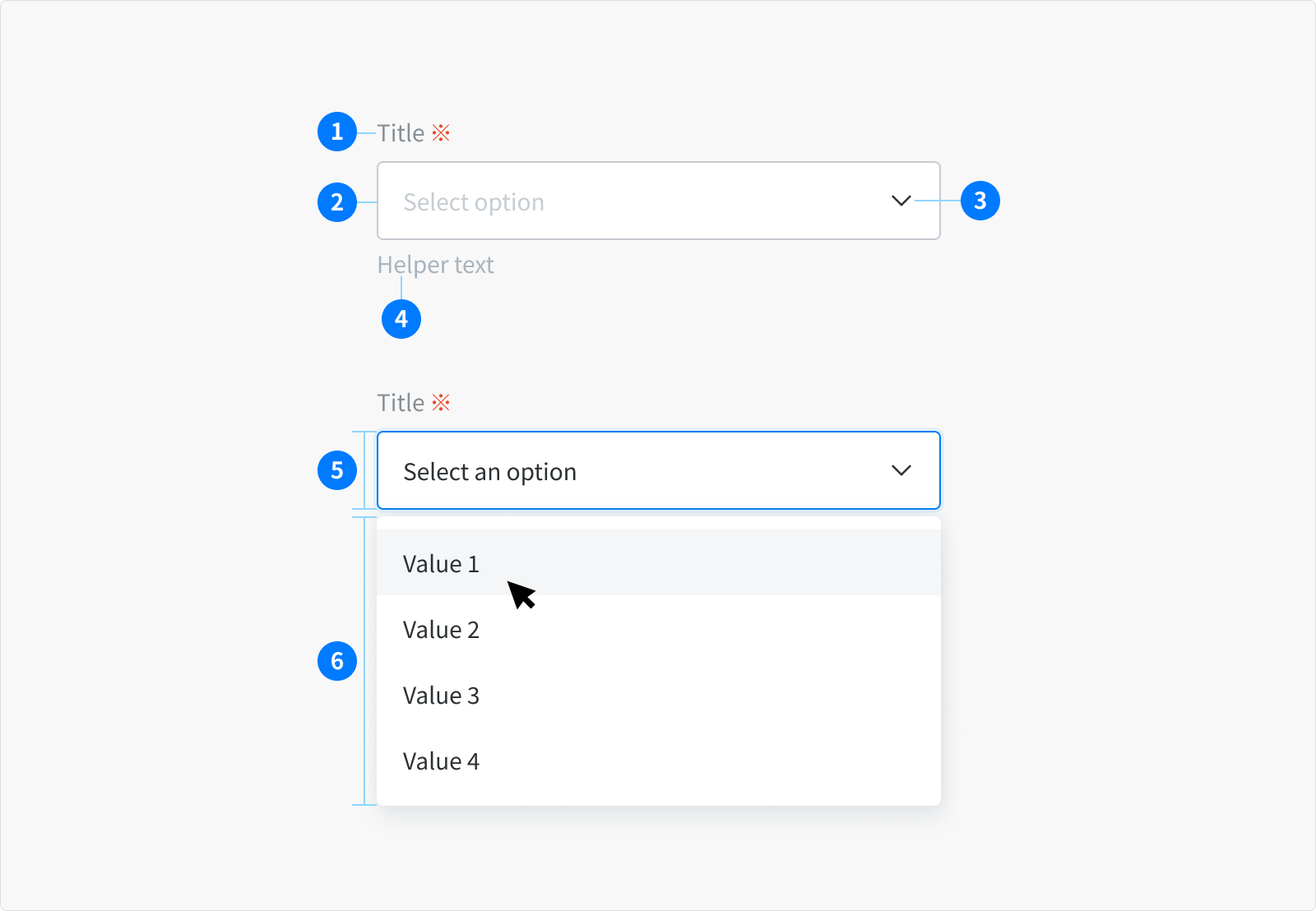
- Title (Optional)
- Input container
- Dropdown arrow / Input area
- Helper text area (Optional)
- Select dropdown
- Dropdown menu
Types
There are 2 different variants of dropdowns that support various kinds of functionality:
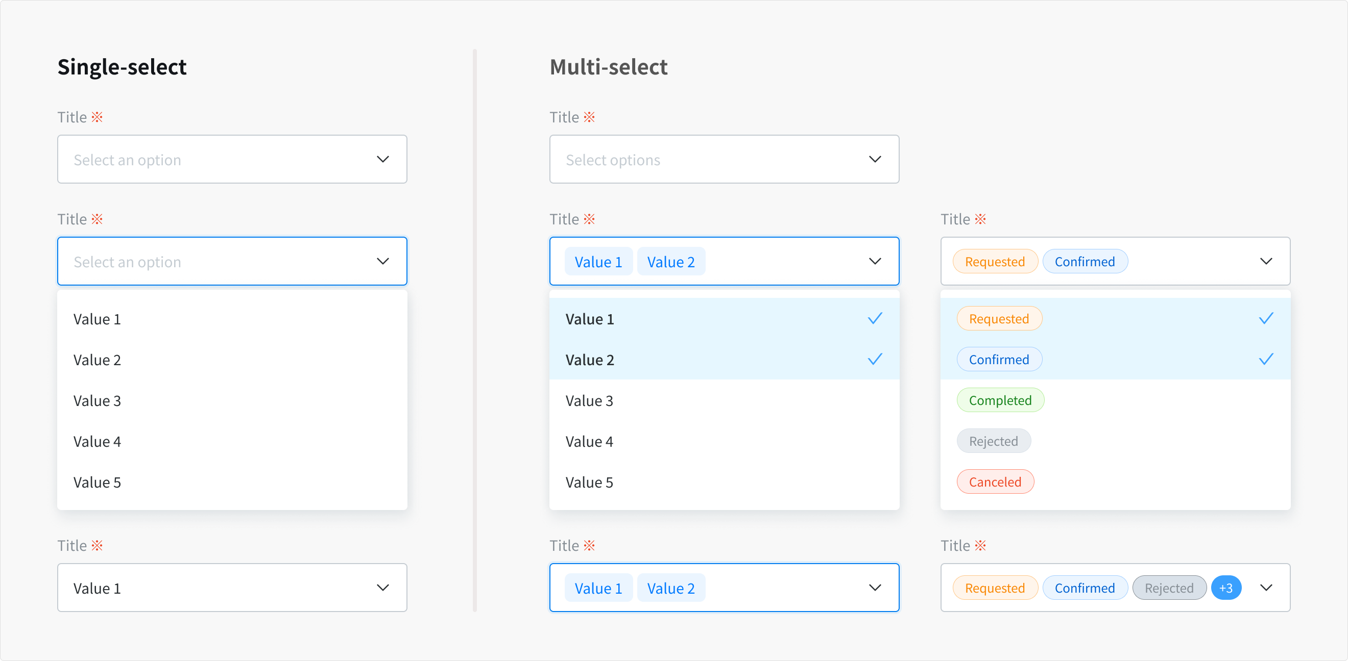
Select dropdown Use when user can select one or multiple options from a list at a time.
Behavior
- By default, the dropdown displays placeholder text in the field when closed.
- Clicking on the arrow opens an options list.
- Selecting option(s) from the dropdown menu:
- Single-select: the menu list is closed and selected option will replace field’s placeholder and also remains as an option in place if the list is open.
- Multi-select: a checkmark appears to the right of option item, the menu list stays open while options are being selected. Closes by clicking the field or outside of the dropdown.
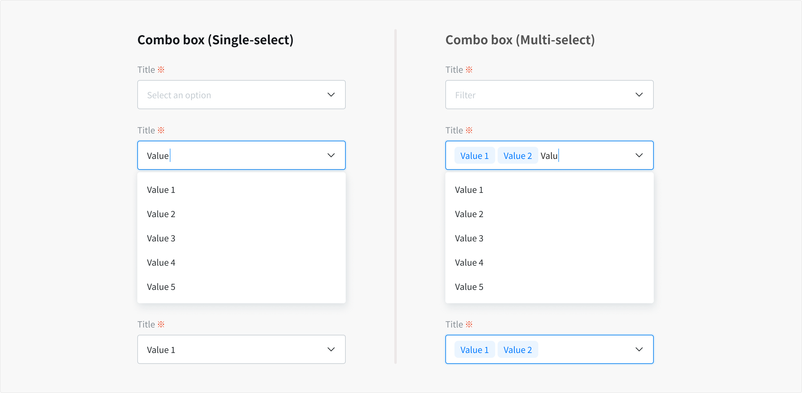
Combo Box Similar to the Select Dropdown but allowing the user to edit the input field in order to sort through the list of options.
Behavior
- By default, the combo box displays placeholder text in the field when closed.
- When hovering over the field, a text cursor appears.
- Clicking on the arrow opens an options list and user can start typing to sort through the list of options. The option that best matches the typed characters is highlighted and displayed at the top of option list.
- Selecting option(s) from the menu list:
- Single-select: the menu list is closed and selected option will replace field’s placeholder and also remains as an option in place if the list is open.
- Multi-select: a checkmark appears to the right of option item, and text cursor still appears next to selected option (tag or status)
The rest behavior is the same with multiselect
States
`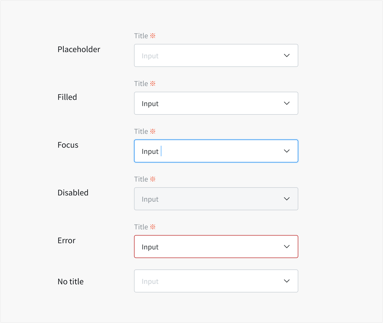 Normal
- When a dropdown/combo box is live but a user is not directly interacting with it (commonly referred to as the default or normal state of the component)
Focus
- When a user clicks on the dropdown/combo box
- When a user is actively selecting option(s) from list
- Indicating the user has successfully navigated to the component.
Filled When a user has selected an option into the field.
Disabled
- When the user cannot interact with a component and all interactive functions have been removed.
- Disabled states are not focusable, are not read by screen readers, and do not need to pass visual contrast, making them inaccessible if they need to be interpreted.
Error
- When the selected option is invalid or a required field has not been selected. It can also be triggered due to a system error.
- This state requires a user response before data can be submitted or saved.
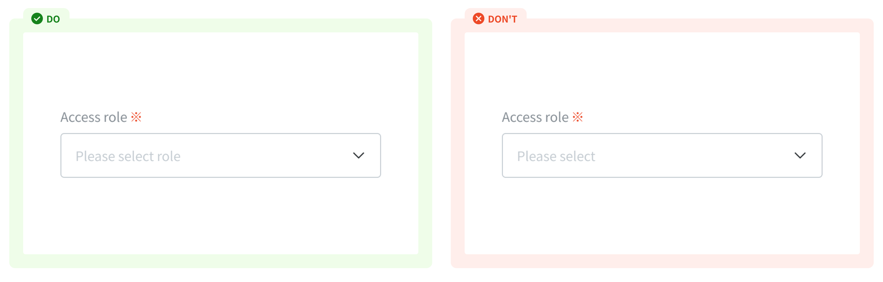
No title Similar to textfield, please check accessibility before proceeding with a label-less design for dropdown.
Content
Title
- Title informs users what to expect in the list of dropdown options.
- Keep the title short and concise.
Placeholder text (Input area)
- Placeholder text should have clear content for the dropdown trigger so that users understand the purpose.
- By default, if no selection has been made, it's important to have a placeholder, especially when the dropdown does not have a title above it.
Helper text
- Helper text conveys additional guidance about the input field, such as how it will be used. It should only take up a single line, being persistently visible or visible only on focus.
- Helper text is pertinent information that assists the user in choosing the right selection from the dropdown option list.
`
Usage Guidelines
When to use
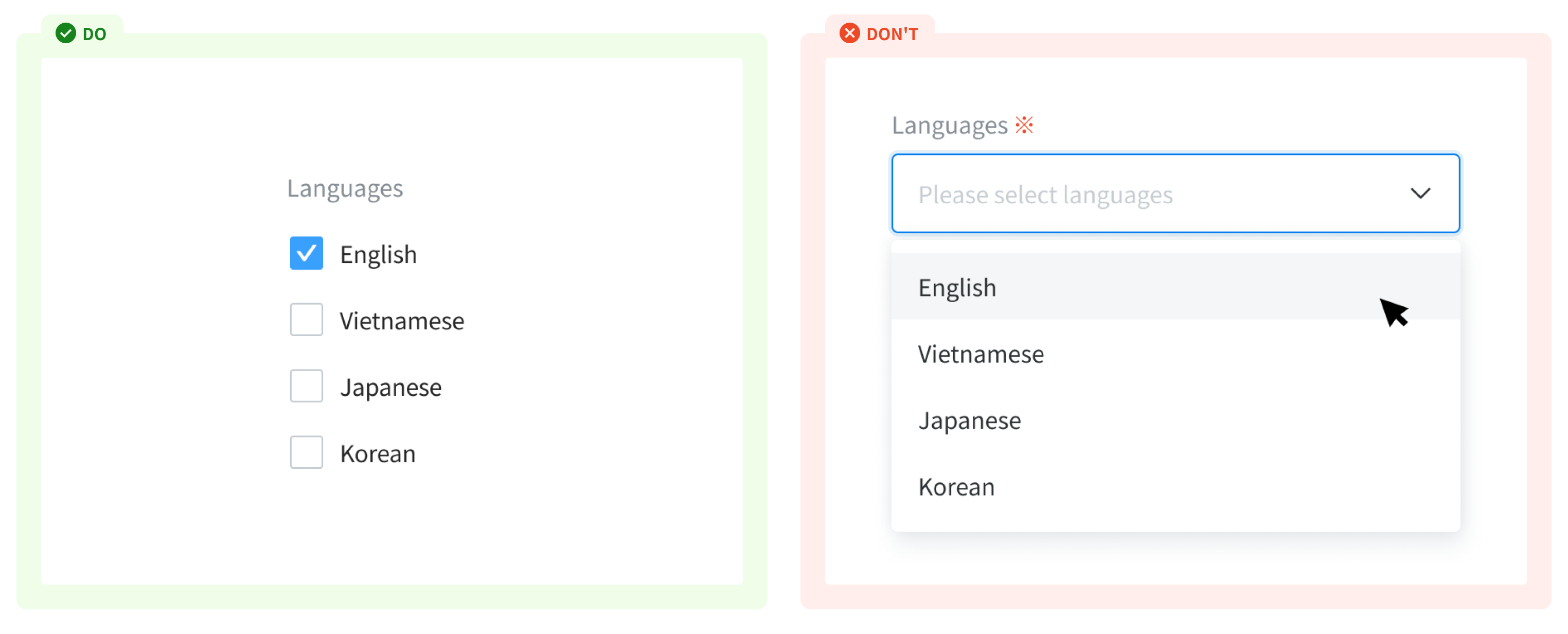
- To present many options where only one can be selected.
- To keep long lists of options from being overwhelming.
- To fit multiple options into a small space.
When not to use
- If you have only a few options and enough space - use a radio.
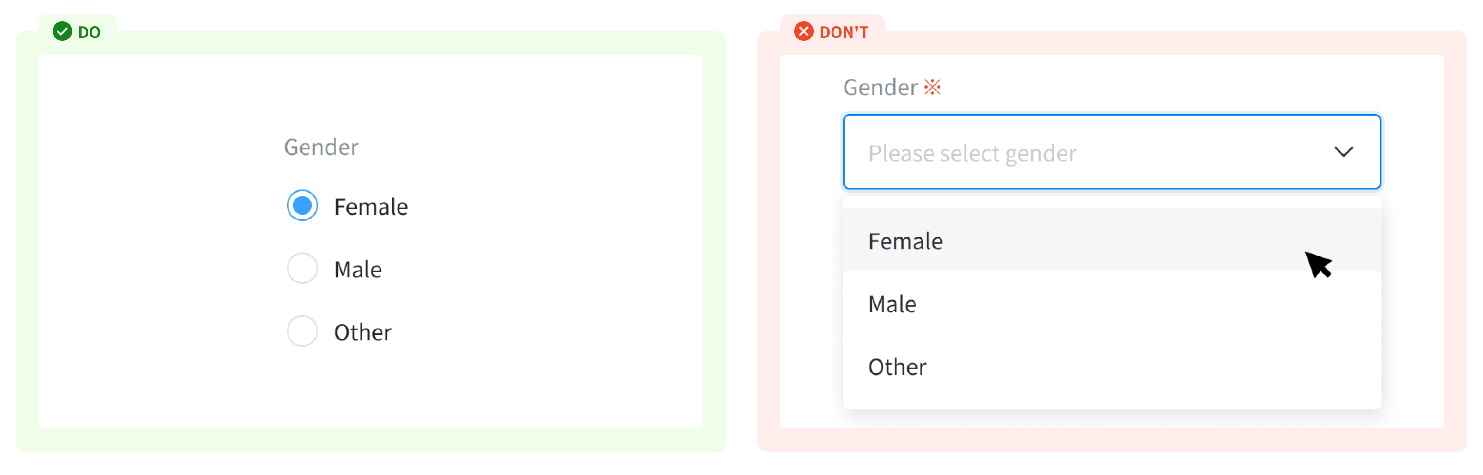
- If users can select more than one of a few options - use a checkbox.
References
Ant Design - Tree select
Doctolib - Dropdown
Orbit - Select
Carbon design system - Dropdown